
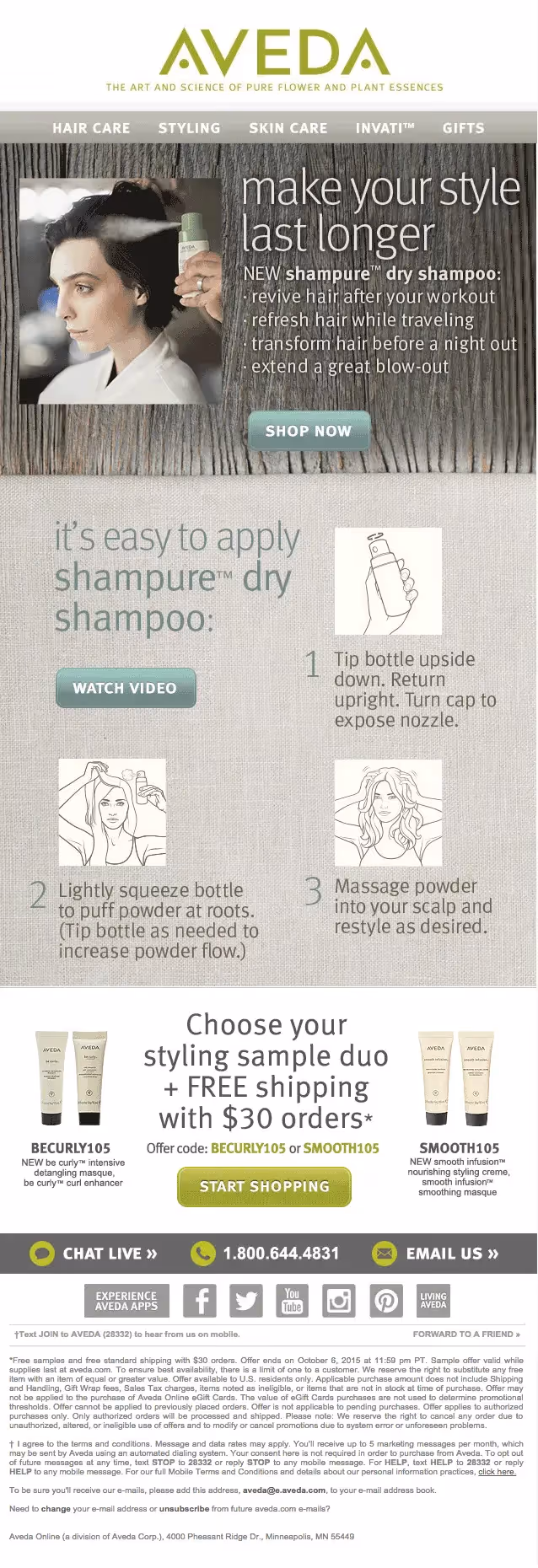
In this week's Design Inspiration post, wetook a closer look at anemail from Aveda(below). Aveda made some smart choices inthishighly visual, on-brand message,incorporating modern design trends like infographics, natural textures, and a monochromatic color scheme. Butit has a fatal email design flaw: the email is made up entirely of images (i.e., it's an image-only email).Here's the Aveda email.
A quick recap: Avoid designing image-only emails
Image-only emails areproblematic for a number of reasons: some peoplewon't be able to see an image-only email at all (because of their email client settings); image-only emailsend up in spam folders; they aren't mobile-optimized; and they often don't getfully downloaded. Check out our post to get the full scoop and ensure you aren't making the same commonly-made mistakes in your email campaigns: read how to avoid the pitfalls of image only-email.
In today's workshop
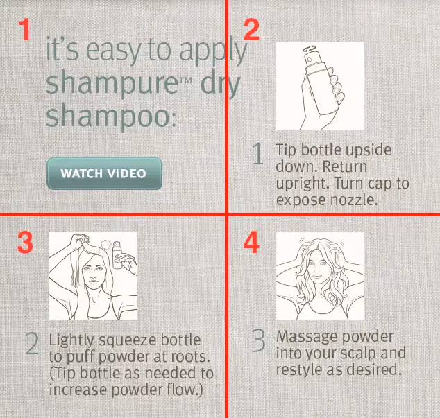
After enablingimages in our inbox, one design tactic that we noticed and liked right away in the email is this infographicshowcasing their product:
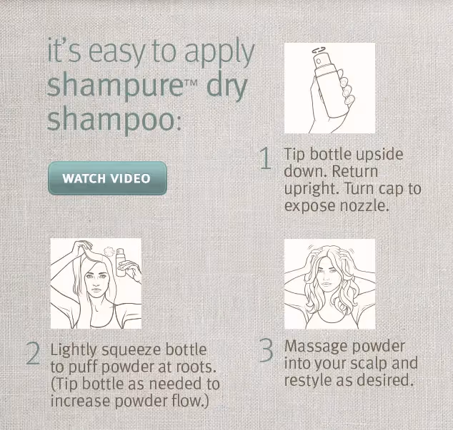
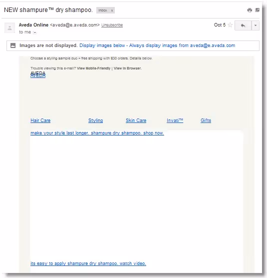
It's prettyquick and easy to tell what the product is and how to use it, isn't it? That’s because our brains take only 1/4 of a second to process visual cues. With just a quick scan—no need to read much or watch a video or keep scrolling—we understand just what the shampure™ product does. That's what makes an infographic such an incredibly effective tool.In today's workshop, we'll show you how to recreate this infographic, optimizing it for email. Notice the original Aveda's infographic is a single image, meaning all the pitfalls of image-only emails we mentioned above apply here. If images are turned off, we just see empty space in our inbox:
We'llbreak down how we'd recommend recreating Aveda's infographic—into different content blocks—so that it's mobile responsive, renders fully, and looks great across devices and email clients.
Getting started: Let's open the BEE editor
First things first: for this workshop we are going to usetheBEE email editor(it’s free, online, and requires no registration). Give it a try and follow along!
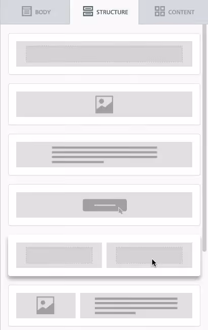
Step #1: Set up a 2-row, 2-column structure
Properly setting up the email's structure is critical here because it will determine how the emailwill rearrange—or be "responsive"—on a smaller screen.Let's take a step back for a moment and think about what responsive design is and how it works. Broadly speaking, responsive email design is a collection of design and coding techniques thatoptimize a viewing experience on different sized devices, particularly on small mobile screens. Responsive designworks by usingCSS media queries (conditional statements) to detect the exact screen size of a device then adjust the email based on the statements in the code.Lucky for us, the BEE editor automatically makes any email wedesign responsiveby applyingsmart CSS media queries, optimizing emails for mobile screens without needing tocode a single line.For ourinfographic to function in aresponsive way, we simplyneed to redesign it to consist offour sectionsarranged on a grid instead of as a single image block. By breaking up the infographic into sections, the BEE editor will be able to rearrange them into a single column for easier viewing on a mobile.So, let'sthink ofthe infographic in quadrants, like this:
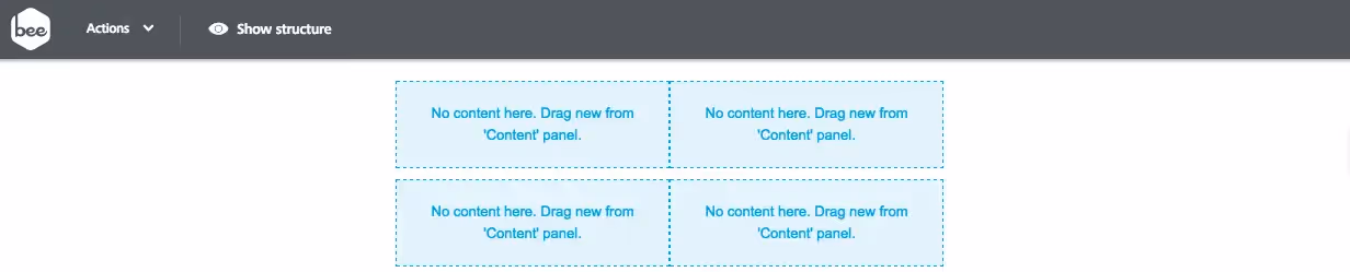
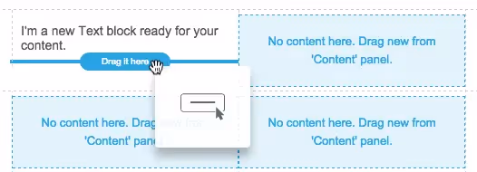
To create this grid in the BEE editor, we'll draga couple of two-column rows from the Structure menu into the body of our email...
...so that ouremail design mimics the 4-quadrant infographic structure:
Step #2: Customize your 2-column structure
On the right side, switch menus from Structure to Content so we canpopulate each quadrant with the appropriate content.
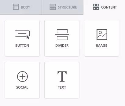
The first quadrant needs text and abutton.
The following three quadrants will all have the samelayout of image and text, so we'll drag those content elements in one at a time.
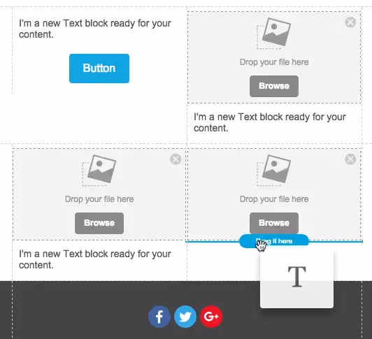
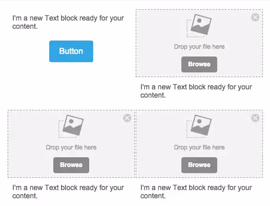
Now our structure is customized with all of the proper content blocks ready to go.
Step #3: Add the content
One by one, we'll go through each quadrant adding Aveda's content. Here aresome design decisions we made:
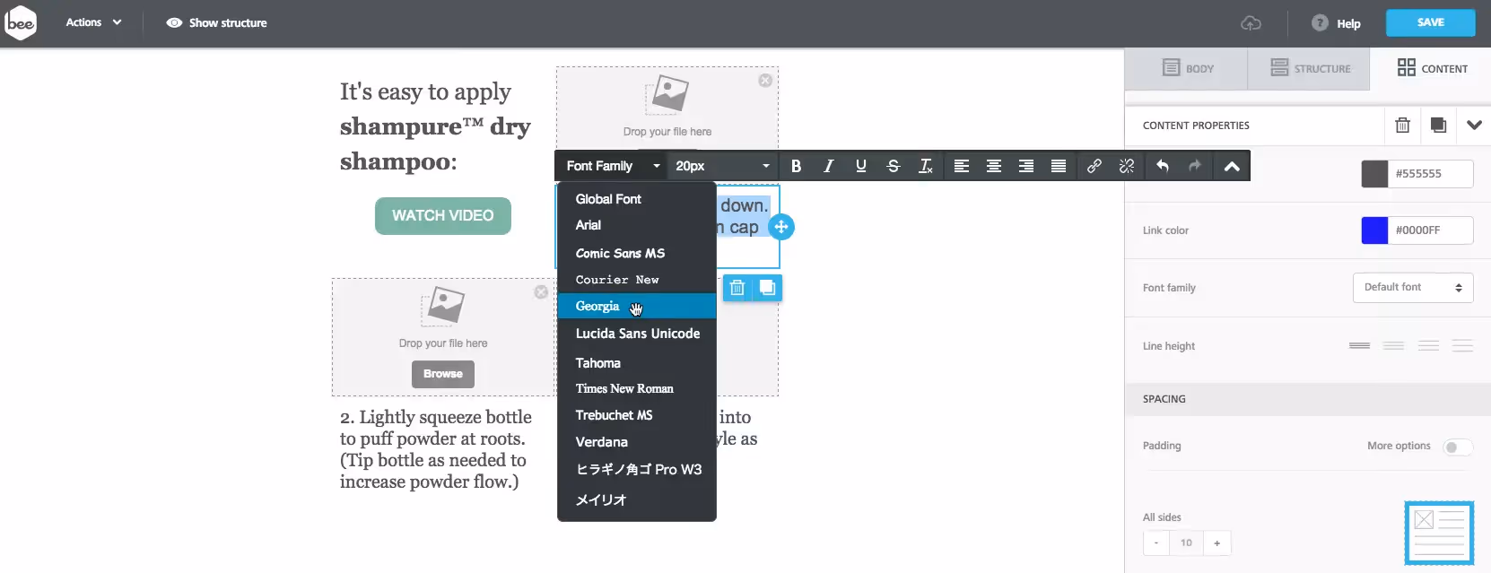
- We've chosen Georgia as our font as it most closely resembles the Aveda typeface. Because we're using a text block and not embedding an image, the text will always be shown.
- We formatted the "WATCH VIDEO" button to match the color and style of Aveda's. Ours, however, is bulletproof (like all buttons created in BEE) so we don't have to worry about visibility or functionality issues that image-only buttons face. (Here's our how-to post on creating and formatting bulletproof buttons in BEE).
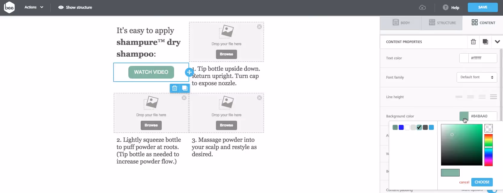
- We left-aligned the "WATCH VIDEO" button and images to match Aveda's layout—an easy adjustment in the Content Properties menu.
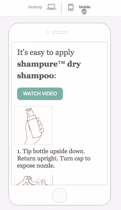
Step #4: Preview the mobile version
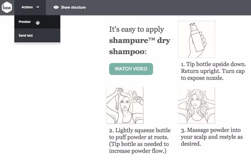
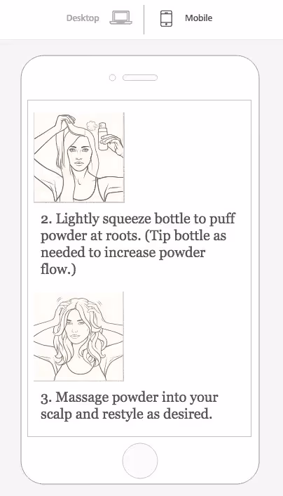
Before we finish formatting and polishing our infographic, let's double-check thatthetwo-column grid structure we've chosen reformats intoa single-column layout the way we want it toformobile devices. In BEE, we can preview the desktop and mobile versions of our email at any point in the design process. Before we finish our infographic, let's take a peek.We simply navigate to the Actions dropdown in the top left and select Preview.
Then, we select Mobile and scroll through our email.It looks great!
Step #5: Add the finishing touches
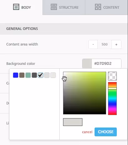
Adding background color
In the Body menu, we can change the background color of the entire email all at once.We chose to use a neutral HTML color (gray #d7d9d2), which matches the color of the background image, and we also made sure to update the font colors to mirror Aveda's.
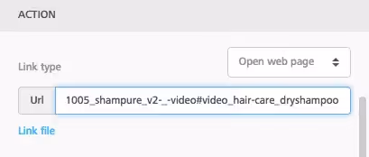
Adding a link to the call-to-action button
Don't forget to make that "WATCH VIDEO" button functional! Selectit, navigate to the menu on the right, and add Aveda's video link to the URL field in the Action section.
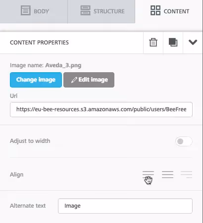
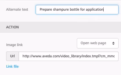
Link the images and add ALT text
Let's optimize our images. We'll add links, making surewe're providing readers with more opportunities to click for more info (i.e., to the video of how to apply the product).We'll also add ALT text so any subscribers who aren't viewing images (per their email client settings) know what the images are and can tap to download.
A side note on ALT text
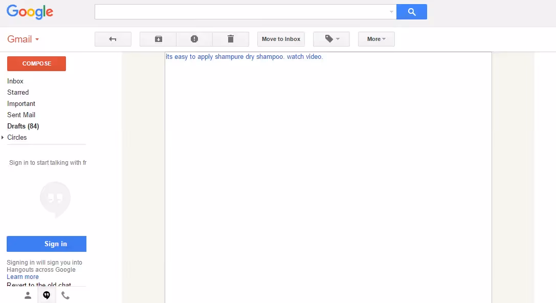
Fortoday's workshop, wedida few quick tests on how ALTtext renders in our inbox, in particular in Gmail in our web browser and on our iPhone. We noticed that inGmail, the ALTtext was not showing at all:
At first we thought it was because the ALTtext that we wrote was too lengthy. Then we thought it was because the image height dimension was not specified to empty (shown as height=""). But inour tests, we learned these weren't the issues.We're currently doing some additional testing and researched ALT text support in email clients. We'll keep you updated! A good resource and recent article that we found is from Litmus (April, 2015):
We're finished!
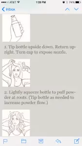
Our final infographic looks awesome on our desktop...
...and on our phone:
Our email design best practices
Aside from aesthetics, let's review why our email-optimized design of the infographic follows email design best practices:
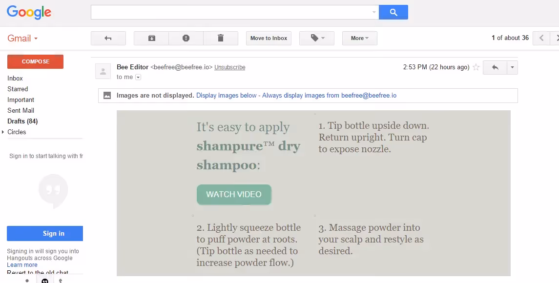
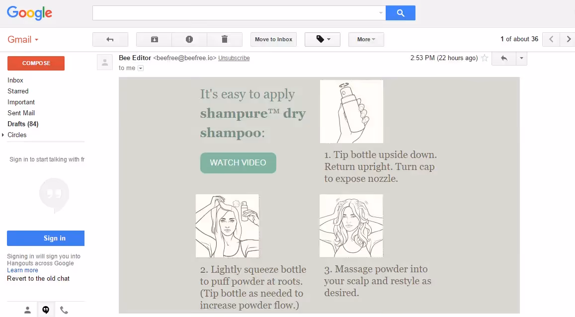
- Subscribers are guaranteed to see all—or at least most—of the email, regardless of their inbox image settings. That's because most of our message is in content blocks outside of our images (in email-safe fonts). With our email preferences set to NOT show images, check out the difference:
Aveda's infographic:
Our infographic:
Our infographic could have been even further optimized if the ALT text was shown. But even without the it, the infographic that we created is already such a big improvement from a blank, empty image! We'll keep you updated on why the ALT text wasn't showing here :)
- It's responsive and mobile-optimized. A single column layout vastly improves viewing on a smaller screen; the images and text are larger and easier to view without sacrificing scale or resolution.
- Content (text) appears no matter what. Not only does this ensure our message actually reaches our readers, but the increase in quality text will keep our email out of spam folders (read why we recommend hitting a 500-word threshold).
- The entire email is likely to be fully downloaded. With smaller images, it's unlikely an email client will reach a maximum email message download size limit and fail to show our pictures.
In the BEE editor, it's super easy to create dynamic, fully-responsiveemails that will reach and resonate with your audience. The possibilities for in-email infographic design are almost limitless. Let us know in the comments if you've given it a try and how it turned out!
