Beefree blog

How to Create a Landing Page in 10 Easy Steps

Emily Santos
Emily Santos
Nov 9, 2021
How to Create a Landing Page in 10 Easy Steps

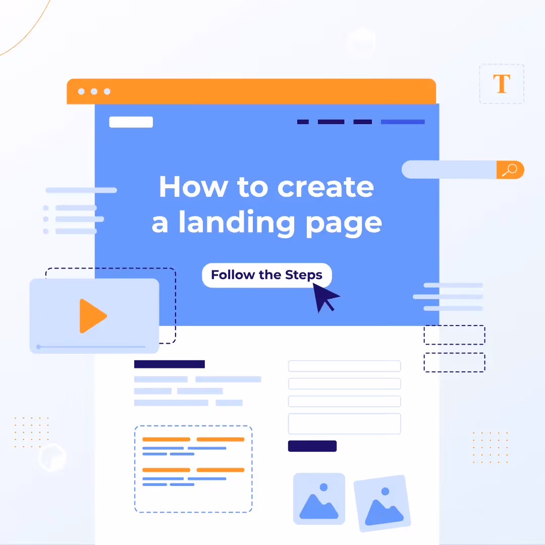
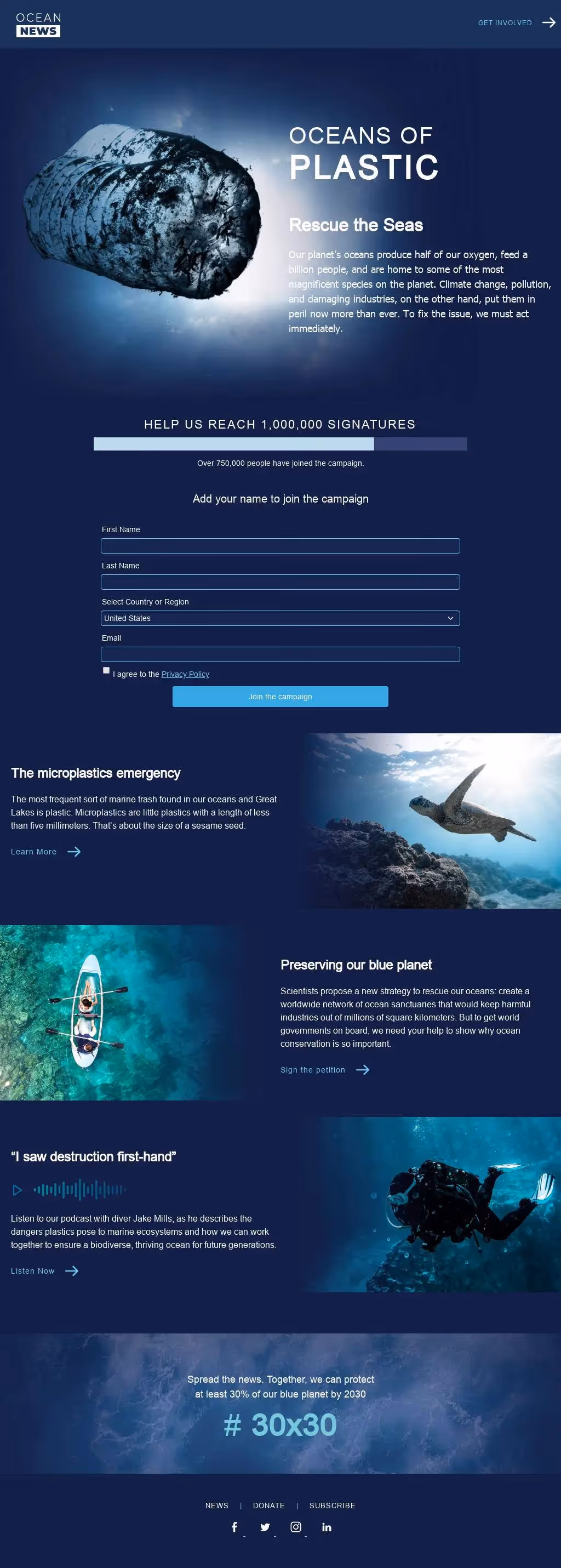
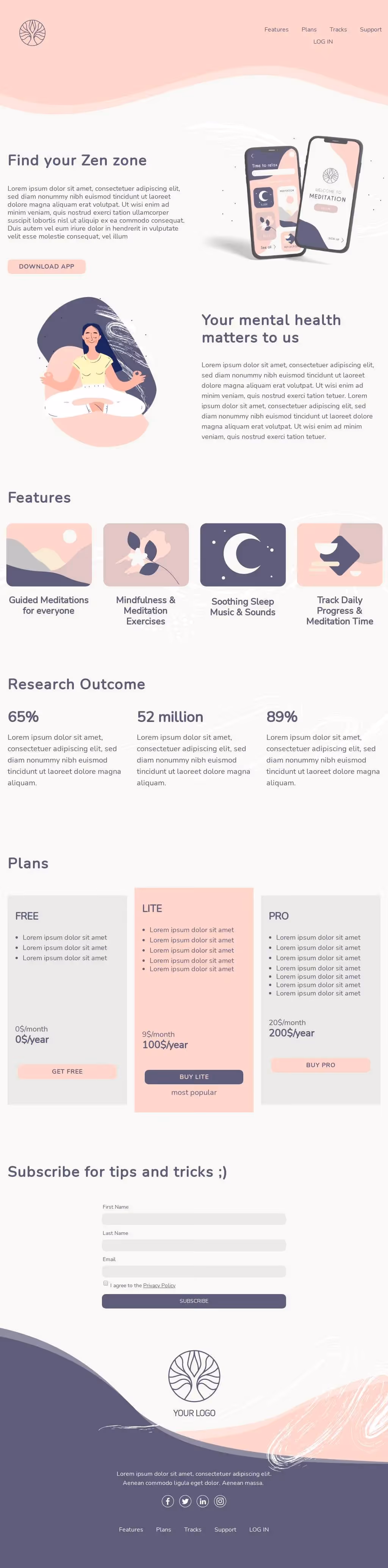
Designing a landing page is a lot like putting a house up for sale. You stage the place, take eye-catching pictures, and list it in hopes of achieving one goal: Selling the house.In the same way, a well-designed landing page gets you to a focused goal: Getting your customer to click on the CTA. Just as you would stage your house for the big sale, you have to make sure your landing page is designed with elements that will entice readers and lead them to click.You don’t need expert-level design skills to achieve a high-converting landing page. Narrowing in on the quality of your content and landing page design elements is a sure way to attain those big results.Are you helping your target audience and meeting their needs? Are you intriguing your customer base to the point of conversion? Think about these questions as you follow along with this step-by-step guide to start designing landing pages that convert.

Know when to use a landing page

Before we go any further, let’s pinpoint if a landing page is the right asset for your goals. Identify what type of page you want to use before you begin designing. Do you need a website or a landing page to achieve your goals?Use a landing page when:

  • You have one focused goal to achieve
  • There are few distractions and one CTA (Call-to-action: The action you want your customers to take)
  • You need to include sign up forms, lead initiating content, sale promotions

Use a website when:

  • You want to explain multiple goals and provide in-depth details
  • There are plenty of info regarding different goals and multiple CTAs
  • You need to build brand awareness and teach customers about your product

Now that we confirmed we need a landing page, you’re ready to jump into the design steps.

Use this template in Beefree!

Use this template in Beefree!

How to build a landing page in 10 easy steps

Landing pages are supportive tools for your business. They work to achieve results like building your email list or driving purchases. Building a landing page requires you to identify the purpose of the page and then implement design elements that align with that purpose. Now let’s get into the nitty-gritty of the design process.

Decide on a campaign goal

By definition, landing pages have one focused goal. Before designing your landing page, determine what your goal will be. Is your landing page going to:

  • Drive sales? Display a specific product where the CTA leads straight to the shopping cart.
  • Boost conversions? Have a clear path to conversion that builds brand awareness.
  • Generate Leads? Grow faster by offering a product demo, free downloadable resource or sign up form.

Once you’ve decided on your campaign-specific goal, choose the template layout that fully supports your goal.

Plan your landing page layout

Your layout is what guides subscribers to achieve the goal of your landing page. The perfect landing page will have a visual hierarchy and includes a headline, your offering, an explanation of the benefits, visuals, a CTA and lead-capture forms.The visual hierarchy of your landing page content will do some of the legwork for you. It creates a natural, easy-to-read pattern for subscribers, which clarifies what action you would like them to take. The F-pattern or Z-pattern layout is recommended for a smooth read.

Also, always remember to prioritize content above the fold. This means that the most important content will be visible instantly upon opening the landing page. Important information and your CTA need to be front and center before you dive into more details.This technique is like a first impression, it gives visitors a quick look at what you have to offer before they scroll, which helps increase conversions faster. It’s also a way to be respectful of a visitor's time.

Write your concise copy

The copy is the driving force of your landing page. It’s how you entice visitors with your offer and communicate the benefits of why your product or service is worthwhile. When writing copy make sure to:

  • Develop a clear headline. State your offer and how it will benefit your visitors. Keep this short and concise.
  • Bring it back to the customer. Simply stating all the highlights of your product/service doesn’t help your visitor. Share the benefits, details and how this is going to help visitors in the short and long term. 
  • Don’t get too technical. Cut the technical jargon and make it simple for visitors to understand what you have to offer. 

Get straight to the point with your copy. Be clear about your explanation of why and how your offer will help customers and meet their needs.

Create your CTA

The CTA is the action you want visitors to take on your landing page. It’s the conversion-driving component and it should be crafted carefully. When designing your CTAs be sure to:

  • Prioritize a main CTA. Having one CTA is best for your landing page, but if you are including more than one, make sure your main CTA is larger and above the fold for visitors to clearly see and be drawn to.
  • Be descriptive. The copy you use inside your CTA will dictate if visitors care to click in or not. If you keep the copy vague, visitors will be less likely to click. Use specific language like, “Start your Free Trial” or “Add to Cart”. 

The simpler the action, the more likely visitors will take that action. Concise copy and visible CTAs is the key to converting visitors.

Choose your images/visuals

Include images that your visitors will connect with on an emotional level. Customers should be able to relate, laugh or feel comforted by the imagery you use. For example, use pictures of dogs if your product/service is related to dogs, or with skin-care products use images of people using your product or close-ups of skin before and after using your product.It all depends on what your product or service is, but make sure to be mindful of the visuals you use for your landing pages. Images that create a more personable experience are what will get customers to buy.For your landing page use images that are personable, emotional and make sure they are optimized. They should also support the copy and other components of your landing page. 

Plug in your design elements 

Stick to the visual hierarchy when you start plugging in your content. This is the best way to limit distractions and ensure visitors will read your content. Use one of BEE’s landing page templates or start from scratch and drag and drop content blocks to make your own template.Be sure to match the landing page with the rest of the assets you create. Visitors and subscribers should be able to recognize your brand when reading your content.Last, be sure to optimize for mobile, and this is made easy with our Mobile Design Mode. This allows you to switch between desktop and mobile view while designing and it will ensure that your content renders on all devices.

Integrate with tracking tools 

Integrate your landing page with Google Analytics and your CRM platform to analyze page performance. See what components are working and not working through this tracking and rework based on that info.It’s also helpful to set your custom domain (with a BEE Pro Agency or Enterprise plan). This is a sure way to raise brand awareness and customer credibility.

Double-check everything and then hit publish

Before publishing your page make sure to:

  • Check the copy
  • Solidify buttons and forms
  • Confirm that you’re focused on one goal

Make sure every component of your landing page is working properly to avoid any issues once it’s published.

Reel in traffic

Now that your landing page is live, it’s time to boast about it. Share your page through:

  • Email marketing
  • Social media handles
  • Social or pay-per-click (PPC) ads

These techniques are the best way to target different audiences and increase conversions at a faster rate.

Improve landing page with A/B tests and optimization

Keep an eye on your landing page. If certain components aren’t achieving their intended purpose then try implementing it in a different way. This could be through changing the copy, the CTA color or any other element that could use some tweaking.Test new elements and optimize everything to make sure the conversions continue to increase.

Use this template in Beefree!

Use this template in Beefree!

How to build a landing page: Expert Insights with our Design Community

Now that you have reviewed each step of the design process and know how to create a landing page, it’s time to run through some insider design tips. Two of BEE’s freelance designers, Betina Todorova and Navid Nosrati blessed us with some expert advice on how to truly make the most of your landing page designs. Let’s take note:

The essentials

Betina: 

  • Define your purpose/goal. 

“The purpose of a landing page is to guide the user to achieve a specific goal, not just roam around your website. A landing page goal like signing people up for a webinar or getting them to subscribe to something. An important part of achieving this goal is to offer an incentive.” 

  • Structure your landing page (hero, body, CTA and footer).

“A hero section is where you have your headline/offering/value proposition,subheading and first CTA.In the body you have to build trust. You can put things like your USP (unique sellingpoints), social proof, reviews, customers you've worked with, etc. This is where you can also offer an incentive to help make up user's minds. For example if your goal is to sign up people for a webinar you can offer them a downloadable mini e-book.Then it's time for your finalCTA. This should be presented in a very clean and precise way so the user knows exactly what to do.”

Navid: 

  • Be purposeful about your layout.

“Having an asymmetrical balance on a page plays a main role. The purpose of a landing page is to create conversion and to do so the page needs to be designed in a way that leads the visitors to different sections of the page.”

  • Understand the weight each element carries and craft accordingly.

“The hero section has to have a clear value proposition and explain to visitors what's in it for them—this needs to be very powerful. Then, a strong call to action. We must tell visitors exactly what they need to do, for example: Click Here, Start For Free, Sign Up Here.And the most important part of a page is the visuals. We want to always show the visitors an image, and that image needs to be very clear and hopefully explain to them what they’re going to get. Normally, I design the images in a way that matches the header of that section so if the visitors are just scrolling without reading by looking at the image they still understand what that section represents.”

The nitty-gritty details

Betina:

  • Create a visual hierarchy.

Hierarchy is important, as this will guide the user along the page. The design of a landing page should be clean, not cluttered with 2 or 3 fonts max.”

  • Include an accent color.

“In your color palette you should have an accent color. Save this color for your CTA to draw attention. Many people make the mistake of using their accent color everywhere and this results in users leaving the page because they're not sure what to do. Also an accent color doesn't have to be bright/neon to draw attention. It just needs to have high contrast from the background color to stand out and not be the same as the copy text for example.”

Navid: 

  • Storytell with a Z-pattern technique.

“Look and feel is quite important. As a designer, my goal is to create a landing page to build trust and offer the visitors a great user experience. I most often use the Z-pattern technique to design my landing page, which is used for pages that follow the storytelling aspect.”

  • Be intentional about each specific element.

“In my designs, I always include:Typography hierarchy: Headlines (no more than 6 words), sub-headers  (compliments the header but does not repeat the wording and no more than 100 characters), and use bullet points (skim-friendly).Call-to-action: Exhibit value of CTA. For example, having a CTA like "Start Now For Free,” provides trust to visitors that they can start using or testing the product without paying.Visual: Images (not complex and evoke emotion), color palette (complementary colors, good contrast ratio and accessible to visually impaired visitors).Social proof: Builds immediate credibility and leverages the bandwagon effect (testimonials or reviews).”

The common mistakes to avoid 

Betina:

  • Too many CTAs, excess information, poor quality images.

“I think a few mistakes that are made are adding multiple CTAs, too much irrelevant information makes it difficult for the user to navigate the page. Also having a lot of menu items that lead to other pages and poor quality images that aren’t optimized.For example, check out Netflix’s site. Their sign up page doesn’t have any menu navigation. So you basically have nothing else to do other than to sign up.”

Navid: 

  • Inconsistent, broken or unstyled elements.

“Having inconsistent, broken or unstyled elements can be really hurtful to the landing page because visitors will see that and subconsciously doubt your brand.Another common mistake I often see is the designer of the page tries to show everything that they have to offer which can be overwhelming. The landing page is a very specific page with a very specific goal therefore it needs to be clear to the visitors and on point.”

Use this template in Beefree!

Use this template in Beefree!

Create landing pages with BEE Pro

Now that you’ve got the steps on how to make a landing page and collected some expert insight, you’re more than ready to design a professional landing page. Head over to BEE Pro to start from scratch and try the step-by-step guide, or quickly input your content into one of our beautifully designed page templates (some created by Betina and Navid).Also, be sure to set your custom domain with BEE Pro. An Agency or Enterprise Pro account allows you to personalize your published landing pages by using your customized domain for a more on-brand experience. Learn more about this here.

Related posts

What Are Email Security Gateways? A Guide to Secure Communications

Are your newsletters being marked as spam? Discover all you need to know about email security gateways and how to create emails that pass all the checks.
Beefree team
Mar 12, 2025

Getting Started with Beefree: A Guide to Streamlined Email and Landing Page Creation

Whether you're designing a newsletter, promoting an event, or driving a marketing campaign, ensuring that your emails and landing pages are visually appealing, engaging, and efficient to produce is no small task. That’s where Beefree comes in.
Beefree team
Feb 26, 2025

8 Common Email Spam Triggers That Can Damage Your Sender Reputation

Whether you’re employing a lifecycle email marketing strategy or simply confirming an order, we’ve outlined the basics of how spam prevention works, why it matters, and how to avoid running afoul of some commonly used triggers.
Beefree team
Feb 14, 2025

What Are Email Security Gateways? A Guide to Secure Communications

Are your newsletters being marked as spam? Discover all you need to know about email security gateways and how to create emails that pass all the checks.
Beefree team
Beefree team
12 Mar
2025

Email is king when it comes to talking directly to your customers. Sure, we might send texts or share voice notes, but we all still check our emails. It’s how we keep in touch with work and the businesses we connect with. 

As an email marketer, this puts you in prime position to get your business’s brand right into the hands of your customers. The problem, however, is that you must first get past the metaphorical guard dog known as the secure email gateway (SEG). 

SEGs use sophisticated methods to identify and block spam and phishing emails from ever entering a person’s inbox. While your email newsletters should go through, that doesn’t necessarily mean they will. That’s why businesses need to know what a secure email gateway is and how it works. Know this key info, and you’ll be able to improve the chances of your emails reaching their destination. 

What are email security gateways? 

Protecting yourself from cyber threats is the basis of all cybersecurity risk assessment services. One of the biggest gaps in any security armor is phishing emails. If they get through and someone clicks a link they shouldn’t have, it’s almost impossible to stop the damage. 

The victim could be anyone. The link could lead to a ransomware virus that holds your data captive or be the start of a data breach. It could even lead to a traditional scam that has you input your credit card details so a thief can steal them. 

For all these reasons and more, email providers consistently invest in security features to help protect their customers. One such feature is an email security gateway. 

A secure email gateway uses AI and machine learning to screen incoming emails, identify spam, and stop it from entering. If there’s any doubt, the system quarantines the email in your spam box for review. 

Why are secure email gateways important?

While we are getting better at filtering out spam emails, an estimated 45.6% of emails sent in 2023 were still spam. This poses a massive security risk for consumers, businesses, and governments alike. 

According to IBM, businesses are hit the hardest, with the global average cost of each successful phishing attack increasing to $4.88M USD. The attacks don’t just hit businesses, either, with attacks targeting individuals and even charities.

Just as phishing and spam emails have become more sophisticated, so have the tools designed to protect against them. All providers, including big names like Gmail, use SEGs to secure communications and other features, such as Gmail’s unsubscribe feature

What do SEGs flag as spam? 

SEGs continually update their parameters. This means that what they check for is constantly in flux. What SEGs look for today, for example, could include: 

  • Strange or suspicious subject lines
  • Highly urgent capitalization or excessive exclamation points
  • Strange URLs
  • Poor grammar and/or spelling
  • Generic greetings that don’t address the recipient 
  • Suspicious email addresses
  • The volume of emails sent at once
  • Attachment types 
  • Image-heavy content 

SEGs are far more advanced than just ticking boxes, but that doesn’t mean your emails can’t get blocked or sent to spam. After all, you might put together a great email campaign, but if your email is too image-heavy, it might get quarantined or sent to spam. 

The good news is that once you know what the SEGs look for, you can work to design better emails. Beefree can help you get started, with a range of templates for responsive email designs.

How to create newsletters with secure email gateways in mind 

The good news is that you can implement and send out most, if not all, of your newsletter ideas without issue. So long as the emails are well-made and are sent at a reasonable frequency, you’ll be golden. 

Start by first improving your security methods

In general, you should always look at ramping up the security measures in your business. You can use one of the top types of risk assessment matrix to understand your business's threats and how to resolve them. Then, since you already have that information, you can use it to create better newsletters and emails. 

Make sure the personalization feature works

One of the biggest red flags for an SEG is a generic greeting. Adding Dear Sir/Madam at the start isn’t going to fly in today’s world. Even if your email gets through, it’s unlikely the recipient will open it. 

That’s why you need personalization. Linking your email marketing tools to your customer relationship management system means you can offer easy personalization, like addressing your customers by name, or even offering personalized recommendations based on their order history. 

Avoid image-only emails 

Image-only emails are tempting for an email marketer. They’re striking, they look good, and you can fine-tune what they look like in Photoshop or another image editor. 

They can also be a red flag for SEGs.

Thankfully, the solution is simple: enrich your emails. The best part about this approach is that it also improves the accessibility. Improving email accessibility will help ensure that all your customers can engage with your emails on their terms. Those emails will also load faster, look great on all devices, and be more engaging. 

Align your emails with the landing pages 

SEGs look out for suspicious links. A link might be suspicious if there’s a misspelling or if the link doesn’t sound like the content in the email. So, how do you ensure that SEGs don’t see any of your links as suspicious? 

You make them predictable. 

An easy way to do this is to create a landing page from an email. On top of aligning the landing page with the content of the newsletter, you’ll want to: 

  • Make a custom URL for every link that matches the content of the page 
  • Ensure there’s no misspelling
  • Don’t use urgent language around your link

Use 2FA to boost security

Do you need 2FA to get past SEGs? No, but it’s a great way to help protect you and your customers. 

You can protect sensitive data by adding user identity verification. For example, a customer may get an order confirmation email but wants to cancel or change the delivery details. Including a two-factor authentication step ensures only the customer can request changes. 

Building in extra security features puts your customers at ease. It also protects your endpoints and, in turn, your business. So, no, you don’t need 2FA to get past SEGs, but it’s worth looking into for you and your customers’ protection. 

Avoid urgency 

Urgency can be a flag for SEGs. So: 

  • DON’T WRITE IN ALL CAPS
  • Minimize the use of exclamation points

Think of the copy in your newsletter as a chance to win over your audience, not scare them into clicking the link. Doing this will improve your relationship with your customers since they’ve come to you on their terms. It’s also essential to get emails past the SEG.

Key takeaways 

Secure email gateways are a primary defense against spam and phishing attacks, but they can pose a problem for email marketers. By working to understand the security risks associated with email scams, you can then understand what your email needs to make it into inboxes. 

From there, you’ll want to make your emails more personable, accessible, and secure. Once you’ve found that sweet spot, your newsletters will be more likely to get past the secure email gateway and into your audience’s inboxes. 

Getting Started with Beefree: A Guide to Streamlined Email and Landing Page Creation

Whether you're designing a newsletter, promoting an event, or driving a marketing campaign, ensuring that your emails and landing pages are visually appealing, engaging, and efficient to produce is no small task. That’s where Beefree comes in.
Beefree team
Beefree team
26 Feb
2025

Creating professional emails and landing pages can be challenging for businesses of all sizes. Whether you're designing a newsletter, promoting an event, or driving a marketing campaign, ensuring that your emails and landing pages are visually appealing, engaging, and efficient to produce is no small task. That’s where Beefree comes in.

Beefree is a robust tool for designing emails and landing pages with ease, offering templates, automation features, and seamless integrations. Regardless of your industry or goal, Beefree empowers you to craft high-quality communication and marketing materials quickly and effectively. By providing an intuitive and user-friendly experience, it helps businesses transform their creative ideas into polished campaigns without requiring extensive technical expertise.

source

Why use Beefree for professional email campaigns?

Before we jump into the nitty-gritty of using Beefree, let's quickly go over why this tool is worth your time. There are a lot of email marketing tools out there, but Beefree stands out from the crowd for a reason. Let’s break down the unique benefits that make it an invaluable asset for anyone serious about email marketing:

Design made easy:

According to HubSpot, well-designed emails can drive open rates as high as 30%. Maybe you’re following up with leads from a recent webinar or you want to reach potential clients after a product launch. But you're finding yourself stuck because crafting professional emails and landing pages that capture attention is no easy feat.

With Beefree’s intuitive design tools and a library of over 1,700 templates tailored for various industries and purposes, you can achieve professional results without the guesswork. The wide variety of pre-designed options ensures that you can find a solution that aligns perfectly consistent with your brand.

source

Time-saving features:

Speed is key, especially if you’re running time-sensitive campaigns. Beefree simplifies the design process with reusable content blocks, real-time collaboration tools, and the ability to transform emails into landing pages with a single click. These features enable you to produce high-quality materials in less time, allowing you to focus on strategy and content rather than struggling with technicalities.

According to a Beefree report, 82% of users report faster email creation. The ability to save and sync reusable content blocks means you can replicate what’s working without reinventing the wheel each time. Once you find a winning format, you can use it again and again with minor tweaks to fit the audience or campaign.

Maybe you’re following up with leads from a recent webinar or you want to reach potential clients after a product launch. With Beefree’s templates, you can get those messages out quickly and make sure your brand stays top-of-mind for your audience.
Using email cadence software like QuickMail ensures that outreach campaigns maintain a structured and effective flow, preventing overwhelming inboxes while keeping engagement high.

source

Increased engagement:

A significant 64% of Beefree users report an 11% or more increase in click-through rates after using the platform. By enhancing the visual appeal and personalization of your emails, Beefree helps you achieve better engagement with your audience. The ability to test and iterate your designs ensures continuous improvement in performance.

source

Getting started with Beefree templates

Alright, now that you know why Beefree is so powerful, let’s talk about how you can get started with their massive library of templates. This section will walk you through choosing and customizing a template that works for you.

1. Choose your template

The first thing you want to do is pick a template. Beefree’s catalog has templates for just about every sector—whether you're in retail, healthcare, SaaS, you name it. With a variety of options, you can find something that suits your goals perfectly, whether for a simple newsletter or detailed marketing report templates. Say you're promoting a webinar—just pick a template that’s built to highlight your CTAs, and you're off to the races.

The best part? You’re not starting from scratch. You save hours by picking a pre-designed template, and then it’s just a matter of customizing it to fit your brand. Beefree's templates are super flexible—add or remove elements, change colors, switch up the fonts, rearrange layouts—make each email uniquely yours without the hassle. This flexibility is especially beneficial for maintaining a low code architecture in website design.

2. Personalize

Consistency is key to building trust, and when your emails have a cohesive look, it helps recipients recognize your brand. It is also important to follow a brand style guide for your email campaigns so that the audiences can associate elements like your logo, colors, and fonts easily with your brand.

When using a template, customization is key to making your emails and landing pages feel unique and relevant. With Beefree’s drag-and-drop editor, you can easily tweak templates to align with your branding. Adjust colors, fonts, and layouts, or add personalized content such as recipient names and company details. The flexibility ensures that your final output is as distinctive as your brand’s voice.

Plus, with so many people opening emails or landing pages on mobile devices, Beefree’s mobile design builder guarantees that they look great no matter what device they’re on. When your emails look good, people trust your brand more, and that makes them more likely to click through and take action.

Personalization isn’t just a nice touch; it’s essential for engagement. According to Campaign Monitor, personalized subject lines can increase open rates by 26%. By tailoring your designs to speak directly to your audience, you can create a more impactful experience. Furthermore, the platform’s collaborative features allow team members to provide input and make edits in real-time, enhancing efficiency and creativity.

1. Export

So, you’ve picked and customized your template—now it’s time to send those emails.

One of the coolest things about Beefree is that it plays nice with just about every major email platform out there—Mailchimp, HubSpot, Outlook, Quickmail—you name it. This means you can create a killer email in Beefree, connect it to your favorite email platform, and schedule it all from one place. For more advanced needs, many businesses choose a CRM with email integration, to seamlessly combine customer management and automated outreach.

Start designing for free

Beefree simplifies the process of creating visually appealing, professional emails and landing pages, saving you time and boosting engagement. Whether you’re looking to streamline your workflow or enhance your marketing efforts, Beefree offers the tools and flexibility to meet your needs.

The best part? You’ll save time and see increased engagement, connecting with your audience in a meaningful way. In a world where everyone’s fighting for inbox space, Beefree helps you stay ahead of the game by simplifying the process while delivering professional results. So, why wait? Dive into Beefree today and see how it can transform your email campaigns.

Stay informed on all email trends

From the latest creative design strategies that inspire your next campaign to industry best practices and tech advancements, our newsletter is the go-to for all things creation.

Thank you! Your submission has been received!
Oops! Something went wrong while submitting the form.
By clicking Subscribe you're agreeing with our Privacy Policy