Beefree blog

How to format fundraising emails to increase donations

Beefree team
Beefree team
Nov 27, 2015
How to format fundraising emails to increase donations

In our Design Inspiration post this weekon design tips for end-of-year fundraising campaigns,we identified six key ways to increase donations through email: tell a story, make your first headline count, create structure with a modular layout, use typography and good design to make a statement, strategically place your calls-to-action, and get personal. As we wrap up 2015, fundraising is going to be a huge focus for many organizations, and the need to stand out is greater than ever.

Today's workshop

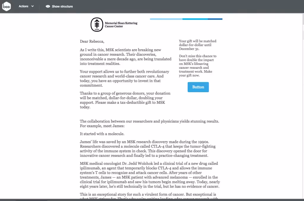
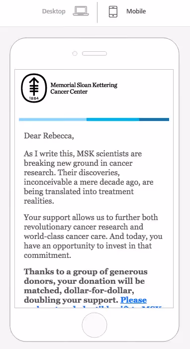
Our workshop this week will lead you through the steps to follow to create your own successful fundraising emails, guaranteed to increase donations to your organization.One email we included in the post, from Memorial Sloan Kettering Cancer Center, had an interesting layout that caught our eye:

MSK

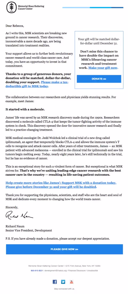
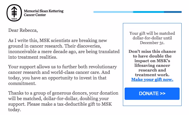
The email is simple: it's a letter from the senior vice president of development that tells a story, gets personal, and speaks directly and candidly to potential funders. Though it'sa long, text-heavy email, smart text formatting maximizes readability andcreates a sense of organization:

  • The text is black on a white background
  • Paragraphs are kept short
  • Bold font makes key takeaways stand out
  • Linked text is obvious in blue and because long strings of text are linked (vs just linking one word)

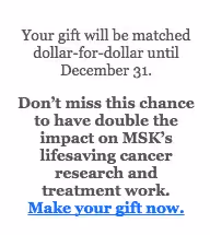
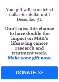
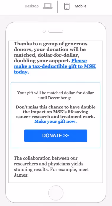
There aren't any elaborate design elements, but the email is focused andcommunicates a clear message that leads to a clear call-to-action. That wide, blue "Give now" CTA is well-placed, as research has shown that placing a CTA button below the fold canincrease clicks by 304%.That's because it's critical to let readers know why they should take action—with great copy and visuals—before actuallyinviting them to act.But Memorial Sloan Kettering can't count on each subscriberto read or even skim the entire thing. It's essential to communicate the key message quickly at the top of an email, so that even with a cursory glance, readers can get the gist.MSKcovers their bases by leaving their key CTA button at the close of the email but by also includinga succinct summary version of their email in acallout box in the upper right corner.With this cleverlayout design, MSK simultaneously keeps its main message above the fold withaCTA button, whilea second CTA closes the message for those with the time and interest to read the full email. It’s a great tactic for reaching as many readers as possible.

Let's get started!

The text formatting in the body of the MSK fundraising email is straightforward, but how do you create a callout box in a single-column email that isn't the full width of the email,formatting it so it has a border and a CTA button, and make sure that the entire email is responsive and looks great on mobile devices? That complex layout design is exactly what we'll cover in today's workshop. We'll use the BEE editor—it's free, online, and requires no registration, so feel free to give it a try and follow along with us.

Getting the structure right

First, let's break down the anatomy of the email,orthe structure of the modules that make up the message.

MSK markup

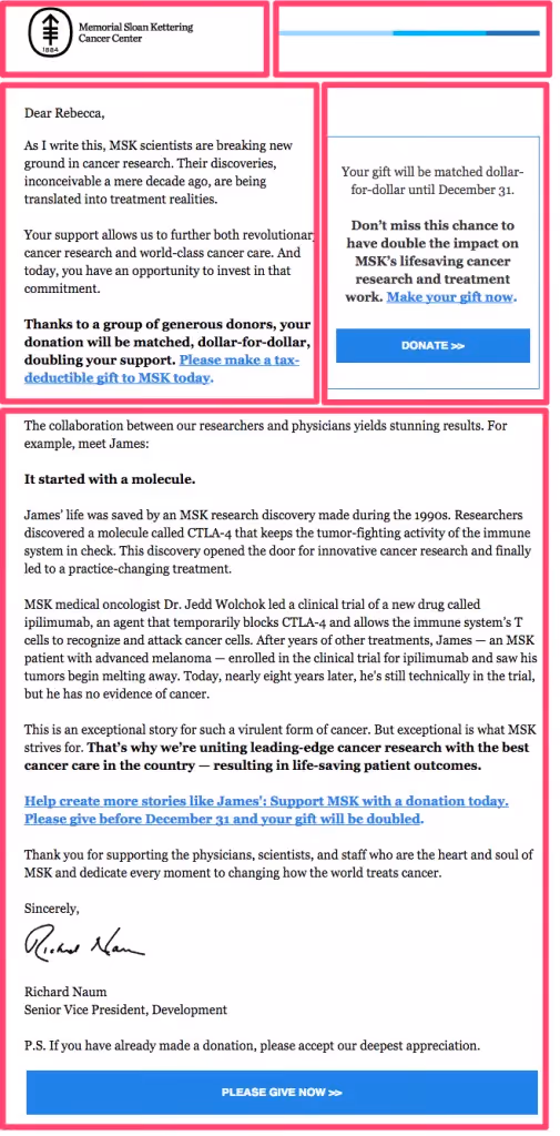
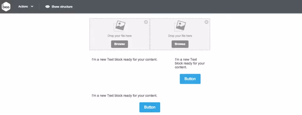
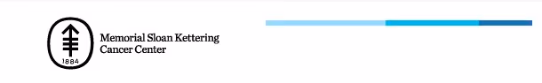
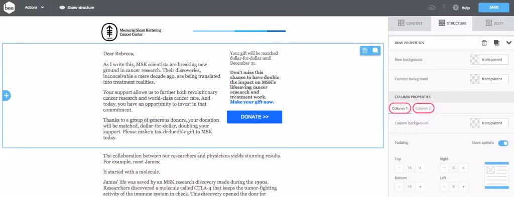
The email has three rows: the first one is split into two equal-width columns, each one containing an image that makes up the header. The second row also has two columns, but the left column is wider than the right. And the final row is one column, containing most of the body of the email.To get started, we'll recreate this structure in BEE, stacking these three containersatop one another from the Structure menu. This is the most important part of setting up our email—including the callout box—for success.

MSK structure 123

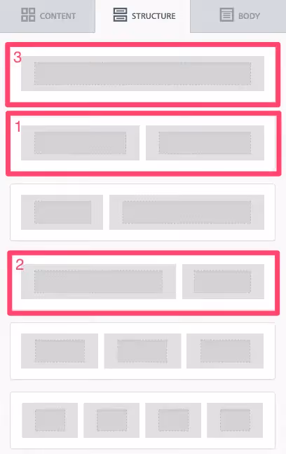
So our email layout looks like this:

Screen Shot 2015-11-27 at 9.57.37 AM

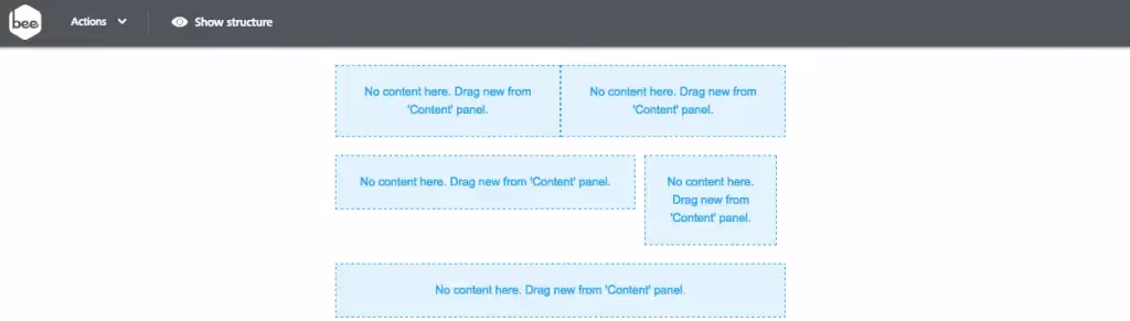
Already, we have our complex layout set to go! The BEE editor allows us to customizecontent arrangementat a granular level, so positioning that special callout box isa piece of cake. Keep reading for instructions on how to bring it to life.

Arranging the content

Now that thestructure of our email is in place, we can drag in the appropriate content blocks.The header will have two images side-by-side, one for the MSK logo and one for the horizontal blue line.The second section will havetext on the left for the body copy, as well as text and a button on the right where we'll build our callout box.The third section will be text, followed by the final CTA at the bottom.Here's how it looks:

Screen Shot 2015-11-27 at 10.09.53 AM

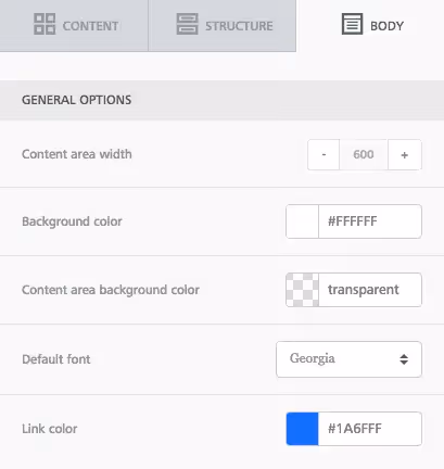
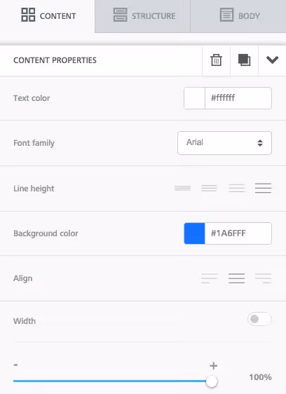
Before we drop in the actual content, let's go to the Body menu and set up our content properties. We'll want to increase the width of the email to 600px to match Memorial Sloan Kettering's. The font used is Georgia, and the link color is a boldblue.

Screen Shot 2015-11-27 at 10.19.53 AM

Now let's drop in the actual content. We saved the images from MSK's email, so we can easily drag those in for the header. Then we'll simply copy and paste the rest of the text.Here's the email with all content in place, before makingany formatting changes or adjustments.

Screen Shot 2015-11-27 at 10.28.16 AM

Formatting the header

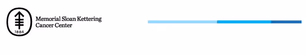
There are some obvious changes needed to be made to the header so that it better matches MSK's.Here's ours:
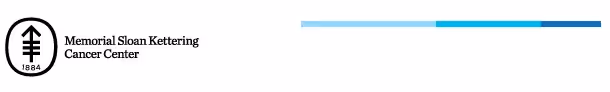
Screen Shot 2015-11-27 at 10.31.44 AM

And here's MSK's:

Screen Shot 2015-11-27 at 8.42.52 AM

Starting on the left, if we select the MSK logo, we can left-align it in the Content Properties menu on the right.

Screen Shot 2015-11-27 at 10.32.50 AM

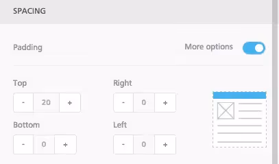
Then we need to bring the blue line down so that it's center-aligned with the logo.The easiest way to do this is to adjust the top padding on the image, increasing the white space between the line and the container's upper border. To do this, we'll select the line image, then navigate to the Spacing section of the Content Properties menu. We'll make sure we can see More Options, then increase the top padding to 20.

Screen Shot 2015-11-27 at 10.36.17 AM

Now we're in business!

Screen Shot 2015-11-27 at 10.36.56 AM

Formatting the callout box

The text in the callout box is Georgia size 14, with the second paragraph bolded, and the last sentence linked. All the content is centered. We'll mimic all of that in BEE with text editing menu that appearswhen we select text:

Screen Shot 2015-11-27 at 11.07.51 AM

Next, we'll format the button so that it's the full width of the callout box (adjusting the width to 100% in the Content Properties menu) and so it's the same blue color as the links (we'll copy and paste that HTML color code from the color we chose in the Body menu). We'll also use Arial for itsfont. For step-by-step instructions on all the ways to format CTA buttons in BEE, check out our postHow to design bulletproof CTA buttons in email.

Screen Shot 2015-11-27 at 11.08.52 AM

Now our button looks more like Memorial Sloan Kettering's:

Screen Shot 2015-11-27 at 11.10.07 AM

Lastly, and most importantly, we need to set this callout section apart from the email with a blue border. If we click the row that holds the first part of the body text on the left and the callout box on the right, we're shown a Column Properties menu that allows us to customize individually each column. This is an exciting feature of BEE. Each column we create can have its own custom background color, border color and width, and padding.

MSK columns

In this case, we'll format Column 2 so that it looks like MSK's callout box. Select the Column 2, and scroll down to the Border menu. Increase the border from 0 to 1. Then paste in the same blue color code to change the border from transparent to the color we want. Check it out!

Screen Shot 2015-11-27 at 11.10.57 AM

Just like that, we have our callout box! When you make your own, you could also try adjusting the background color and border width and color. Let us know how it goes!

Final adjustments

To complete our email, there are a few final tweaks to make:

  • Add bold emphasis and links to appropriate sentences in the body text
  • Adjust the padding between content structures so all the pieces of the email are spaced equally
  • Format the final CTA button to be the full width of the email and the same blue color
  • Preview the email to see how it looks on mobile

In preview mode, we can check out our responsive design in action. It's really coolto see how the header design and callout box respond beautifully to the smaller screen size:

Screen Shot 2015-11-27 at 11.28.09 AM
Screen Shot 2015-11-27 at 11.28.47 AM

It's clear Memorial Sloan Kettering put some time and thought into this email design to optimize readers' experience and, hopefully, bring in donations.Fortunately, in an email editor like BEE, it's simple to put together complex layoutsthat look great on all screen sizes and accommodate the reading preferences of your subscribers. Try the BEE email editor and maximize the impact of fundraising emailsthis season, and let us know how it goes!

Related posts

Email strategies you’ve likely heard of but haven’t implemented yet

While email marketing has come a long way and is changing faster than ever, there’s only so much you can do within 600x1,500 pixels. However, there are no limits to where your creativity can take you. 
Kruti Shah
Feb 5, 2025

How to Leverage Email Campaigns to Gather Sincere Product Reviews

What do customers think about your brand’s products? The best way to find out is to ask them directly, which you can do via strategic email campaigns. Keep reading to learn how!
Beefree team
Jan 22, 2025

How Beefree is Helping Email Makers Scale Their Production

2024 was a banner year for email markers everywhere. From sleek newsletters to interactive promos, you flexed your creative muscle to new heights and did it with a level of speed and efficiency that made crafting award-worthy emails look easy. Let’s dive into the numbers, trends, and stories that made this year unforgettable for email makers like you.
Beefree team
Jan 6, 2025

Email strategies you’ve likely heard of but haven’t implemented yet

While email marketing has come a long way and is changing faster than ever, there’s only so much you can do within 600x1,500 pixels. However, there are no limits to where your creativity can take you. 
Kruti Shah
Kruti Shah
5 Feb
2025

Now, let's be honest—you’ve likely heard about all of these rotating for the last few years. While email marketing has come a long way and is changing faster than ever, there’s only so much you can do within 600x1,500 pixels. However, there are no limits to where your creativity can take you. 

Let’s get into it.  

#1. Unique, tailored experiences 

Damian Grabarczyk, the co-founder and growth marketer of PetLab Co., says, “We faced the challenge of connecting meaningfully with an audience that expects more than one-size-fits-all communication.” 

When we speak about crafting tailored emails we mean going beyond the recipient's first name in the subject line. We’re talking about optimizing your entire email strategy to design multi-stage touchpoints to nurture leads across the customer lifecycle. As well as, leveraging data to send hyper-personalized, relevant, and engaging emails that feel less like a broadcast message and more like a conversation. 

Many are using AI machine learning algorithms and AI automation to analyze customer interactions, past purchases, browsing habits, website visits, and even social media behavior to curate engaging email content that resonates deeply with the real-time needs of recipients.

For PetLab Co this looked like including content such as an individual’s pet health history or product usage timelines. Damian Grabarzyk expands, “This approach transformed the conversion rate and strengthened customer loyalty. As we look ahead, I see brands in 2025 moving beyond generic personalization to adopt strategies that make customers feel truly understood and valued.”

On the other hand, many are leaning into user-generated content (UGC) for crafting tailored experiences. Customers today are more likely to trust the opinions of peers over branded messages. UGC like customer reviews, testimonials, videos, and photos are the best form of social proof depicting real people using and benefitting from your products or services. 

We see the benefits of using both AI and UGC to get the most out of your email conversions ;). 

#2. AI tools as an addition, not a substitution

Experts at NordPass state, "AI-powered content generation tools are not here to replace email copywriters and marketers. These tools make us more efficient. The smarter the tool is, the better equipped we are to create high-performing email content that drives results." 

AI tools can support us by significantly enhancing the speed, precision, and effectiveness of your emails. For instance while traditionally A/B testing has required a lot of time to analyze small variations with AI you quickly implement and test multiple email elements and make adjustments based on real-time engagement data. There are AI algorithms that can even predict which variations are most likely to resonate with different audience segments, leading to more accurate targeting and faster optimization.

In short, AI tools are revolutionizing the way we craft and optimize our email’s deliverability. There are many different types of AI solutions so we suggest finding the right one for your needs. 

#3. Even more transparency around data

With AI continuing to rise, folks are more and more concerned about where their data is going. That’s where zero-party data collection becomes a key strategy in email marketing, allowing you to gather data directly from customers rather than relying on third-party sources. 

Zero-party data includes information that consumers willingly share, such as preferences, interests, and purchase intentions. This data is often collected through surveys, preference centers, quizzes, or interactive content and is highly valuable because it is shared explicitly, ensuring accuracy and deeper personalization without privacy concerns associated with third-party tracking.

As privacy regulations tighten, zero-party data will empower you to deliver hyper-personalized email experiences while respecting user privacy. This approach will help you build trust, as customers feel more in control of their data, and you gain insights that lead to more relevant and engaging email content.

#4. The death of static emails

With attention span getting shorter day after day, digest-format emails are expected to rise in popularity in 2025. Presenting email content in an easy-to-scan, organized, and minimalistic layout will surely help deliver the most relevant information in a fraction of the time. 

Additionally, interactive emails will allow recipients to directly engage within the email without having to visit a landing page or website. Interactive elements like product carousels, polls, and quizzes create a dynamic experience that keeps subscribers engaged, especially in visually driven industries like fashion brands

So what now? 

You’ve heard these strategies before, but now it’s time to actually put them into action. The brands that win at email marketing in 2025 won’t just be sending emails—they’ll be creating experiences. Whether it’s hyper-personalized content, AI-driven efficiency, zero-party data collection, or interactive emails that break the mold, the key is to stay ahead of the curve.

So, what’s the first strategy you’ll finally implement? Your inbox (and your audience) are waiting.

How to Leverage Email Campaigns to Gather Sincere Product Reviews

What do customers think about your brand’s products? The best way to find out is to ask them directly, which you can do via strategic email campaigns. Keep reading to learn how!
Beefree team
Beefree team
22 Jan
2025

What do customers think about your brand’s products? The best way to find out is to ask them directly, which you can do via strategic email campaigns.

Email makes gathering authentic product reviews quick and easy. By collecting sincere feedback, you can build trust, increase sales, boost loyalty, and innovate product improvements. 

That said, requesting reviews via email requires precise timing, personalized messaging, and lots of engagement optimizations. But don’t worry—we’ll walk you through some key steps to create email campaigns that deliver the valuable feedback you need.

Why product reviews matter

Product reviews do more than confirm that you're meeting customers’ needs. Sincere feedback drives loyalty and sales, offers valuable customer insights, and helps you develop a strategic product development roadmap.

  • Fosters customer loyalty: Requesting and listening to feedback makes your customers feel valued and heard. It demonstrates that you prioritize customer satisfaction, which helps you build stronger, long-term relationships. Review requests also act as re-engagement emails by starting new conversations with customers.
  • Increases sales: Social proof drives sales. According to a recent survey by Power Reviews, 90% of potential customers use online reviews to make purchasing decisions. In fact, reviews have more influence over purchasing decisions than product prices. Turning product reviews into customer testimonials and encouraging reviews on third-party sites can significantly boost sales.
Image sourced from powerreviews.com
  • Builds Customer 360 insights: Customer feedback delivers insights into customer needs and sentiments, enriching Customer 360. Exactly what is Customer 360? It’s a unified, 360-degree view of customer data. It empowers you to tailor products and customer experiences to meet individual needs and preferences. 
  • Drives product improvements: Sincere customer feedback reveals what target customers like/dislike about your products. It provides key insight into their value, functionality, and usability, unlocking large-scale development opportunities.

How to create an email campaign to collect product reviews

Want to unlock the power of product reviews? Let’s explore how to create email campaigns that encourage customers to share their feedback.

Segment your audience

Like promotional emails, product review requests shouldn’t be sent to every subscriber.

If subscribers haven’t had the chance to try your product, product review requests will feel irrelevant and may trigger unsubscriptions. So, only send review email requests to customers recently trying your product.

You can do this by segmenting your email list based on where customers are in the buying cycle. Target loyal customers, recent purchasers, and first-time buyers with tailored email campaigns. This ensures that you’re sending emails to customers most likely to respond with insightful feedback.

Write a compelling email subject line

According to Superoffice, 33% of people open an email based on the subject line. 

Image sourced from superoffice.com

To get the click-through rates you want, your email subject lines should be personalized, relevant, and engaging. Here are some examples:

  • Did you love [product]? Or hate it? Let us know!
  • We value your opinion — help us improve!
  • We want YOU to help us make our product better!
  • Up for a discount? Share your feedback for 10% off! 

Learn more > Tips for writing open worthy subject lines.

Optimize for customer engagement

A successful email marketing strategy relies on customer engagement. Here are some key email elements you need to encourage interactions.

  • An attractive email design: With the right layout, color scheme, typography, and images, you ensure easy readability and promote interaction. Use these engagement-boosting email design best practices to help you create a design that boosts conversion rates.
  • Gratitude and value: Thank customers for reading the email and explaining why their feedback is so important. Also, consider including a personalized Gmail email signature with your content details to build trust and encourage customers to engage with your review request. 
  • Personalized, relevant content: Personalized email content motivates engagement. Use customer data platform (CDP) data to tailor messages to individual customers. What is a CDP? It’s a centralized platform that collects and unifies customer information, building comprehensive customer profiles. 
  • Incentives: Offering a small discount can motivate customers to leave reviews, especially first-time buyers. That said, incentives can (sometimes) generate insincere reviews, so stress the importance of honesty. 
  • A strong call-to-action (CTA): Your CTA should direct readers straight to the reviews submission page. Use clear CTAs with bold buttons and typography to make it stand out.
  • Mobile responsiveness: If your emails are slow to load or don’t display correctly on mobile devices, your bounce rate will spike. Leverage solutions that offer advanced mobile optimization features — such as Beefree— to create responsive emails every single time.

Ask specific, concise questions

Complex, drawn-out questions that are too open-ended can disengage customers. So, get straight to the point with concise, direct questions. Here are some examples:

  • What did you think of [specific product feature]?
  • How often do you use our product?
  • What are your favorite/least favorite features?
  • How likely are you to recommend this product?
  • What could we do to improve our product?

Use a mixture of closed and open-ended questions to increase your chances of receiving meaningful responses.

Make it easy to respond

The easier it is for customers to leave a review, the more responses you’ll receive. So, make the process as seamless and convenient as possible. One way to do this is with survey emails.

Email surveys have high response rates. They can be completed within the email with minimal effort, which is a big plus for busy customers. And, they can generate a wealth of quantitative data and metrics that are quick to analyze, leading to faster improvements. BeeFree has an extensive collection of email survey templates to suit every need.

For longer review requests, include a CTA that directly links to the review submission page. Review forms should use simple, clear language, be optimized for mobile, and have a progress bar. 

You could even provide your telephone contact details to allow customers to leave a review via telephone. It’s the preferred communication method for 55% of Baby Boomers according to Hubspot, so it’s worth considering. 

Leverage small business telephone services from Vonage to access call center capabilities like virtual receptionists and CRM integrations, streamlining processes.

Also consider directing customers to leave reviews on popular review sites, such as Google and Amazon.

Optimize email timings

If you send product review requests too early, there’s a chance your customers won’t have tried your product yet. But if you send them too late, your customer might have forgotten their experience. 

So, when’s the best time to request reviews? 

Aim to send review requests within 7-14 days post-purchase. This gives customers a chance to try the product a few times, leading to more sincere, meaningful reviews. Plan for seasonal surges such as Black Friday and incorporate them into your schedules.

Key takeaways

Do email campaigns work for gathering valuable product reviews that drive improvements, boost trust, and increase sales and loyalty? 

Absolutely — but they need to be strategic.

To generate sincere reviews and valuable data, ensure your marketing emails are personalized, engaging, and optimized for convenience. And, use email list segmentation and marketing automation to ensure they’re sent to the right customers at the right time.

Stay informed on all email trends

From the latest creative design strategies that inspire your next campaign to industry best practices and tech advancements, our newsletter is the go-to for all things creation.

Thank you! Your submission has been received!
Oops! Something went wrong while submitting the form.
By clicking Subscribe you're agreeing with our Privacy Policy