Weekly or monthly newsletters are a great way to stay connected with your audience. Whether you're sendinga company update or letter-style message, a digest or a series of stories, a well-designed newsletter can help keep subscribers engaged. And designing one doesn't have to be complicated (especially once you have a template in place). Read on for our top newsletter design tips and learn how to access to our free newsletter creator that will make designing a breeze!
5 tips for building a great newsletter
1. Think in terms of hierarchy.
Since newsletters can be long, and not all readers will scroll through, begin with your most important, interesting piece of content (and maybe reiterate it in the subject line, too). In general, we recommend design simplicity whenever possible. That means cut clutter like navigation menus and extra CTA buttons, and keep your word count low (unless you're writing a letter-style newsletter). You might even cut your intro, too. In other words: Cut to the chase.Check out how Core77 structures its newsletter with a big opening module followed by shorter-form secondary content. The subject line of the newsletter (How Will YOU Prepare for the Third Wave of Design?- Core77 Newsletter) introduces the key takeaway of the email, which is revealed in more detail in its first module. If readers take away one thing from this newsletter, it should be about preparing for the third wave of design with the Core77 conference.

2. Use a single-column, modular design
Nine times out of ten, a single column design will be the best format for your newsletter. If you’re familiar with modular design, this will be intuitive for you. With a single-column, modular design, you can divide your content into bite-sized pieces (just like Core77 did, above). That way, if youdo need to say a lot or deliver a lot of content in one email, breaking it down into segments makes for easier reading and skimming. Use design to signal transitions, including:
In this single-column modular newsletter from Need Supply, each module has a consistent layout (image, text, button) with plenty of white space in between for a smooth transition between one piece of content to the next.

3. Alternate styling between content blocks.
Not every module needs to look the same. In this example from Creative Boom (Subject:Creative Boom'sWeeklyNewsletter: All the latest top stories), background colors help make some pieces of content pop.

4. Choose meaningful visuals.
The images you choose for your newsletter will convey information visually, break up the flow of text and create structure, and offer a way for readers to click through. Choose and design art that adds value to your newsletter. Choose and customize stock imageswith care, and get creative with formatting by alternating image size, adding HTML background colors (as above), or trying a mini responsive photo grid, like in this email from Blu Dot (Subject: Blu Dot's February Newsletter).

5. Lots of text? Format wisely
If your newsletter has a long chunk of text, make sure it's easy to read with these design techniques:
- Choose a narrow content width (e.g., 500 pixels)
- Opt for plain/live text (like Arial, Times New Roman, Helvetica, Georgia, etc.)
- Make plenty of line breaks
- Select a legible font size (like 14 px)
- Follow email accessibility best practices
- Consider a list format
This weekly newsletter from Ten Percent Happier (Subject: Brené Brown on Courage and Vulnerability | Meditation Weekly) has plenty of text, but it's easy to read thanks to the large, legible font (Helvetica), narrow boxed-width format, and short paragraphs.

Remember: Be consistentIf you're sending a newsletter at regular intervals (like monthly or weekly), you don't need to reinvent the design wheel each time. In fact, being consistent with your newsletter design is a best practice for creating brand trust and dependability. You can switch it up and refresh your HTML newsletter template from time to time—and you should—but you don't need to each time. Keep it simple.
Design your own free newsletter with BEE
Start with a free, professional newsletter template
BEE has dozens of email templates to choose from. Each one is fully customizable with the drag-and-drop tool. Delete or add new content blocks. Upload your own logo and brand images or illustrations. Customize colors, fonts, buttons, and every design element so your newsletter is precisely on-brand.
Access thousands of modern stock photos
Need images? Access more than 500,000 modern, beautiful photos from Pexels, Unsplash, and Pixabay.

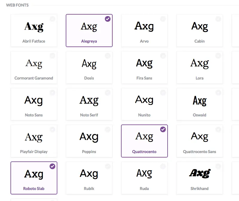
Choose the best fonts
Use BEE Pro to work from a library of web fonts and upload your own brand fonts, too.

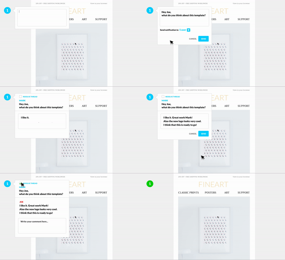
Collaborate with your team
Collaborationis a teamwork tool that allows users to share, comment, and approve email campaigns and templates in one place. It's available for BEE Pro users and their colleagues and clients. The tool streamlines the email review and approval process, so you can work more efficiently.

Send with MailChimp or Gmail
Use the BEE Pro Gmail or MailChimp connector to push your finished email to your preferred client.

Ready to design your own beautiful newsletter? Start usingBEEor a free trial of BEE Proas your go-to online newsletter creator! Choose from an expansive library offree templates, then use the drag-and-drop tool to customize and send in minutes.
Looking for more newsletter inspiration?
Check out these other posts from Email Design, and happy designing!


