

Curious about how a single brand tackles its email stream design? We'll explore and analyzeFitbit, which sends a variety of emails—like product announcements, shipping alerts, and user notifications—to its subscribers.When it comes to products, the fitness brand often focuses on its activity trackers (like the wristbandpicturedbelow), so we'll take a closer look at the messages to see which elements stay the same or change, and how style and voice are maintained across different designs andemail types.So let's review Fitbit's brand identity and then its emails to see what we can learn from the company's email design philosophy.

A strong visual brand is always maintained
With its bold colors and smooth, roundedshapes, Fitbit's visual brand identity is modern, fun, and friendly. Fitbit's primary brand colors are teal and gray, but it also uses bright colors like orange, pink, and lime green. To prevent colors from being overwhelming, ample white space breaks them up and provides a fresh, airy aesthetic. Here's a look at some of the colors in action in an app screenshot (Alta version):

Iconography is also simple and clean. Its logo recently underwent an update, making the newer version even simpler and bolder. Plus, Fitbit'sweb font is the popular, easy-to-read Proxima Nova.
Fun illustrations help user alert emails stand out
Alert emails are automatically sent when usersreach certain milestones. The email stream design copy is encouraging and cheerful, with subject lines exclaiming: "Congrats on earning your Marathon badge!" and "Congrats on earning your first Urban Boot badge!"The intention of these feel-good messagesis to acknowledge the user's accomplishments, without asking the user to do anything more. There's no bigcall-to-action button, though Fitbit does include some social sharing buttons.

You can also see the key aesthetic of these emails is simplicity. They're short and sweet, with a classic inverted pyramid structure to make for easy reading.Theflat, geometric spot illustrations (the badges)are also easy to understand at a glance, and the high contrast of white font against a teal background makes the text pop. Using the email-safe Arial font for the header and support textmeans the message still shows up even with image-viewing turned off.

Takeaway: Communicate a single, clear message to readers by keeping a simple email structure! Large text,brightcolors, and simple illustrationscan help communicate cheer.
Simple info makes shipping notifications easy to read
According to Litmus, 64% of consumers consider transaction confirmation emails the most valuable messages in their inbox. But the messages can get frustrating real fast if they're cluttered or time-consuming to read. Confirmation emails, like the ones from Fitbit's email stream design, should include an easy-to-spot tracking number, plus some key information (like what you ordered and where it's being shipped from).Not only does the brand provide the necessary info, but it does a great job of building excitement with playful messages ("Are you smiling?") and equally playful product images. No doubt the reader will get excited that a Fitbit order is being processed.

The main message is also clear and easily scanned because Fitbit uses a white background, readable font, line breaks, and three font colors (red, gray, teal) to organize information.Although the same header from other emails is used, social sharing buttons have been replaced with store icons. These "passive" CTAs (in the upper right) correspond wellwith the type of email sent, while the footer is almost completely eliminated. By removing extra CTAs, theseemails are really user-focused, especially since Fitbit knows the only thing a reader wants to click is the tracking code.Takeaway: Make transaction emails easy to read by contrasting a white background against a primary brand color (the repeating teal) and using high-contrast text. Focus on the tracking number and order details, and exclude extras (like social sharing buttons or footers).A fun image and clear message convey an engaging brand voice.
Playful GIFs boosts product promotion
We recently pointed out that usingGIFs in special announcement emailscan signal an out-of-the-ordinary message. Fitbit follows this animation trend by incorporating simple GIFs to highlight its products and features. In a Fitbit Flex welcome email, the lights in the Fitbit GIF flicker:

Here's the full message:

In a promotion email for colorful accessory packs, Fitbit's hero image rotates between color schemes:

Here's the full message:

Fitbit knows it's better to show than to tell, so product featurespop on thescreen to help readers see features in action. Both animations are also positioned at the top of the email to grab readers' attention right away. Plus, the GIFs are simple; with only a few frames, they won't be slow to download or eat up data plans.Takeaway: Put your animated GIFs to work—make them show off your product's features and quickly demonstrate a product's capabilities or features. Readers will be more engaged!
Fresh photos upgrade product announcements
Beautifulphotography used in an email stream design also makes a statement, and the photos in the recent email below enhances Fitbit's modern and friendly brand identity.Layering text over the hero image is also a simple design trick that levels-up the email's look. The photos below are bright and fresh. The goofy selfie face isplayful and placing the image within the iPhone really shows readers how the feature works.

Here, Fitbit unveilsaproduct again with beautiful hi-res images. And what better way to show updates to the app dashboard than with screen shots? It's the quickest, most effective way to convey the redesign.
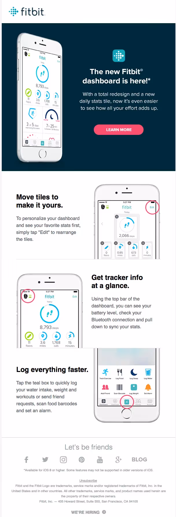
For a product-focused email, we see that Fitbit chose a two column layout with alternating image and text sections. The result is an email that's easy to digest in a step-by-step fashion. The screenshots are further highlighted by pink circles thatpoint to product updates, which help readers see specific features right away. (Hot tip: you can easily create circles like this in Skitch, and screen grabs can be placed on iPhone stock images through platforms like Placeit. See all our recommended email design tools here.)Takeaway: Use photos of your product in action for update or announcement emails. Let readers seeexactly what you're talking about withdevice mockups and image markups (like those pink circles).
Wrap-Up: Tips from Fitbit's email stream design
From all the emails above, it's easy to see Fitbit's brand style in action. Here are some points to follow:
- Messages need to be simple, short, and clear
- Minimize text and use web-safe font for easy scanning
- Don't be afraid to use a primary brand color more heavily
- Include bright and fun illustrations and photography
- Use GIFs and screenshots to show products in action
- Have simple logos and headers to establish branding
- Vary the CTAs but make sure they fit the email's message
- Keep footers the same (except in transactional emails)
Save


