
Earlier this week, in our second Design Inspiration series blog post, we saw how GOOD magazine uses color, typography, and illustrations in email to create an effective daily newsletter. In today’s email design workshop, we’ll be recreating the GOOD email in the BEE email editor, step by step.Why? Because it contains some cool design ideas - especially in the header section - that we believe you can draw some inspiration from. Follow along and try these email design concepts yourself by using your favorite email editor, or by opening the BEE drag-&-drop email editor in a new browser tab.We've divided thisemail design workshop in three sections. We'll be showing you how to:
- Setup the email layout of the GOOD email
- Step 1: Choose your email template
- Step 2: Configure your email layout
- Step 3: Customize your email message
- Recreate the complex email header design from the GOOD email, using:
- Image editing with Aviary
- Padding settings
- Border settings
- Background color settings
- Visually separate sponsored content and ads in email
- With the use of background colors
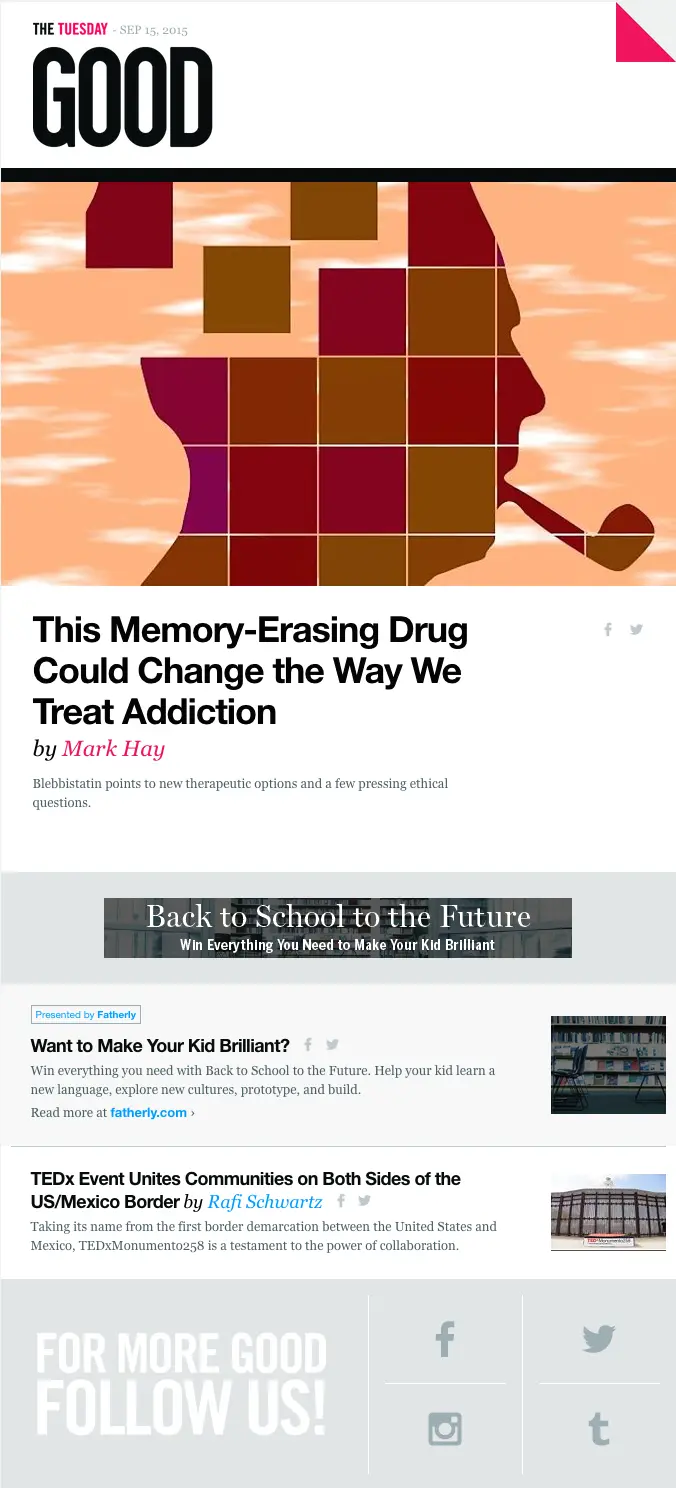
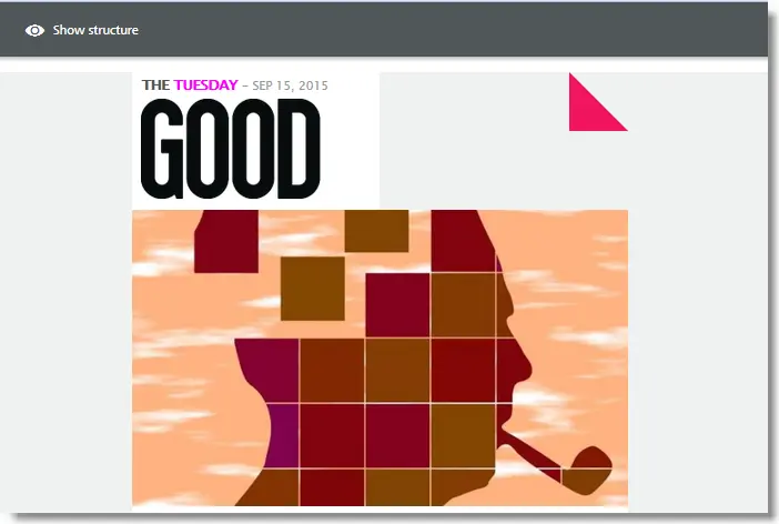
To start off, here's the email from GOOD magazine that we're going to focus on. You can find the original email here.
Getting started with an email layout
As we mentioned, we’ll be using the BEE email builderto recreate the GOOD email in this workshop. It's free, online, and requires no registration, so it's an easy option if you want to follow along!
Step #1: Choose your email template
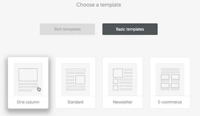
The first step here is to match the general layout and template structure of the GOOD email. We can see that the GOOD email uses a single-column layout for the majority of the top portion of the email. So let'sstart out bychoosing the basic One column template in the BEE editor, and then drag-n-drop the remaining structures and content blocks.
Step #2: Configure your email layout
It's important to dedicate the right amount of time in the initial layout. Think of the email layout as your canvas. Being organized and diligent in this step will help us speed through the next steps to come.Let's take our one-column basic template. We're going to:
- Set some general settings
- Add the structural elements we need
Set your general settings
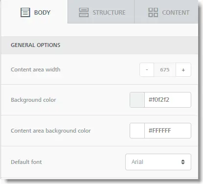
The GOOD email is 675 px wide with a grey background color #f0f2f2 and a white content area background color. To clarify, since the GOOD email is responsive,the 675 px width is a max width setting used on larger screens, but the message needs toignore it on mobile devices that have smaller screens. The nice thing about the BEE editor is that you don't have to worry about mobile rendering issues: all emails created in the BEE editor are responsive and optimized for mobile. For us, this means that we can simply add the desired max width - which is 675 px in this case - and know that it will be properly adjusted on a mobile device.In the BEE editor, we can input these values in the right hand menu under Body > General Options:
Add the remaining structures
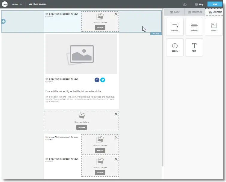
To complete the email layout we'll need to add the following structures in order:
- A two-column structure for the heading (as we see below)
- A one-column image structure for the illustration
- A two-column structure for the title (on the left) with social icons (on the right)
- A text structure for the subtitle and text
- Another one-column image structure for the advertisement
- Followed by three two-column structures for the sponsored content, the content below that, and for the social footer
The nice thing about the BEE editor is that you can simply drag-n-drop structures in place, from the Structure tab in the right-hand side menu:
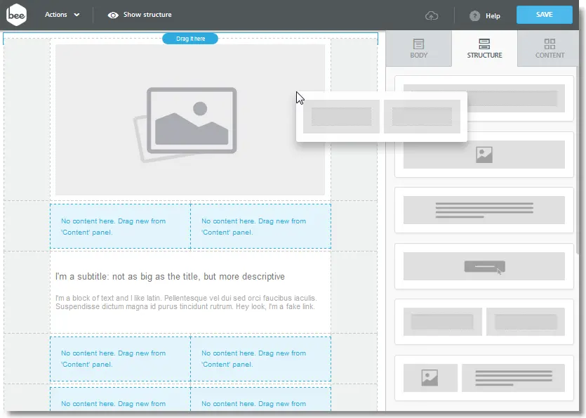
The finished email layout should look something like this (below). Note that in this screenshot we've already added content blocks (e.g. image, text, and social blocks) in our structures, which is discussed next.
Step #3: Customize your email message: add images, edit text, set padding, and more!
Now that we have our email layout in place, we can add content to it by dragging and droppingimages, text, and other content blocks from the Content tab, and bypersonalizingeach of them to meet our needs.Let's focus on a couple of the most important content elements in this email, and look at:
- How to recreate the complex heading of the GOOD email with the use of granular padding and border settings
- How to visually separate content blocks with the use of background color settings
Building a complex email header design
Recreating the email header design from the GOOD email is not a trivial task. It uses some cool design tricks that can appear hard to implement at first. It's challenging, but definitely doable!It took us about 10 minutes to rebuild in the BEE email editor, and allowed us to further appreciate the flexibility and granular customization the BEE editor provides (so a big "thank you" goes to our development team!). Let's see how we did it: maybe you can use some of these tricks in your next newsletter!
Here's a challenge: Try recreating this same email header design in the email editor that you're currently using. Can you do it? Let's compare!
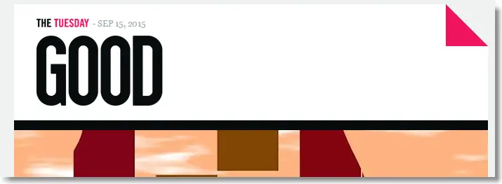
Before we start, notice that the email header is made up of 4 images:
- "THE TUESDAY" is actually a resized image (77 x 14 px)
- The GOOD logo (resized: 180 x 110 px)
- The pink earmark (resized: 60 x 60 px)
- The illustration below the black divider (675 x 404 px)
The only text is the date: Sep 15, 2015.In the BEE editor, the structure of the email header design translates to something like this:
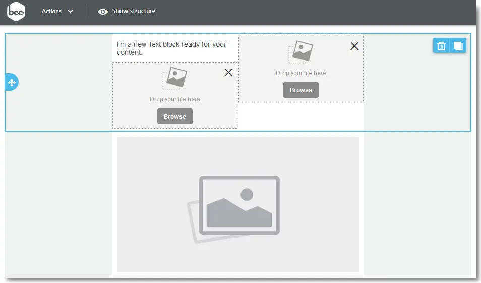
Let's upload the images. In this case, we'll upload the three images (logo, earmark, illustration) and have "THE TUESDAY" image as text.
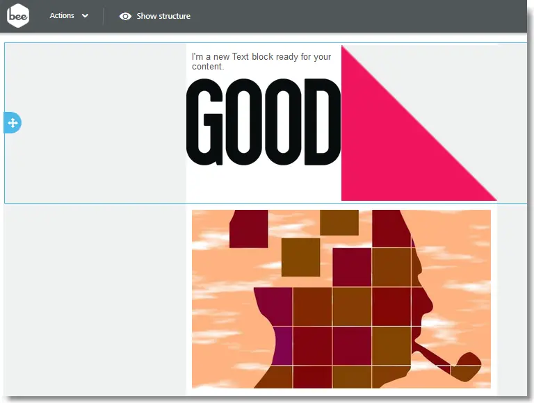
It's clear that we need to resize the images from the specs above. This is actually super easy to do in the BEE editor with the built-in Aviary image editing tool! Check out this quick video tutorial (2:42) on how to resize images for email with Aviary (with the crop tool).Let's use the Resize tool from Aviary under Edit image:
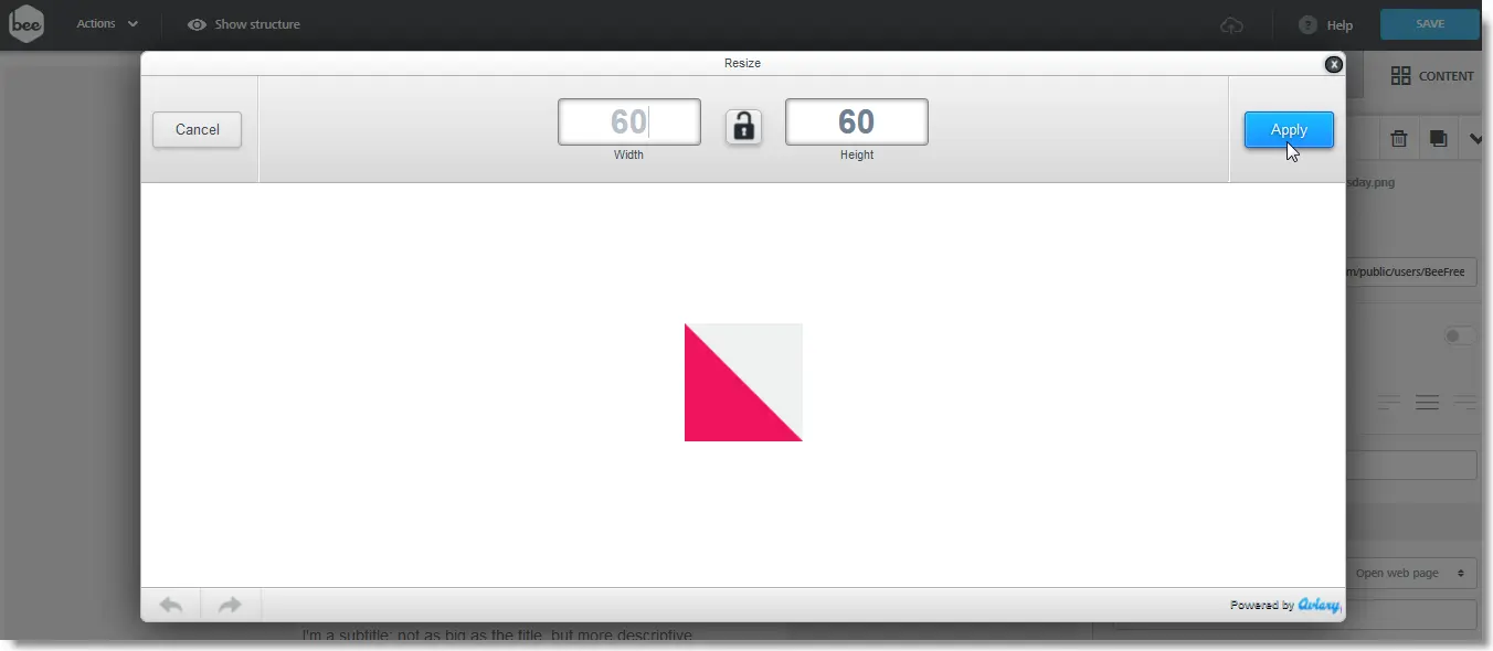
...and this is how our images now look, correctly resized:
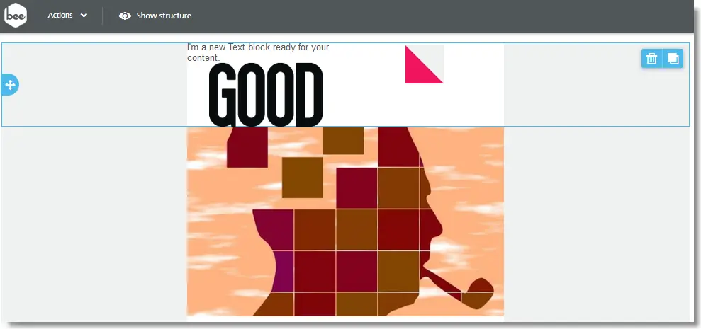
The challenge here is getting the pink earmark correctly positioned on the top-right hand side of the email header. Let's see how to do this!Click on the pink earmark image. Under Content properties choose the right align option:

We can see that the position of the earmark is where we want it: on the top, right corner of the email header!

Similarly, we're going to left-align the GOOD logo, write the text above it, and add a bit of padding.
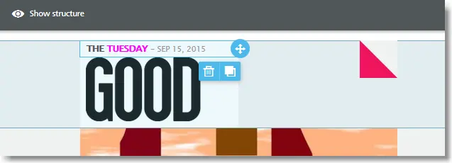
Notice that the padding settings in the BEE editor allow you customize all four sides individually (or all equally). For the GOOD logo we've decided for a padding of 0px (top) 0px (right) 10 px (bottom) 10 px (left). Having granular control on padding is really handy.
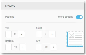
And, for completeness, the padding for the heading text is 5px top and bottom and 10px left. Our heading is looking good! Two more steps to go!
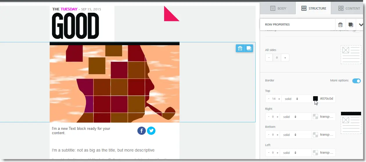
The next design element we're going to focus on is the black divider between the heading and the illustration. The original GOOD email has the following border properties: 14px, solid, and black #070c0d. To accomplish this, we are going to editthe top border of the illustration image. Here too, luckily, we can count on granular border control provided by the BEE editor, which allows us to individuallytargetthe top border of the image. How cool is this? :)
The last part of the email header design that we need to work on is the background color: we need to change it from transparent to white. To do so, we need to work with column settings. To access column settings, click to the right of the content area (i.e. where there are no content elements). Notice that the Row properties show up on the right hand-side menu. And, notice the column properties for both columns. The correct setting that we want is:
- Column 1 (i.e. the column where the GOOD logo is): a white column background
- Column 2 (i.e. the column where the pink earmark is): same thing, as shown here:
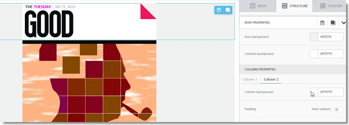
And we're done! We've built a perfect replica of the email header design of the GOOD email.
Where you able to replicate it in the BEE editor or in your email editor? Let us know in the comments below if you had any trouble.
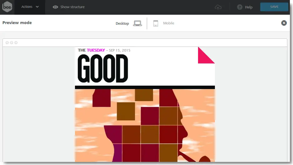
Here's a preview of how the re-created GOOD email looks on a desktop email client:
Bonus tip: Visually separate sponsored content and ads in your emails
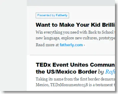
Additionalemail design inspiration from the GOOD email comes by paying attention tohow ads are handled: they are elegantly separated from the rest of the content.The key is to always be transparent with sponsored content and ads in your email campaigns. Don't let your subscribers second-guess what is sponsored content and ads versus your own, original content. Luckily, design-wise, it's rathersimple to visually separate sponsored content and ads in email. Let's take the GOOD email. They do two things right:
- Lead with their own content, followed by an ad (the ad doesn’t steal the show, but it’s still placed prominently in the email to ensure a good ROI for the advertiser) and...
- Maintain transparency by changing the background color of the ad to distinguish it from the rest of the email content.
The main design tactic here is to change the background color. This simple design tactic along with the text "Presented by..." reinforces the fact that it's sponsored content or an ad. Notice that the GOOD email is currently using more than one shade of grey to highlight its content. In detail, the greys in hexadecimal format are #f0f2f2 for the main background color and a lighter grey #f7f8f8 for the sponsored content block.
In case you are wondering, this is very easy to do in the BEE email editor as we saw when building the GOOD heading from above:
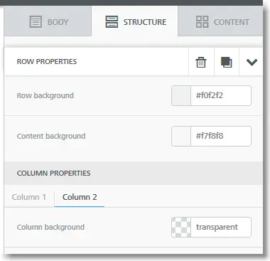
- Load the row properties for the row that contains that content
- Change the background color of the content block from white to a light grey #f7f8f8, as shown below
There you have it!In this workshop, we've really seen the power of the BEE email editor: from background color settings at multiple levels (think: structure vs. content block vs. row vs. column) to complete control over padding and borders, and image editing.We hope you enjoyed this article: it's part of our email workshops series. Let us know what you think in the comments below, and see you next week for a new workshop!
