Have you ever felt lost in a sea of design industry jargon? We have. There are some words we see and use every day that should have simple, no-nonsense definitions. This is why we created the email design glossary here. Now all those pesky words are in one place, in alphabetical order. So the next time you need a refresher, make sure to bookmark this page and come back here!
A - F | G - I | L - P | R - W
A/B testing
A/B testing compares two variations of a design (from subject linest o email design layouts to CTA buttons, etc.). Often, one version is sent to one segmented audience (group "A") while another version is sent to the other segment (group "B") at the same time; then, response rates to both versions are compared.
alt text
a short keyword-rich phrase describing an image, which can help with SEO; alt text usually appears when a mouse pointer hovers over an image
anchor link
linked text that, when clicked, takes you to a specific place in an email, or on a page, without needing to scroll (here's a quick tutorial on anchor links - plus, see the alphabetical anchor links we included above!)
animated GIF
an image format that allows for multiple frames, in order to provide an animated sequence

Animated GIF by Warby Parker
bulletproof CTA
a call-to-action button that's written in HTML so it renders across all inboxes (but you don't need to know how to code to make one!)
call to action (CTA)
a short imperative phrase that usually appears on a button and motivates users to take action (like clicking through to a site, landing page, etc.); the better the phrase, the more clicks you'll probably get
CAN-SPAM Act
a U.S. law that sets the rules for email and "establishes requirements for commercial messages, gives recipients the right to have you stop emailing them, and spells out tough penalties for violations"
cinemagraph
similar to a GIF, a cinemagraph is a still photo where a specific section or element has a repeated movement

Via the Flickr Group: Cinegraph--More Than a Photo
countdown timer
a "live" timer that counts down to a set date and time, in order to create urgency (here's how to make one!)
fallbacks
fallback content is what readers see when your original content—like an image or particular font—fails to load because of an email client compatibility
footer
the last content block in an email, which often includes fine-print, like a physical business address and an unsubscribe link to comply with anti-spam laws (so make sure you know footer design best practices)
full-bleed
a full-bleed email layout with an edge-to-edge appearance, that extends to the full width of your screen; typically more noticeable on desktop and tablets, and sometimes referred to as full-width or edge-to-edge
ghost button
CTA button in whichthe background color is transparent, just like the Twitter “Follow” button on this tweethttps://twitter.com/chadswhite/status/765941284917899265?ref_src=twsrc%5Etfw&ref_url=http%3A%2F%2Femaildesign.pantheonlocal.com%2F2016%2F08%2Fbest-tips-from-the-litmus-email-design-conference%2F
HTML
stands for "Hypertext Markup Language"; often used to describe emails that are built like websites, with images and colors instead of with plain text
image-only
an email that's made entirely of, or mostly with, a single image—not a design best practice (we explain why here)
interactivity
“email interactivity” refers toan action taken in anemail that triggers an event within the same email (like tappable pop-ups, drop-downs, videos)
live text
part or all of an email comprised of "plain text" that reliably renders, using email-safe fonts like Arial, Georgia, and Helvetica
merge tags
a placeholder for dynamic content, like a |FIRSTNAME| tag that gets populated with your subscriber's name upon sending
mobile-first
when you implement various design practices (like responsive design) to optimize a design's effectiveness on a mobile screen
modular design
a system of organizing your email content as building blocks (i.e., modules); most modern email editors follow this principle, including our BEE email editor
padding
empty space surrounding and separating content blocks (this makes a big difference!)
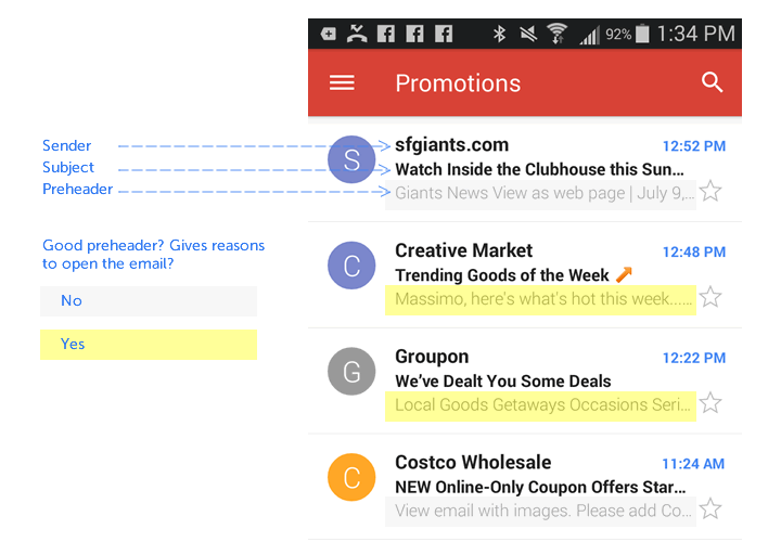
pre-header text
the text that follows the subjectline in the inbox, often used by readers as a screening tool

retina-scaled images
the practice of optimizing images for a phone's retina display by compressing them to avoid blur (here's how to do this!)
responsive design
when a design is coded to detect the device it's being viewed on, so that it resizes (or "responds") to fit the device's dimensions/size parameters
spot illustration
small drawings similar to icons—usually without borders or backgrounds—that are often designed to appear alongsidetext

UNIQLO spot illustrations
template
a design foundation that's standardized (e.g., with the same header and footer layout) to improve workflow efficiency and provide a framework for delivering well-designed messages that are always on-brand
white space
empty space in a design, often achieved by adjusting padding, that creates breathing room between design elements
WYSIWYG editor
What You See Is What You Get text editor that allows users/editors/designers to create HTML emails without needing to know how to code (think WordPress)How would you define the words mentioned here? And, what other words do you want to define? Share them in our comments section!


