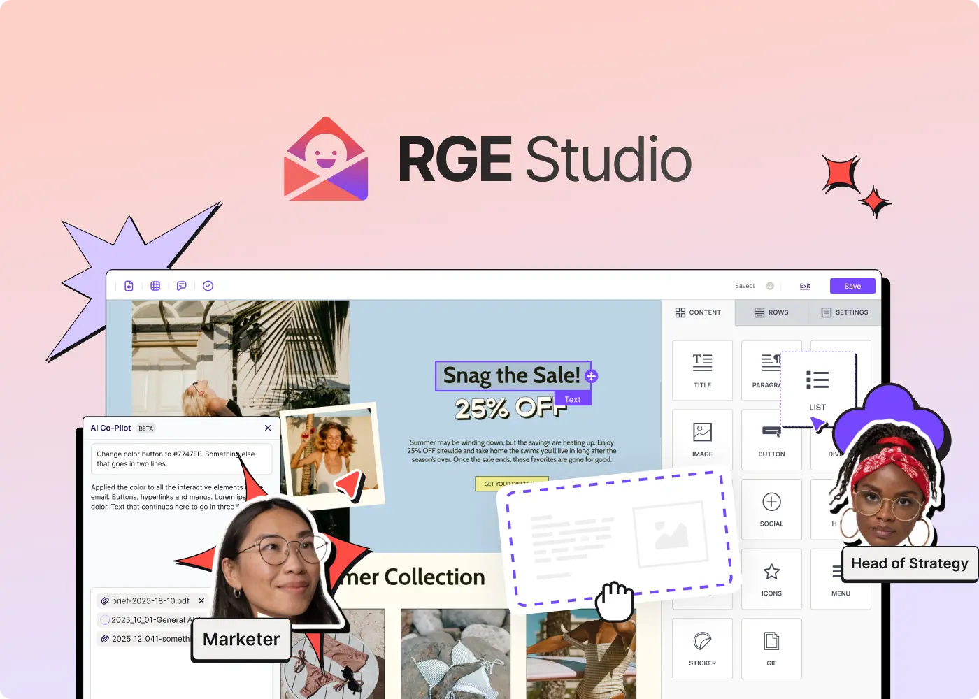
Today, we're getting a little meta: we're looking at how email companies design theiremails. After all, email service providers and email marketing companies want you to use their platforms to design and send your emails. With hundreds of email marketing companies out there, each one has to work hard to stand out.Even though agreat product is the most important thing, how well a brand communicates is also key. So how do email designs from top email brands stack up? Let's take a look at nine examples from across the industry, from ActiveCampaign to Moveable Ink, along with our own BEE newsletter!
MailChimp
The product announcement email: simple, celebratory, and descriptive

This pretty pink email from MailChimp doesn't need flashing lights or moving parts to get the job done. A few smart design choices are all it takes. The hero image is perfectly MailChimp—fun and playful—and the text that accompanies it is simple and clear. A healthy line height makes the plain text easy to read, and the bold blue links pop against the HTML color background. The tone is friendly and approachable—a good choice when introducing a new feature. And for readers who choose to skim? The headline and hero image both state the main message, so you can skip the details if you don't have the time. There's nothing foggy about this email.
GetResponse
The webinar invitation email: boxed, headline-focused layout with a CTA that pops

This webinar invitation—clearly labeled in the subject line: "[Webinar] A/B test your way to email success"—gets right to the point. All the important details are included, like the time and date, the reason you should join, and how to register. We like that the header is the title of the webinar, and we dig the huge font size (and color) GetResponse chose. You can't miss it. Same goes for the CTA button. It passes the squint test and employs the "isolation effect." Since the email is all text, using a subtle border color to create a boxed effect helps make it easy to read.
MailCharts
The new feature email: an animation that shows more than tells


When it comes to giving your audience an update about a new feature or product, it usually helps to show more than tell. That's exactly what MailCharts does with this animated GIF. It's better than a screenshot because it shows exactly how easy it is to open a drop-down menu and click. The movement is eye-catching, too. Otherwise, your eye might not immediately know where to focus on the screenshot—what am I looking at?—which isn't visually interesting on its own.
Emma
The new-blog-content newsletter: a simple header that starts with a hook

We've talked about responsivephoto collages in email that incorporate text. Here, Emma creates a mini version of that. Instead of a single hero image, the hero "image" is actually comprised of aside-by-side image (left) and text (right). The HTML background color behind the live text makes it blend with the image, which means it will always render. (Another alternative would be to use live text atop an image). Using a question as a header (and CTA as a lead-in to the answer) is a great way to engage readers, too.
Litmus
The informational email: modular, color-coded, and informative

Litmus wanted to know what was holding readers back from using its service. So they asked. From the results, they excavated three misperceptions people had about its brand. This unique email addresses those myths, and the result is a clever brand introduction email. The long, smart design decisions also help make the email easy to read. For one, the question in the hero image is attention-getting, just like in Emma's email. And to format the text-heavy message, Litmus does a few other smart things: 1) each module has the same layout and style of header and body text, and 2) each module has a bright red "myth" label that pops against the gray color scheme. Then, the matching red CTA button at the end seals the deal. Et voilà.
Campaign Monitor
The activation email: a case-study that catches the eye


This is an activation / re-engagement email for readers who haven't begun using Campaign Monitor yet. And, put simply, the GIF is eye-catching. It renders beautifully in our inbox, and even though we don't know exactly what we're looking at, we're intrigued enough to click to see the video. Using an animation as a video preview is often more compelling than using a static image because it gives readers a teaser of the content to come. We also like that this isn't a standard "Who we are" or "What we do" type of message. Instead of telling readers why its service is great, Campaign Monitor is showing through a case study.
ActiveCampaign
The welcome email: straightforward and clear

This no-fuss email from ActiveCampaign has a simple goal: for the new subscriber to log in and use the service. To that end, its message is pretty clear, and it's easy to spot where the log-in link is in the email. It's also easy to spot the CTA, though the messaging isn't very compelling. The "getting started" section at the bottom is visually appealing but seems like an afterthought. It's a tough call to make: either put the value proposition above the CTA at the top, hoping to make that information compelling enough for readers click the button; or prioritize the CTA button itself, bumping it up and making the value proposition secondary content. A good way to find out what works better is, as always, conducting an A/B test.
LiveIntent
The fresh content email: a video-preview GIF and click-worthy CTA

LiveIntent creates a lot of content and does a great job distributing it through email. We've featured their emails before. Because their blog content often includes videos, their emails also include video teaser content in the form of an animated GIF. We're fans. Plus, we love how they customize their CTA button text every time. No "click here" or "read more" in sight.
Moveable Ink
The invitation email: a personal note with a photo signoff

Movable Ink sends more visually interesting emails than this one, but let's see how the brand styles its more personal letter-like messages. A template like this is one that we recommend every brand have on hand because sometimes, you want to send an email that feels more like a personalnote from a friend. Moveable Ink's "To" line is actually personalized with a dynamic field. But because I haven't provided my name, the field is auto-populated with the default "there," to read "Hi there." Likewise, the sign-off is personalized with Katrina's name and picture. The whole email feels like a personalized invitation, and this style might help drive attendance.
Bonus: Our own BEE newsletter
Get design tips, tricks, and product updates delivered straight to your inbox


We want you to get the most out of our email editor, and that's exactly the goal of our newsletter. We often include animated GIFs, bold easy-to-read updates, and quick takeaways in a modular design that's mobile-friendly.To get insider email design tips delivered to your inbox each week—and decide how the BEE newsletter design stacks up against the rest—look for the Subscribe Now box at the top of this post!