As we roll into December, inboxes are beginning tofillup ascompanies and organizations plead for readers to take action: get the coupon, buy now, tell a friend, register for the event, learn more, shop the sale. In fact, studiesshow that merchants significantly increase the volume of messages they send during the holiday season.

Whilethe end of the yearcertainly stirs up afrenzy of consumer activity, fundraisingand donation-driving are also an enormous partof this season of giving.Nonprofit organizations and charities will launch end-of-year donationcampaigns, hoping to bring incash for the new year (and help their donors maximize their 2015 tax deductions), while for-profit companies run their own do-gooder campaigns alongside them.As an email marketer, you're likely under pressure to make a splash with special holiday giving campaigns that appeal to readers and help increase donations through email, all amidst the busiest, most crowded marketplace of the year. Phew! We know it's hard to stand out in the crowd, so we've preparedour top design tips for great fundraising emails that will stand out this December.
Tell a story
Humans are prone to procrastination, so to increase donations through email, your email needs to give readers a clear, compelling reason to give now. Keep yourstory short, clear, and focused, quickly building to your call-to-action. Along the way, make a statement about why now is the time: the reason could be a specific event, a tax break, or a donation matching period with an approaching deadline. People want to do good, but they generally need the persuasion of a specific reason for doing it right now.Here's an email from the Brooklyn Public Library that checks these story guidelinesoff the list:

There's a sense of urgency. The header prominentlyreads "Last Chance," followed by a sub-headermentioning these are the final hours.BPL tells a story in just 5 sentences. The body copyis to-the-point and clear while also setting a grateful, approachable tone that's easy to understand and appealing.There's a clear reason given to donate now. It's readers' last chance to give before the tax deadline.The call-to-action is obvious. The CTA button is a strong contrasting color; the type is large and the message is succinct.
Make your first headline count
It might be all subscribers read.This is your opening statement, your introduction, and your chance to get readers’ attention. Don’t plop in stock photography or make a poor headline choice: brainstorm in advance and plan to make a bold statement. Sometimes just a few words are all you need tomotivate and inspire.Look how much Everlane, the clothing company, accomplishes in just a few lines of headline text:

By using a simple black background, huge text, and a direct message, readers can get the idea almost instantly. And, if they like what they've read, they can continue readingby clicking the "Learn more" call-to-action button.Thrive Market takes a similar approach, also using two super-short, punchy statements as a headline: "LIVE WELL. DO GOOD."

Like Everlane, Thivechooses a large font size—about twice the size of the body copy—to make a bold statement. Thrive also follows the header image best practice of customizing the photo to reflect their brandwith a cute graphic and text overlay. Even if subscribers don't get through the fine print, it's clear right away that this is a message about giving and doing good.What each of these brands also does is writein a tone that's personal, approachable, and on-brand. There's no generic messaging—like "Give to our campaign today and make a difference"—instead, each brand establishes an inspiring sense of excitement in just a few lines.
Create structure with a modular layout
Using amodular layout—one that divides your message into modules or content blocks— is an effective strategy for creating structure and improving readability in email. Withfundraising, modules can introduce hierarchy in your message, reaching readers at varying levels of interest and reinforcingyour goal in multiple ways. Let's lookagain at Everlane's email, this timein full:

Each module serves a purpose: Module 1 is a short, simple, clear header that tells the story in just a few words. Module 2 adds a second degree of context, both visually (with the photograph) and with a single sentence of text that succinctly describes the exact goal and target amount to raise, followed by another CTA button. Module 3 adds a further degree of granularity with a personal letter from the CEO, clearly describing the full project in detail, followed by a final CTA. The structure allows Everlane to capture readers withthree different approaches and three levels of granularity, all in one message.
Use typography (and good design) to make a statement
Photography and illustration are powerful tools in good visual storytelling. But look how effective beautiful typography and a bold colorare in this fundraising email from Housing Works:

Not your average donation-driving email, is it? Housing Works follows the great storytelling tips we've covered—bold headline, concise and focused messaging, and a sense of urgency—and then makes their message sing with great type and great color. By using pink elements (header, headline, CTA, footer) betweenblocks of black-on-white text, the color also creates structure in the email. And, as a bonus, the email header is also an animated GIF:

Strategically place CTAs
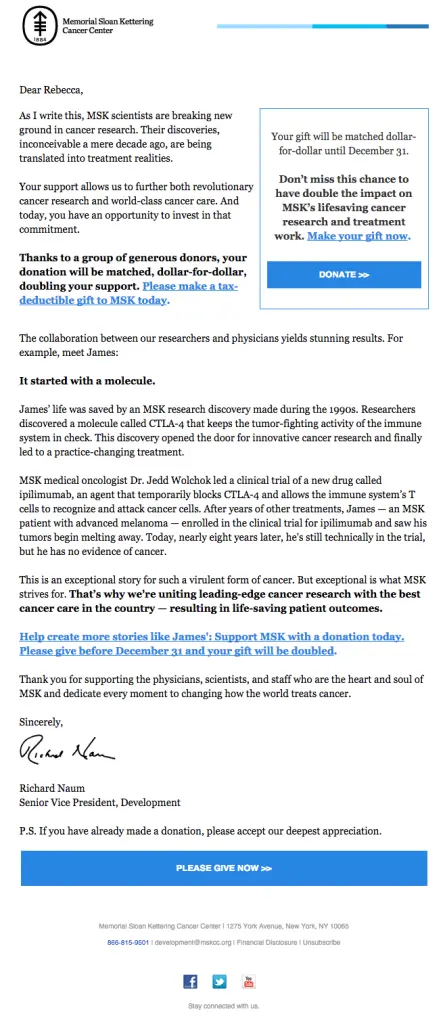
An effective donationemail is a focused one: it shouldcommunicate a clear, single message that leads to a clear, single call-to-action.Research has shown that placing a CTA button below the fold canincrease clicks by 304%.The important thing is to let readers know what they’re signing up for first—with great copy and visuals—then invite them to act.However, organizations are under pressure to communicate quickly and clearly at the top of their email, so even with a cursory glance, readers can get the gist.In this email from Memorial Sloan Kettering Cancer Center, they've accomplished both:

With this cleverlayout design, MSK simultaneously keeps its main message above the fold with its own CTA button, whilea second CTA closes the message for those with the time and interest to read the full email. It's a great tactic for reaching as many readers as possible.
Get personal
A common and effective way to increase donations through emailismaking the message personal. We've seen that in a few examples above, with heartfelt messages from organization leaders of Everlane and Memorial Sloan Kettering that are signed with an actual signature—a nice touch in creating a sense of connection to an organization.But getting personal can also mean telling a story that demonstrates why your organization is worth funding: because it's making a difference in real people's lives. Take this example from StoryCorps, the oral history project:

By featuring a real person's story—in just a few sentences, and with beautiful photography—StoryCorps hopes to demonstrate their value and compelreaders to act. And like Housing Works, color creates structure and calls attention to what's important:the call-to-action and the deadline, bringing a sense of urgency that stands out against the black-and-white message (plus, there's the added urgency of the limited-time donation matching period).
How good design can increase donations through email
If we had to summarize our thoughts on email design for end-of-year fundraising, we'd probably tell you this: use all the principles of good email design!Consider everything you normally would: the clarity of the message, the placement of CTA buttons, the structure and hierarchy, the use of color, the infusion of great visual elements, and, importantly, how the email will look on mobile. Don't let the end-of-year pressure intimidate you. Do what you do best and build a well-designedemail that your readers will notice. Try the BEE editor—it's free, online, and requires no registration—to build an email that stands out from the rest.


