Email signatures aren't just for person-to-person business emails. Manybrands use special, designed sign-offs tomake marketing messagesmorepersonal, seizing an opportunity to show readers what theirbrand is all aboutand to leave a lasting impression. After all, emails aren'twritten and designed by robots, but by a team of real people. If you're using email signatures in your messages, or if you're intrigued by the idea, check out how other companies use email signatures to make sure you're implementing best practices.
Dos and don'ts of email signatures
Let's begin with the basics. To create a stellar signature, here are some best practices to begin with:
DO
- Keep it short. Two or three lines of text is plenty.
- Keep it simple. Use one or two fonts and only one or two colors.
- Make it visual. Include an image of your headshot, signature, or logo.
- Consider layout and hierarchy. Give emphasis to your first line with a larger font size or bolded font. Use horizontal or vertical bars to separate content. Pay attention to alignment and spacing.
- Limit the links. You don't need to include every social media button and link to every project and site--you can save those for your email footer. Treat links in your signature like calls-to-action: limit links to the most important one (or two). Too many options will likely leave readers unsure of what to click (and then clicking nothing).
- Make it personal. Show your face with a headshot in your signature, or just make it a warm sign-off in your brand voice (avoid the overused "Sincerely" or "Thanks").
- Design for mobile. Any links or clickable content should be large enough to easily tap on a mobile device.
DON'T
- Include your email address. It's redundant and unnecessary!
- List every way to contact you. Include just one or two, like a link to your site and a phone number.
- Make it an image. Include a headshot, logo, or icon, but make the rest of your signature plain text so it appears when image viewing is turned off.
Email signature design inspiration
Signatures with a smile
Hubspot, the inbound marketing company, often emails subscribers witha personalized "from" line from a single person on their team, like these recent messages from marketing manager Juliana Nicholson.

Because Hubspot is making it clear these emails are coming from a person (not just some unknown voice or facelesscompany email address), Juliana also signs off her emails with a signature that includes her photo.

It's refreshing to see the person who's emailing us--the personal touch might make customers more likely to engage with the email. Her signature follows important design best practices: it's only two lines, uses one font, and has one link / call to action.
Simply linked
Links in your signature are calls to action. They're an opportunity to send readers to your website to learn more. But including too many links can makeyour signature long and cluttered, preventing subscribers from actually reading it, let alone clicking.The Mint Life Blog sends out content with free, simple personal finance advice. A recent email featured content from author Beth Kobliner, butinstead of a simple sign-off to close the email, her whole bio was included, which felt like too much information and way too many links to close the email with:

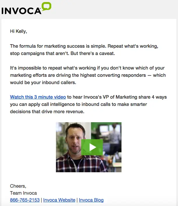
By contrast, Invoca, the software company, has a really simple two-line signature that includes three links:

It's well-organized, simple, and minimalistic. A Song A Day, the service that curates and sends songs to subscribers, has a similar signature with two links:

Giving readers a simplified list of links (CTAs) streamlines your signature and calls attention where you want it to be called.
Signed, sealed, delivered
A great way to add instant personality and intimacy to an email is to include good old fashioned handwriting. Or at least an image of a handwritten signature. Emails from Skillcrush, a company offering web design, marketing, and other online classes, often include the signature of Adda Birnir, the company's CEO:

The sign-off reminds readers that the content is coming from a real person, and it reinforces a connection between readers and the Skillcrush brand. Likewise, artist and designer James Victore "signs" all his newsletters, too:

Victore isn't afraid to take up a lot of real estate with his signature; it emphasizes to readers that he wrote the email to them and for them. Plus, it's memorable. It makes sense that Victore doesn't add a photo or other details. The signature speaks for itself.
Signing off above the fold
We've noticed somenewsletters that include a module at the top where the sender can address readers in a more personal, informal way, before presenting the remainder of the email's content. Chef Mario Batali recently employedthis approach in his weekly digest of recipes, videos, and foodie tips for readers.

It's a great way to catch readers' attention at the outset of the message and to peel back the curtain on the newsletter and remind readers of the person who's behind it. Sometimes we're so focused on providing readers with great content that we forget to remind them that there are real people working to come up with and create that content specifically for them. An email signature is a great reminder of that. And we love how Mario signs off "love & lentils"—it's authentic and playful and makes a statement about his brand.Apartment Therapy recently took a similar approach with a note from its executive editor, Janel Laban, at the top of its newsletter.

Like Mario's note, this one is only a few sentences, and it reminds readers in a short and sweet way that the newsletter is coming from an actual person. We really like that Janel's black-and-white headshot and autograph are included, too.
Stepping away from "sincerely"
Lots of brands keep their email signature design super simple but take the opportunity to demonstrate their brand voice and identity with a playful line in the signoff. In other words, instead of closing with "Thank you" or "Sincerely" or "Best," these brands mix it up.MailCharts, the email marketing software, often closes their emails with "Happy emailing":

DropBox says "Happy Dropboxing!"

Artist Austin Kleon gets cozy with readers and signs off "xoxo" (it's a long email, so we're just including the signature):

Even with plain text, these sendersshow how a simple email signature is an opportunity to show readers who theyare.
Wrap-up: Best practices for email signatures
If you're on the fence about including an email signature, try it out and test how recipients respond. The more we started paying attention toemail signatures in our inbox, the more we found. They're a great way to connect with your audience, even if they're a tiny part of your email, like in these sweet-and-simple signatures from Kickstarter...

...and from Vimeo:

Why not leave readers feeling better connected with your brand at the close of your emails? Try out a few options in the BEE editor—it's free, online, and requires no registration. And don't forget to tell us how your email signature experiment goes in the comments!Plus, check out Bee Pro, our new toolset that gives you all the advantages of BEE with even more flexibility, template offerings, and testing capabilities to create beautiful responsive emails.


