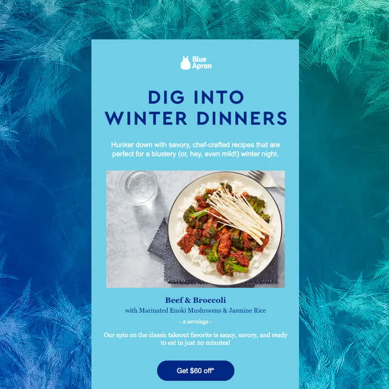
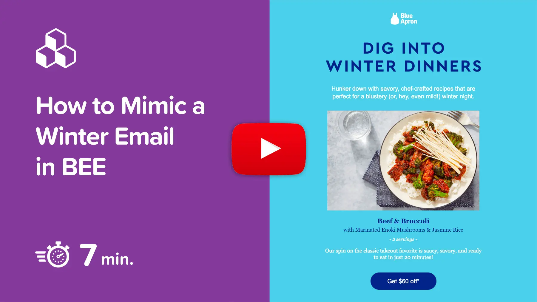
It's a new year! For many brands, that means vying for customer attention while clearing out post-holiday inventory and setting the stage for the year ahead. Our inboxes are loaded with dazzling marketing campaigns and innovative designs. We took a closer look at post-holiday emails and chose one of our favorites for today's tutorial. We'll walk you through how to whip up a stellar winter email of your own, so you can promote, announce, or invite readers to your next big thing, all while staying in sync with the cool and cozy vibe of the season. Start 2019 off with a bang and follow along step-by-step in this video:
Winter email inspiration: Blue Apron
In this tutorial, we're going to show you how to build a winter email like this one we recently received from Blue Apron.Subject: Spice up your life! ????️
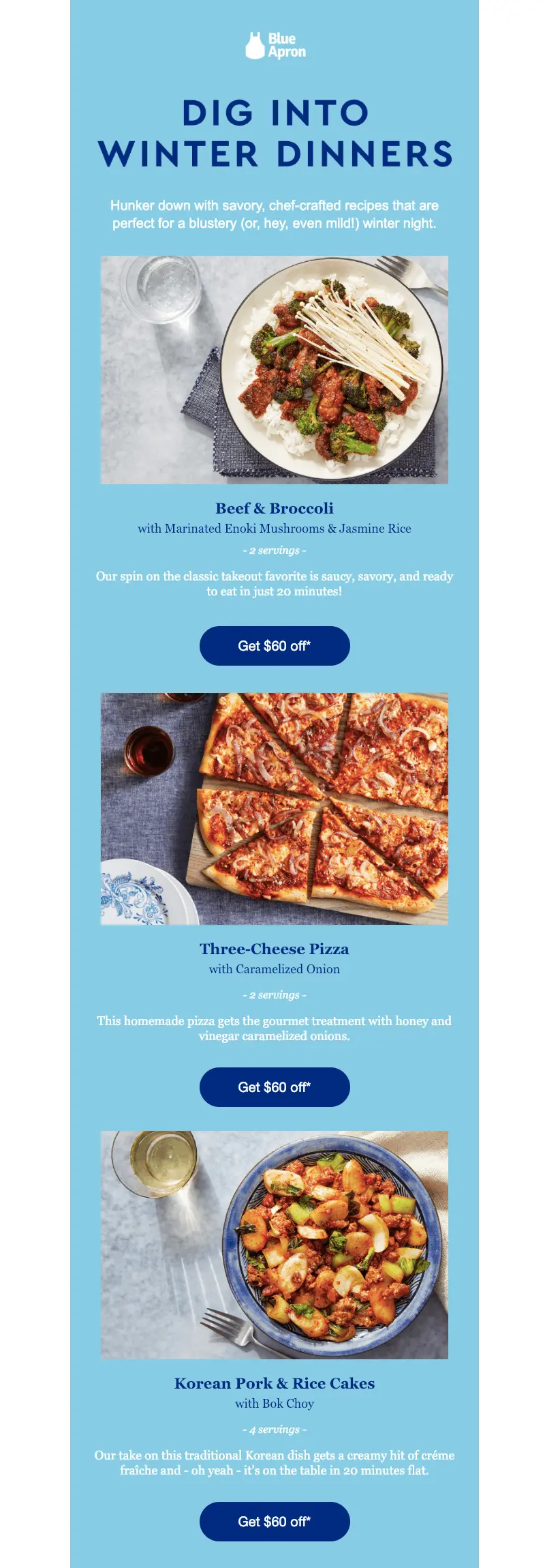
These are the design choices we love about Blue Apron's email:
- Single-column, modular design ideal for mobile
- Bold blue HTML background color
- No navigation menu or clutter at the top
- Large, skimmable headers in live text
- Bulletproof CTA buttons that are easy to spot
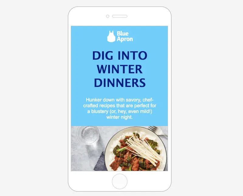
Here's a look at the mobile view, so you can see how nicely an email like this renders on a smaller screen:

Ready to build your own? It's easy!
Tutorial: Build a perfect winter email
Step 1: Log into BEE and choose a blank template
If you don't have BEE yet, try a free BEE Pro trial. You can use our templates or build an email of your own from scratch, then send away!
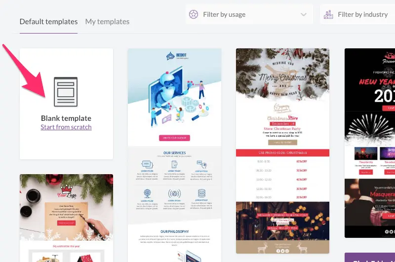
Since this email has a simple, single-column design, customizing a blank template will be a cinch.
Step 2: Adjust the setting for the whole email
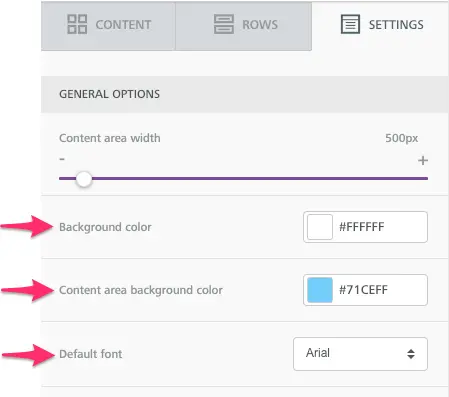
Before we start building the structure of the email, we can set the HTML background color and default typeface so that anything we build will be customized to our choices.Navigate to the Settings menu on the right. There, we'll choose a bright blue HTML background color for the content area and white for the background color (this will create a fixed width effect).Blue Apron's email uses two email-safe fonts: Arial for body text and Georgia for headers. We'll set Arial as our default, then switch to Georgia as needed once we're in design mode.
Step #3: Build the structure of the header and first module
To start, let's set up the layout for our email's header content and the first module.
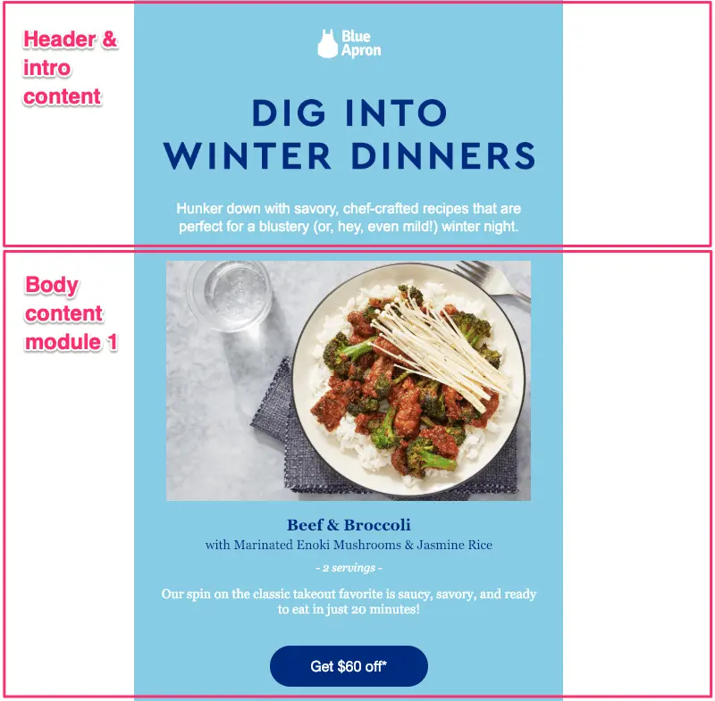
In BEE, we'll pull in two empty rows—

Then we'll drop in our content placeholders. The first row will have the Blue Apron logo (image), followed by large header text and body text. The second row will need to hold an image, body text, and a button.
Step #4: Add and format images
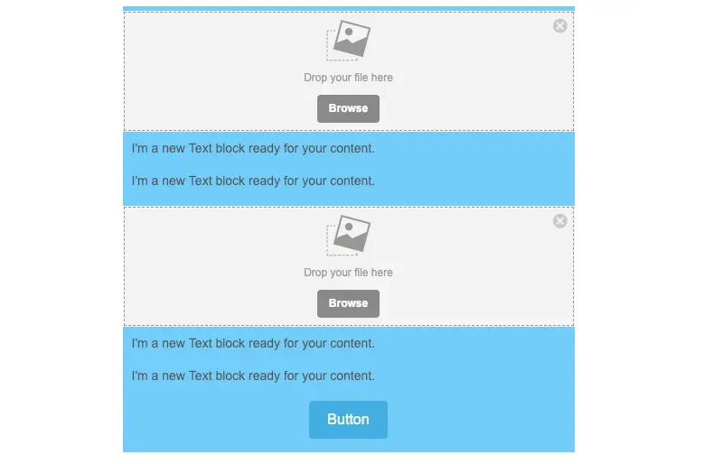
Now let's add our images! We saved the photos from Blue Apron's email, then drag-and-dropped them into BEE. Here's how they look unformatted—
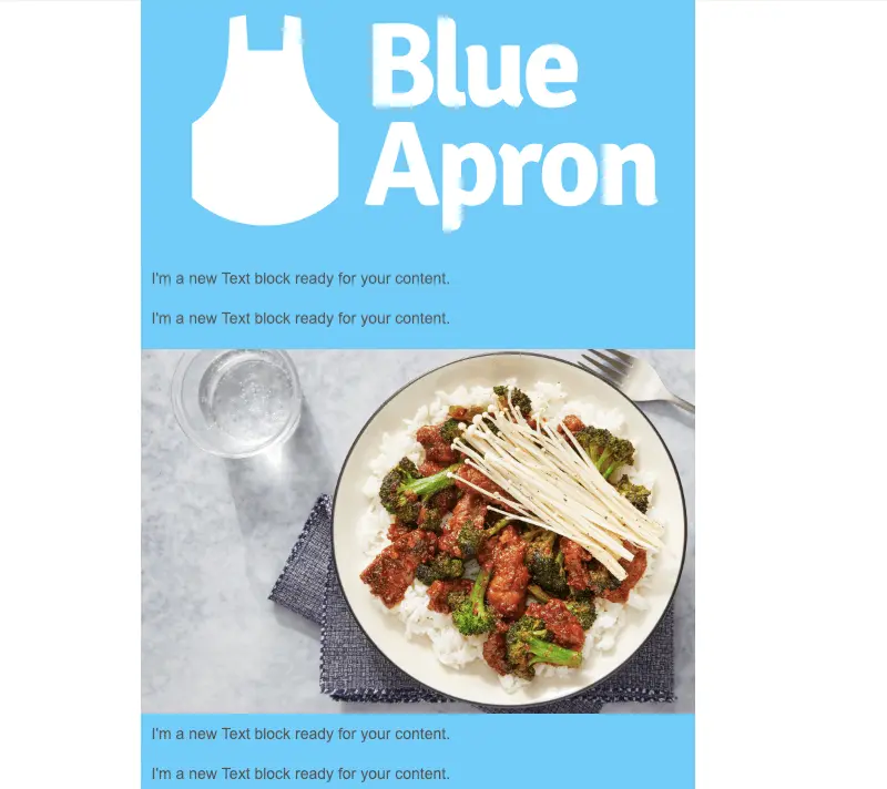
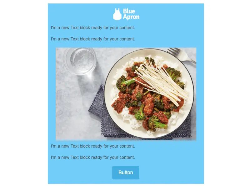
Let's adjust the image widths. Simply tap on the image you want to adjust. We'll start with the logo. Use the Content Properties menu on the right to uncheck the auto-width setting and move the slider down to about 20%.(Don't forget to also check Full width on mobile so the logo isn't tiny on a mobile screen.)

After adjusting the following image down to 90%, both images are now in correct proportion—
Step #5: Add and format plain text
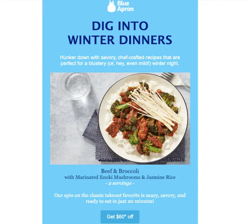
Now we'll simply copy-and-paste (or type out) the content from Blue Apron's email. First, we'll format the "Dig into..." header. To achieve a similar look, we changed the font to Lucida Sans, increased the size to 38, chose a navy blue color, bolded the text and center-adjusted it, as shown—

The body text below it can then be formatted to be larger, white, and also center-adjusted—

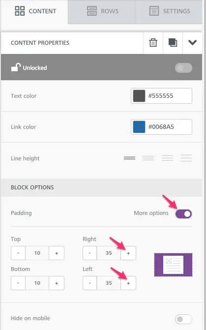
We will also adjust the padding on either side of the text box so that the column of text is narrower than the full width of the email.
After formatting the rest of the text, here's how our email is shaping up—
Step #6: Format CTA button
Now let's make that bulletproof CTA button pop! Simply tap the button, then format using the menu in the right panel. There are three things we'll do:
- Change the background color to dark blue
- Achieve rounded edges by adjusting the border radius
- Elongate the width of the button by upping the content padding to the right and left

And here's how our button looks—

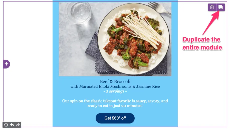
Step #7: Duplicate your module for fast designing
Now that our first module is perfectly designed, we can employ a handy BEE shortcut. All we need to do is duplicate it, then update the image and text. We can repeat this process for the rest of the email, making it super easy to complete your design.
Step #8: Preview on desktop and mobile
Once you've finished designing the rest of your modules (or at any point!) you can preview your message using the Actions menu in the upper left. Select Preview, then toggle between desktop and mobile. Here's how ours looks—
Voilá!!Are you ready to build your own winter email? Sign-up for aBEE Pro free trialand check out our cozy new winter email marketing templates:
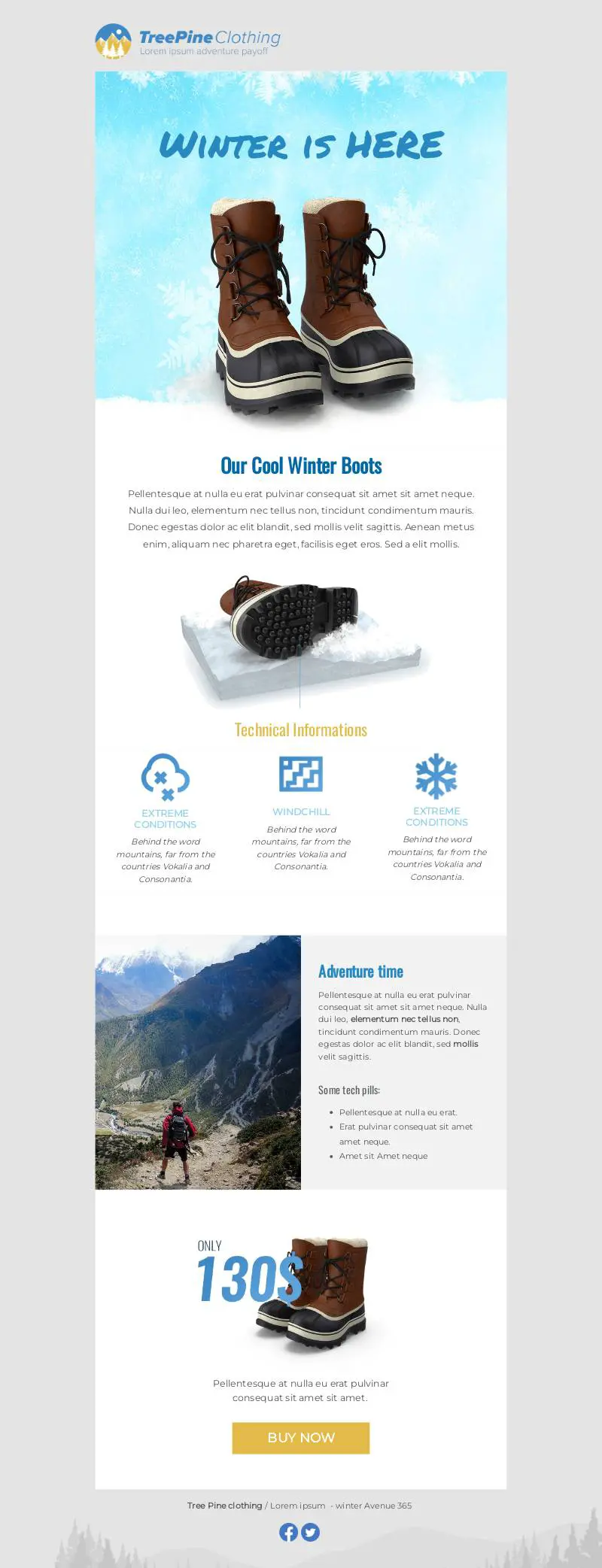
You'll get access to all of these features, along with free stock images and easy-to-use tools to make your email look perfect! And of course, if you're looking for more winter email design inspiration, we've got you covered!
