
Welcome to our first workshop! We'll be looking at how to build better emails and apply our email design tips from our weekly Design Inspiration series with a new workshop every Friday. Let's get started!
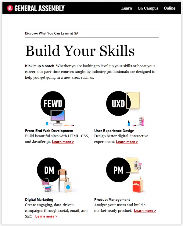
In our first Design Inspiration blog post, we saw how General Assembly (GA) uses design simplicity in their emails to showcase their online courses. Here's what GA said:
@massiarri @beefreeio Super flattering and cool analysis, thanks!
— General Assembly (@GA) September 28, 2015
In today's workshop we'll be building the GA email in the BEE editor and showing you how to use the BEE editor and its many features, step by step. Once we've built the GA email, we'll be covering in much more detail a few email design tips and tactics from the GA email and see how to apply them, hands-on. Be sure to try these email design tips in your own email campaigns and see if they work! You can also quickly see how to apply them in our BEE editor (it's free, online, and requires no registration).Feel free to browse through the two sections of our workshop:
- View how to build the GA email in the BEE editor, step by step
- View our email design tips and tactics, applied in more detail
One of themost visually noticeable design tactics used in the General Assembly email is the equal-width, 2-column layout of the message, showcasing each online course in its own squared section. There are many other less noticeable, but nevertheless clever design tactics, including the use of different font styles for separate sections of the message (main title vs. paragraphs), and having heading text that's four times bigger than the paragraph font, for creating emphasis and contrast.
Let's get to work!
Getting started
We'll use the BEE email editor to recreate the GA email in this workshop. Use your favorite email editor, oropen BEE athttps://beefree.io/ and follow along!
Step #1: Choose your template
The closest template resembling the GA email layout of a two-column layout is a basic E-commerce template. Let's select this one and launchthe BEE editor.
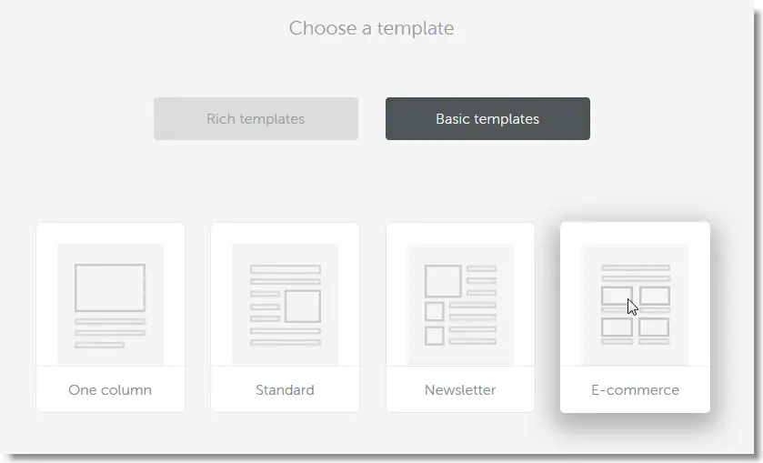
Entering the BEE editor, we can see that the template we picked has a good layout for what we want to accomplish: a header, a few image placeholders, and the 2 column layout.

If you start with another template or from a blank message, simply use the structure panel to drag and dropa one-column row for the header, a couple of two-column rows for the main content section, and another one-column row for the footer.
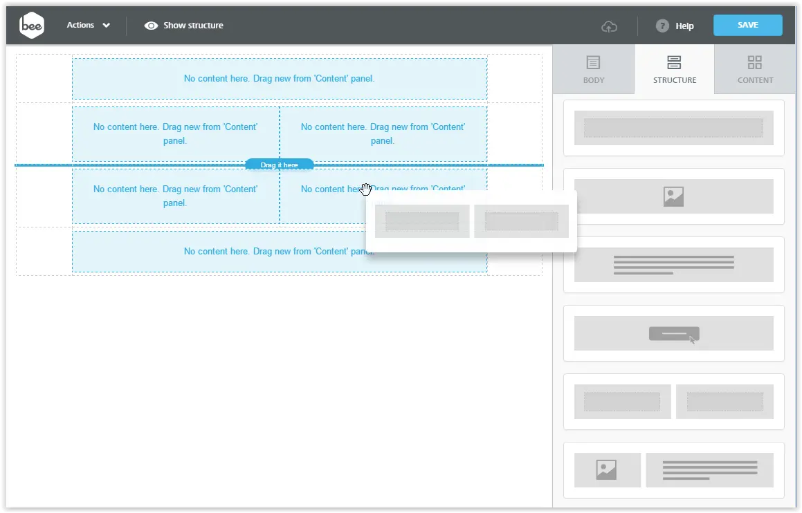
Step #2: Customize or add your 2-column structure
You'll find a number of useful content blocks and structural elements on the right-hand side of theBEE editor. For example, to build a 2-column structure, you have a choice of predefined structural elements that organize content in two columns.
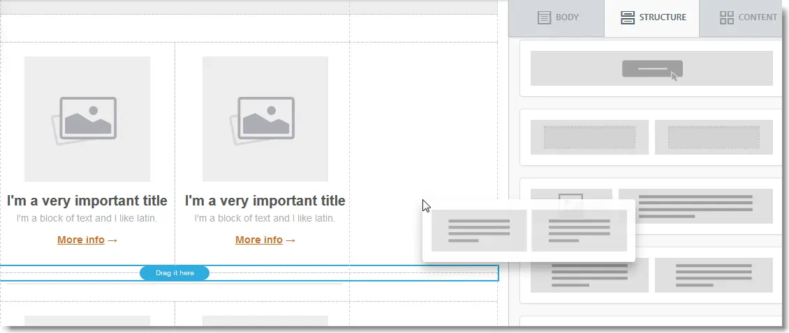
Step #3: Start adding content!
Now that we have a basic layout in place, we can start adding content blocks, and recreating the General Assembly email.For the header, we need to drag from the Content panel into our top, one-column row a text block and two content dividers.For the title, we'll use another text block, and edit the font to set the type to Georgia and the size to a large value (here we picked 48px). We will also set the color to black.
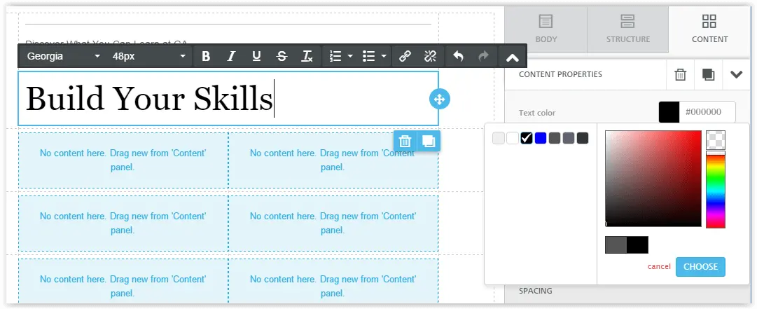
For the images, we can use the same images saved from the GA message we received (just for the purpose of this workshop: the images are theirs!), dragging and dropping them into the image blocks we positioned in the message.
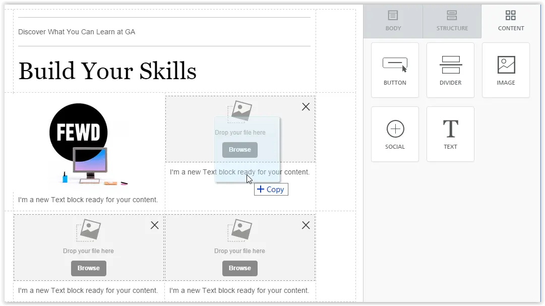
For the text blocks, we need to take a few steps to achieve the clever look & feel used by General Assembly:
- Type in the text
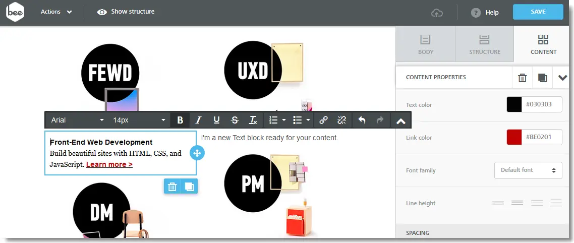
- Using the text editing toolbar, highlight the section title and set font type to Arial and weight to Bold. Font size remains set to the default value (14px).
- Now highlight the rest of the paragraph and set the font type to Georgia and the font size to 16.
- Finally, increase the line height as shown in the screenshot below, using the corresponding setting in the Content Properties panel.
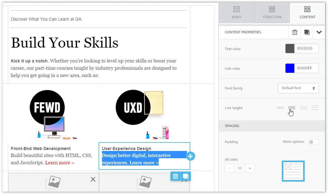
Things are looking good! Continue as above to add more rows to the message.
3 Design simplicity tips for email to try out
Now that we have covered how to get started, let's focus on how to apply some usefuldesign simplicity tips and tactics in more detail.
Tip #1: Use a 2-column layout, but make sure it's responsive!
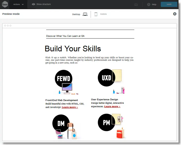
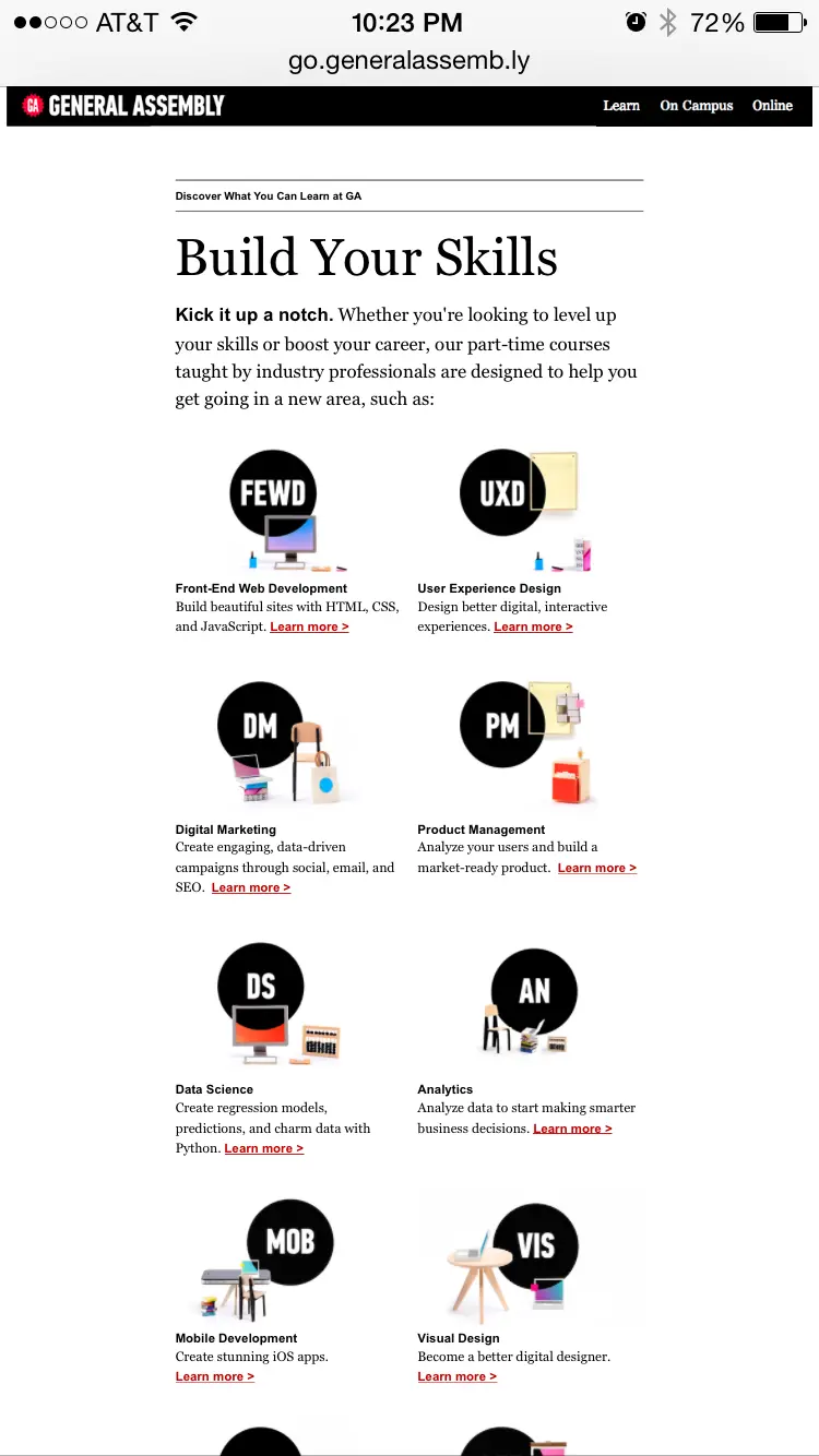
A recent email design trend from a few years is modular design, which favors a simple, 1-column, 100%-width layout. Having said that, using multi-column email layouts can still be effective, such as in this GA email. As we'll see, however, a 2-column layout provides a few rendering challenges in mobile inboxes.The GA email works well in desktop and tablet view, as we can see from the preview section of the BEE editor:
But for mobile, it's a whole other story. The original GA email has a noticeable flaw (and the only critique we have): the content blocks of the two columns are a bit too small too view. The GA email is somewhat mobile-optimized at best but definitely not responsive, which is a shame. This small example is an industry-wide phenomenon in which companies are still struggling with adopting email for mobile devices.
The good news is that many email editors today allow you to build a fully responsive mobile email, including the BEE editor. For you HTML/CSS geeks, these editorsautomatically add CSS media queries and other code to make the email responsive across the most popular email clients.This is how the GA email would look like if it were responsive. As you can see,ourreplica of the message switches automatically to a one-column layout and looks much better on mobile:
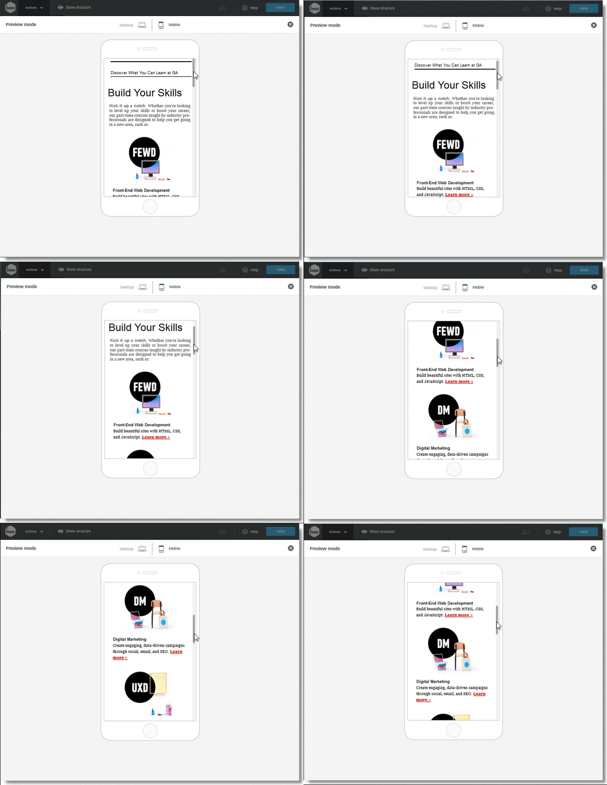
Reminder: Use an equal-width, 2-column email layout, but be sure to see how it looks on mobile. If it's responsive, the better! Try it out and build it in our BEE editor.
Tip #2: Use different fonts to create emphasis, contrast, and spacing in your text
Notice the interplay between the two different fonts - Arial and Georgia - in the GA email.This is a simple, yet effective, typography tactic that creates contrast and spacing between the various text elements. This is achieved without more complex design tactics that may require additionalwork. If you decide to use the samefont size of 16px for all text, including the heading, body text, and linked text, the Arial font style shows as slightly bigger to the eye compared to the Georgia font style, hence creating that contrast and popping out! This may be the reason why the Arial font style is used in headings (and is in bold) throughout the GA email. Here's how you can recreate this typography tactic in the BEE editor:
The BEE editor has 9 standard style fonts that correctly render in all inboxes. Unlike with web design (which has a wide number of web-standard fonts for the most popular web browsers), with email design we're limited to fewer "email-safe" fonts. Some font styles just don't render in some email clients (e.g.Outlook). So, don't over do it, and choose an "email safe" font!
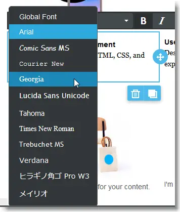
Reminder: Test different fonts in your emails. Be sure to customize the line height and padding as well.
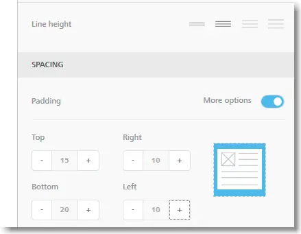
You can also perfectly recreate the GA line height and padding settings in the BEE editor with a setting 2 for the line height and the flexibility to customize the top padding to 15 px, left and right to 10px, and a 20 px bottom padding.
Tip #3: Use a 3x to 5x bigger font size for your heading text
We all know the importance of font size in PowerPoint presentations (if the text is too small, no one in the audience will be able to read your slides), in print ads, and in web design. All of this applies to email design as well. If your text in an email is too small (or too small in a smartphone), then we have a problem.A 16px font size is a good reference point for your body text, as the GA email has. What does stand out is the 62px font size of the heading text "Build Your Skills", which is almost 4 times bigger than the body text font size.
Reminder: Test a heading font size 3x to 5x bigger than your body text in your emails. Try it out!
Adding a heading text should be pretty easy for you. Simply drag and drop a text structure to your email body in the BEE editor:
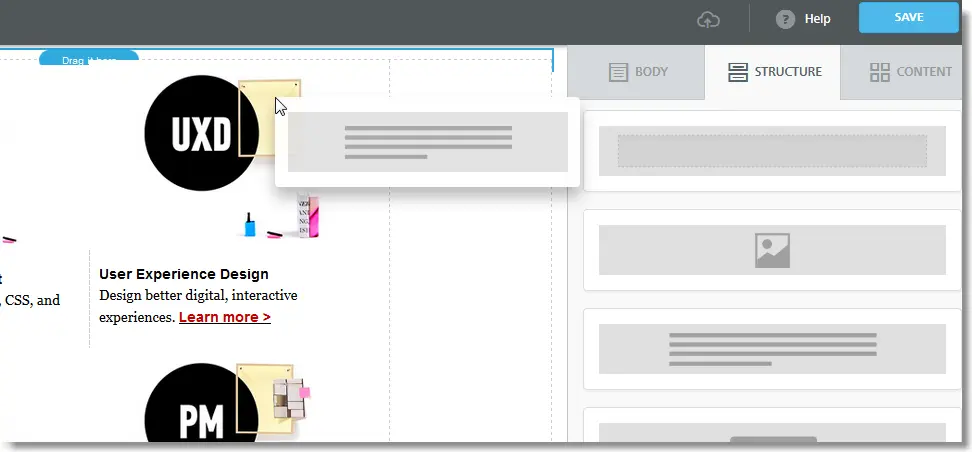
In the BEE editor we see that a 48px does the job.

What we like about this heading is that:
- It stands out... maybe too much, but for a good reason: it's the substance of what the email is about: think of it as your value proposition in one sentence, or better yet in only 3 words: you know the GA email is about how to "build your skills" with GA's online courses.
- The heading is very concise: only 3 words. Because it's so concise, you know (or should test!) that the heading will be visible and optimized in mobile inboxes, shown in the same row.
Reminder: Shorten your headings (and subject lines) for mobile. You'll see an improvement in your email metrics. Try it out!
Bonus Tip #4: Test your call-to-action (CTA) position
As email optimization experts know well, the position of your CTA button in your email matters.Put the CTA too early, then none of your subscribers will click (because the email and CTA position doesn't follow a logical thought process that your subscribers follow). Drop the CTA at the bottom and your subscribers wont even see it.Notice that the GA email has its main CTA at the very end... maybe too far at the end.

So, what's the best advice? The only reliable answer is through testing! As an optimization tip, I would test the "Get Started" CTA and integrate it at the beginning of the email (and perhaps eliminate a few secondary CTAs or additional links to click on).To keep things simple, I would actually test a CTA in the form of just simple text "Get started >" after the heading text. Something really easy to do and test. Who knows, this simple change could increase my click-through rates (or could also have a negative impact). The key is to test your hypothesis out! Here's where the CTA could be positioned:
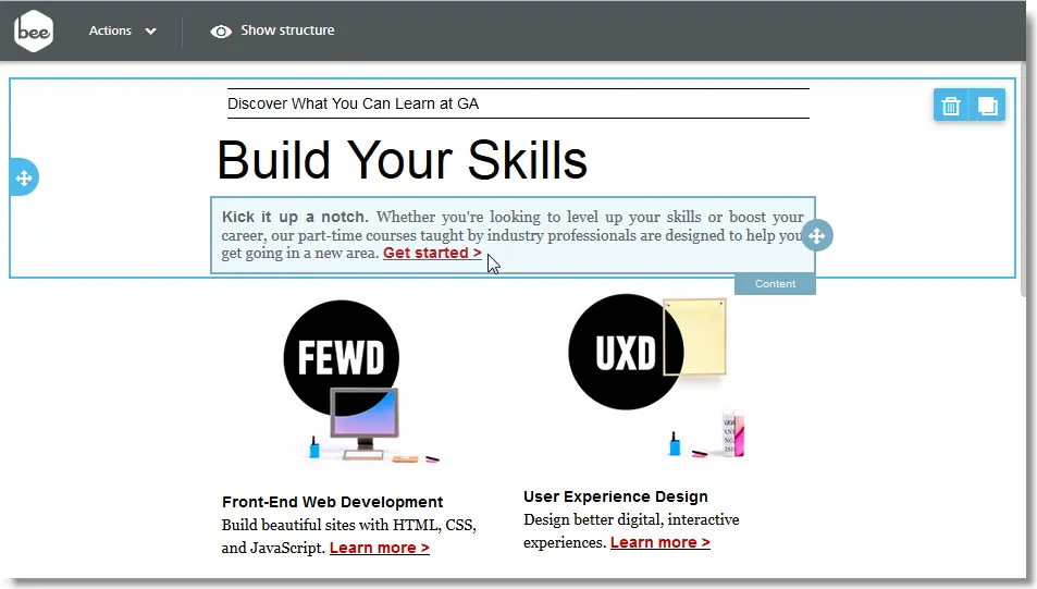
As you can see, with an editor likeBEE, it's very easy to quickly create multiple versions of the same email and use them in your tests.
Did you find these email design tips useful? Let us know in the comments below! And stay tuned for a new workshop every Friday!
