
As we roll into March, spring break is on our minds. Sandy beaches, sunshine, swimming. Mexico, Aruba, Jamaica. Even a staycation sounds good right about now. The point is, it's time for a break. And the tourism industry knows it. Our inboxes have been filling up with travel newsletters. Let's take a look athow their email designs stack up.
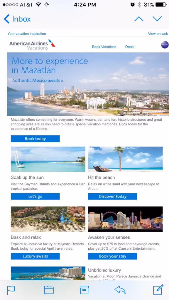
No vacation blues for American Airlines
American Airlines brings us something bright and blue with this inspiring photographicemail.
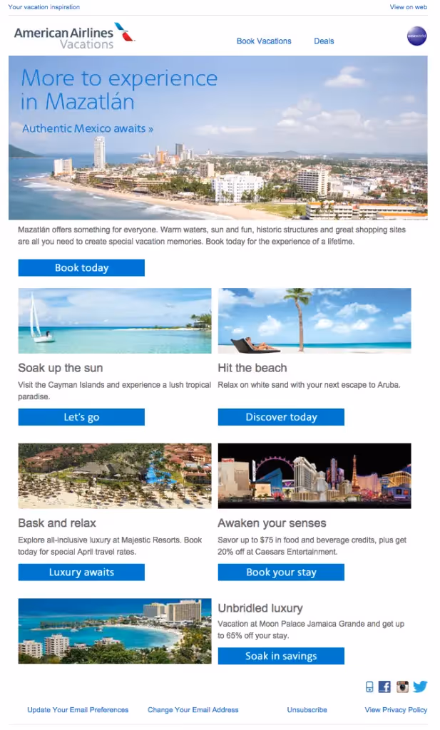
The imagesare stunning.All that sea-and-sky blue ties togetherwith the blue CTA buttons and links, evoking a sense of calm and cool that's bolstered by the gray type andample white space. The simple, streamlined header and grid-based layout make this email easy to read. We're in vacation mode already! If we had to make revisions to this email, the number one thing we'd recommend is making it mobile responsive! The grid design is a perfect foundation for a responsive email—it could easily be rearranged into a single column for easy reading—so we were bummed out to see it appear on our iPhone screen the same way it appears on desktop:
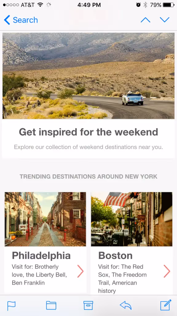
AirBNB keeps it simple and structured
Just like American Airlines' email, this message from AirBNB is photo-forward, inviting us to come along for the journey with beautiful images.
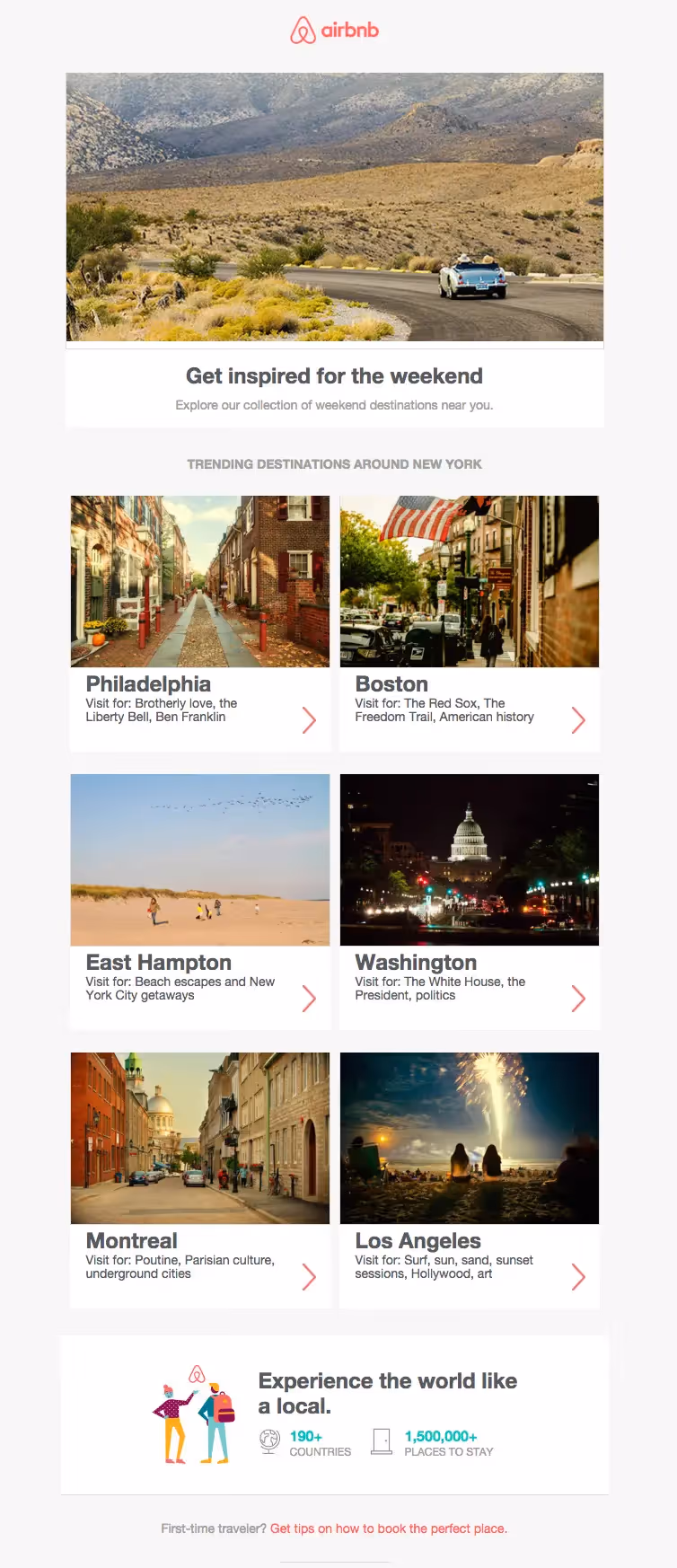
We love how the plain text in this email is short and to the point. Notice how the only full sentence is at the top of the email—Explore our collection of weekend destinations near you—while the rest of the photo descriptions simply list top reasons to visit each place. It's the perfect approach for on-the-go audiences skimming quickly through this email.The email's simplicity translates well on mobile, though having a responsive design would have been optimal for improving text legibility and image resolution on a smaller screen. And again, the grid-based design makes it easy to go responsive.
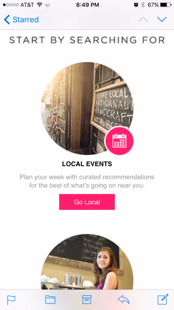
Hipmunk inspires with illustration
Hipmunk, the San Francisco-based online travel company, takes a break from the photo-intensive approach with this playful, illustrated email about booking flights:
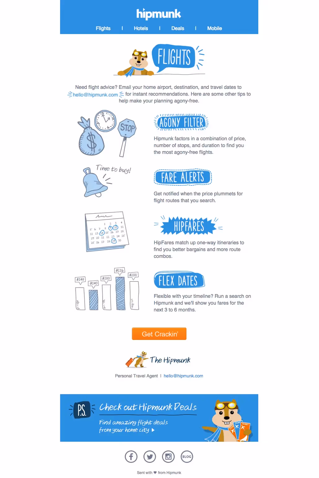
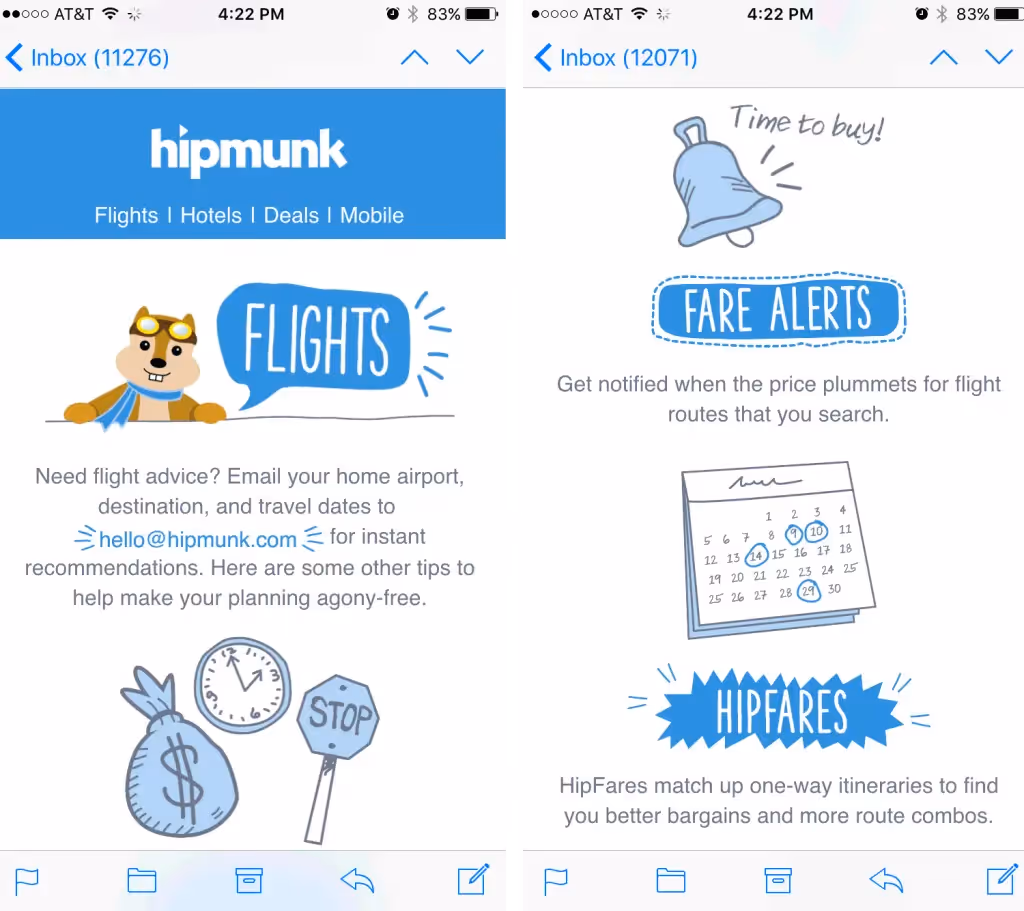
Hipmunk's email is so well executed. It's well organized: it begins with a clutter-freeheader with a blue HTML background color, announces Flights as its topic, then sets up the email in two sentences. The message is brief: it sticks to four key points,each with a unique illustrated header and 1-sentence description, coupled with a cute illustration to visually represent the point. The call-to-action button is a bright, contrasting color and is placed below the fold—but it should be bulletproof! We also love the all-blue color scheme; itreally brings togetherthe email and offers a cohesive, contemporary look. And, the email is responsive. It's easy to read and looks great on an iPhone screen:
Sharp and polished Jetsetter
Jetsetter, a company that offers travel deals, creates a clean, sleek email spotlighting sales on hotel stays and other travel essentials:
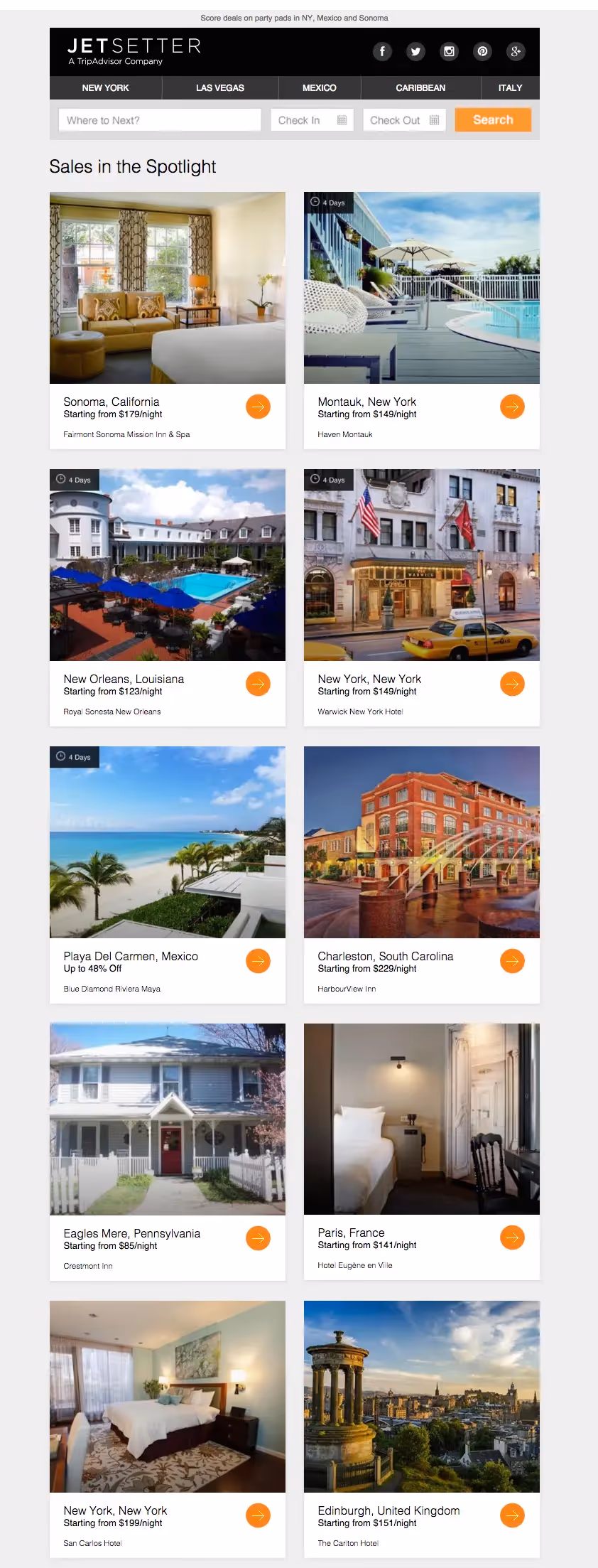
The email is actually quite long, so we're showing only a portion of it here. Because of its size, the full email is also clipped by Gmail, whichclips messageslarger than 102KB.To avoid a clipped message, Jetsetter could minimize the email's HTML.
![Gmail UI showing “[Message clipped] View entire message” indicating the email is too long and has been truncated.](https://cdn.prod.website-files.com/6495758c052e260635fe09fd/65eec68d399728e81a6d71aa_Screen-Shot-2016-03-02-at-7.51.55-PM.avif)
Aside from length,this grid-based email is well organized. The gray background color makes the modules stand out, and the orange arrows pop on the page. Plus, it looks really great on mobile. The header simplifies really cleanly, and the single-column design is optimal for scrolling through.

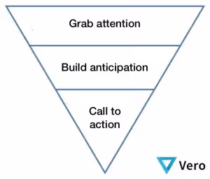
Travelocity follows the inverted pyramid
Travelocity takes a relatively traditional email design approach in this message about deal alerts:
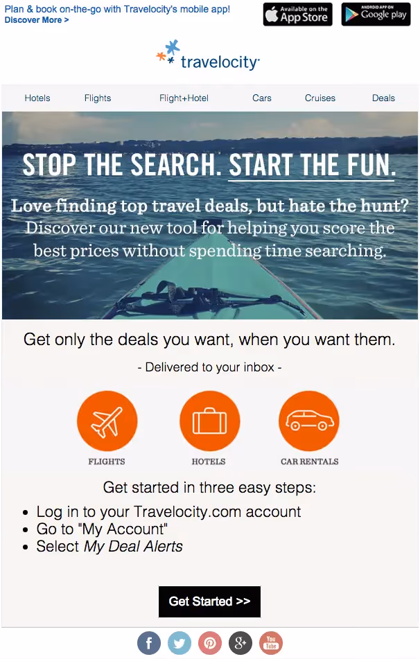
The emailfollows the inverted pyramid modelby grabbing attention at the top of the email, providing detail in the middle, then calling readers to act.
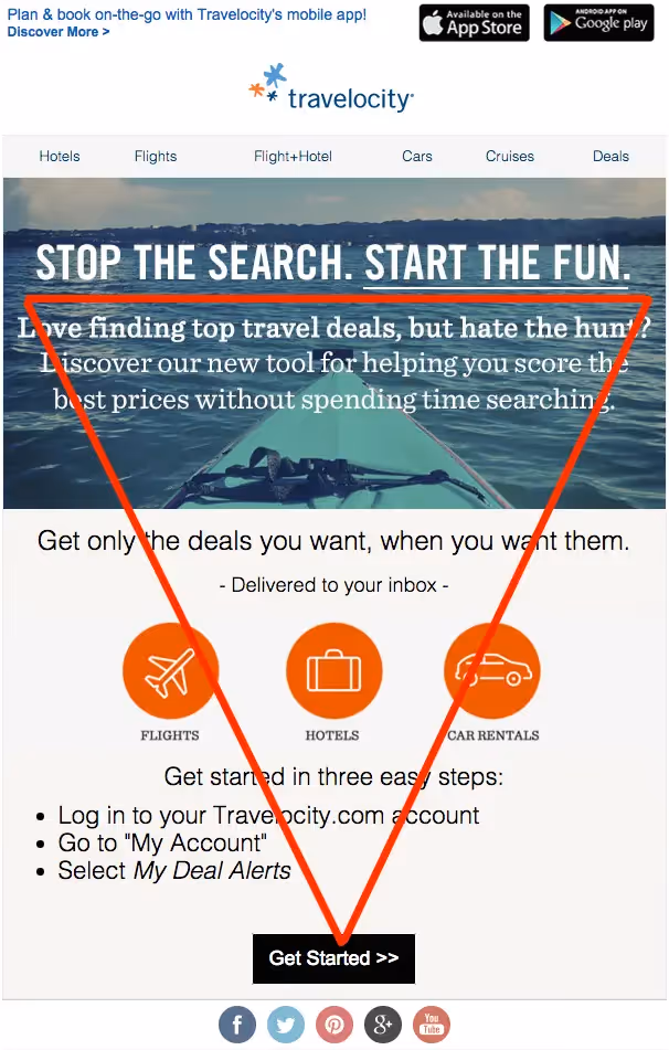
Despite its structure, the email would be stronger with less text. With a quick scan, it's hard to determine what exactly the email is asking readers to sign up for. What is it? Travelocity calls it "our new tool" but doesn't name it. Plus, the middle section, with the header "Get only the deals you want, when you want them" feels repetitive of the header text in the lead image. If it were up to us, we'd simplify and clarify this email, and we'd make the call-to-action clearer. For instance, it might say, "Sign up to receive my deal alerts" or "Start scoring deal alerts now."
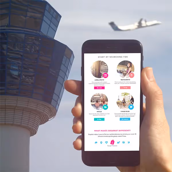
Colorful content goes with Gogobot
Gogobot, an app that helps you discover nearby events, restaurants, and hotels, sent us a stellar welcome email after signing up online:
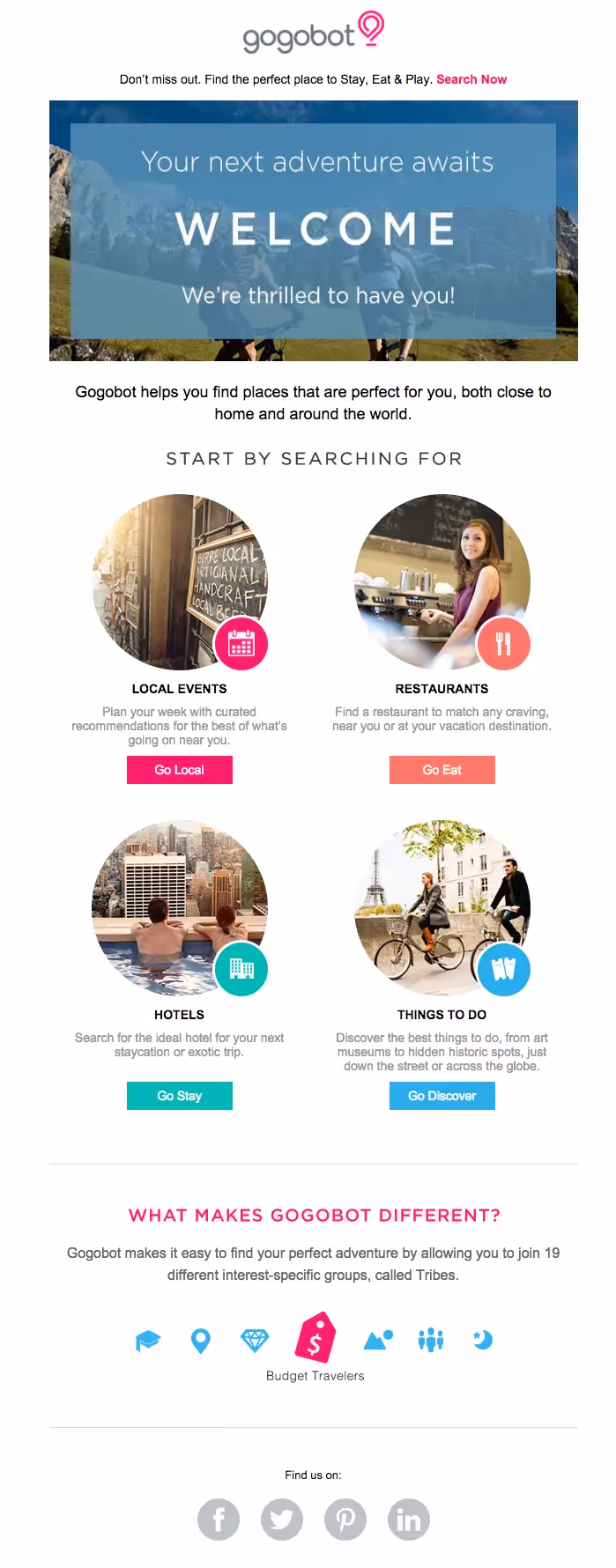
Unlike most of the other travel newsletters in this post, Gogobot uses a combination of illustration and photography, and breaks away from the monochromatic color scheme approach. Even though there's a variety of color and content here, they pull it off. Take the color scheme, for example. Bright pink is used as an accent color in the header and then again at the close of the email, in this animated GIF, which establishes balance and cohesion in the email:

That allows them to get a little bit more playful with color in the body content, where each illustrated icon matches the color of itscorresponding call to action button. And, the photos and icons both take on a circular shape. Plus, it's all on a grid, which makes the email feel organized and elegant. And—you guessed it—that means it's mobile responsive too! Here's how the email looks on an iPhone screen:
Wrapping Up
Travel newsletters run the gamut when it comes to email design, but most of these emailsdo a great job at optimizing their messages for a distracted audience. Here are some design tips we can take away from the travel industry:
- Use color to evoke emotion. Blue is great for the travel industry—it makes us feel tranquil and reminds us of the sky and sea. Study up on color with this infographic and consider what emotions your email could incite based on the color scheme.
- Skip full sentences. Use quick words and phrases that get your point across. Your email content should be a teaser.
- Have a simple email header. Your email is not a website. A bold HTML background color is a great way to make your header stand out.
- Illustrate your headers. Well-executed illustrations can grab attention and improve your email's structure.
- Optimize your CTA buttons by making them bulletproof, well-worded, and a strong contrasting color.
- Design for a mobile-first audience. Your email must be responsive! Design on a grid in the BEE editor and you're email will look good on any mobile device.


