
Earlier this week, we gotinspired by the email design of a recent webinar invitation email from Skillcrush, a coding academy that focuses on teaching women how to code. Their webinar invitation email had all the relevant information—event time, cost, key details, and a way to register—but they didn't get boxed in by the standard, bland email template we so often see... and that we start to tune out. Instead, they created an engaging, personality-packed webinar invitation email. There's plenty to learn from! Check out our email design tips on How Skillcrush Built a Unique Webinar Invitation Email.In today's workshop, we're going to focus on a key design element of the Skillcrush email: the bulletproof call-to-action (CTA) button. But first, what does bulletproof mean? It's a term used by email professionals for a CTA button, written in HTML, that renders across all inboxes and, because it's HTML code and not an image, the CTA button will always be shown, no matter what.Now that we know what a bulletproof button is, the next step is to figure out: how do we design one? And this is where it can be a little bit tricky for some. You can either turn a standard CTA button bulletproof by adding a few lines of HTML code or check that the email editor that you're using generates bulletproof buttons (and that those buttons are not simply images). We'll look at how to design a bulletproof button with the use of the BEE email editor.
How a bulletproof CTA button should look
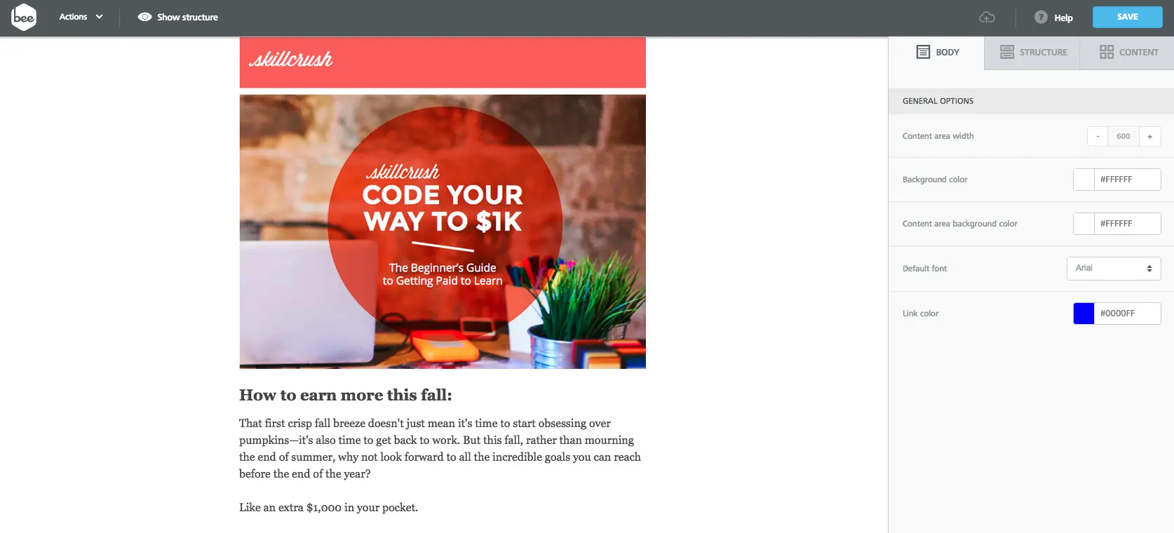
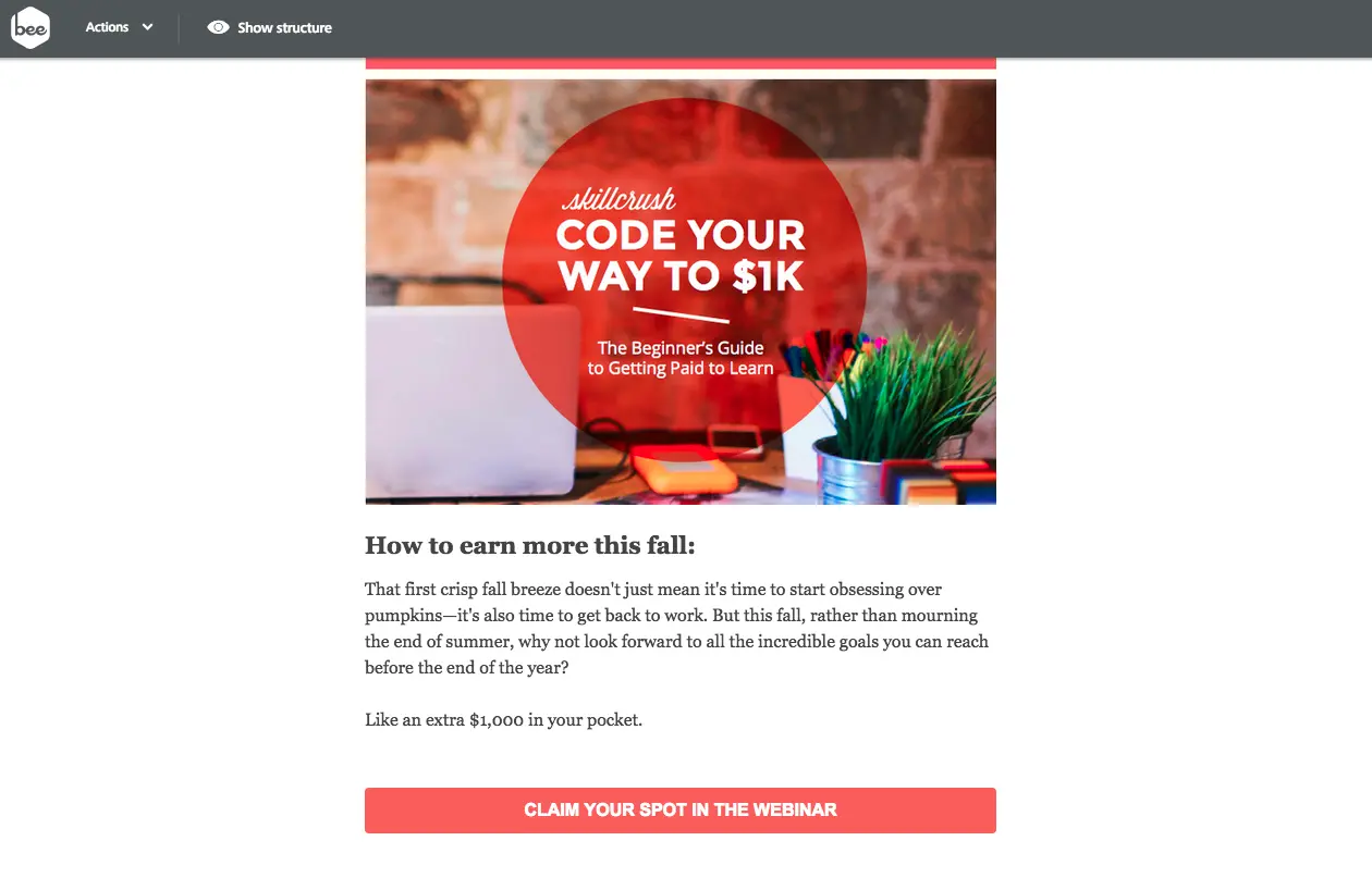
Let's start with a look at the bulletproof button from the Skillcrush email. For reference, here's the full email:

And here's a close-up of their unique call-to-action button:

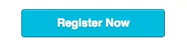
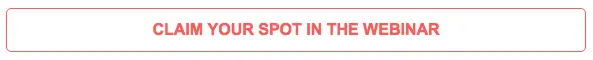
It's a refreshing change of pace fromthe typical "webinar blue" button weoften see, like this one:
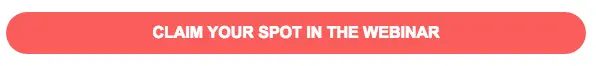
Notice how Skillcrush uses smart design tactics for its CTA button, which in turn reflectits modern, feminine, and personable brand:
- The button is on-brand pink with bright white text
- It's the full width of the email and doesn't have a bulky outline (like the black one around the "Register Now" button), evoking a light, modern feel
- "Claim your spot," with the use of a personal pronoun "your," has an approachable, friendly tone while still directing readers to act
But perhapsthe most important design feature ofthe CTA button is that it’sbulletproof, meaningthe button is written in HTML so that it fully renders on all inboxes. We can see how the button is shown even with images turned off on iPhone:

Let's now get much more hands-on and see how to design a bulletproof button ourselves and recreate the Skillcrush CTA button. We'll be using the BEE email editor, which generates bulletproof CTA buttons.
Be sure to follow along and open the BEE email editor in a new browser tab. The BEE email editor is free, online, and requires no registration. So, do give it a try!
Video Overview: How to design a bulletproof CTA button
As a quick overview, here's our video tutorial on how to design the bulletproof CTA button from the Skillcrush email in the BEE email editor:
A step-by-step guide in the BEE editor
Let's walk through how to easily create a stellar CTA button in the BEE editor, where we have full customization of width, border radius, border color, padding, and color and text styling.
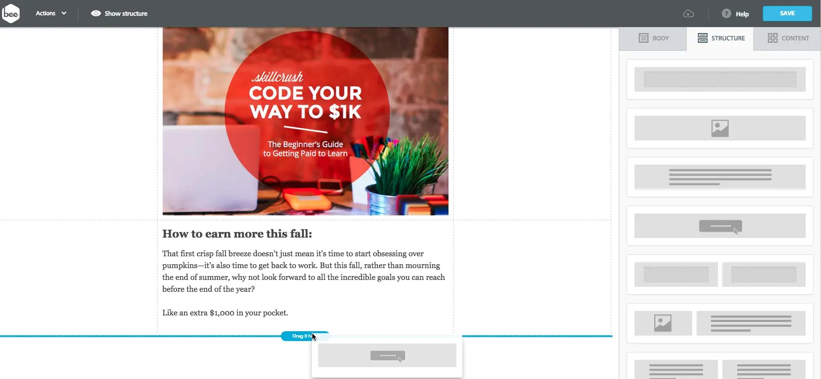
To get us started, we took a couple minutes to recreate the top portion of Skillcrush's email,populating abasic one-column templatewith the header image and intro content. (For a step-by-step guide on how to set up a modular single-column email, check out this workshop post).Now, let's create our button!Over in the Structure menu to the right, we'll grab a button content block and simply drag it into the body of our email.
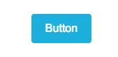
Notice that the default button is blue, rectangular, and centered on the page:
But there's a lot we can do to customize it! To match Skillcrush's button, we'll need to:
- Change the background color
- Update and style the text
- Increase the width and adjust the padding
- Insert a link
In the body of our email, we'll click on the button structure to activate it, then start making our adjustments in the Content menu on the right.
Button color
First, we'll set the button color to pink(#F16059 in hexidecimal format) to match Skillcrush.

Then, we'll update the text. As we type, the button automatically widens to accommodate our content:

We can keep our default font color (white #ffffff), font family (Arial), and font size (16px), but we'll make our messagebold (and be sure to type in all caps).
Full button width
Makingthe button stretch to the full width of the email body is easy. Back in the Content Properties menu, we'll adjustthe width slider to the right, up to 100%. From a design perspective, the full width makes sense: it mirrors the Skillcrush header at the top of the email, providing an aesthetically pleasing balance, and it also givesmobile readersmore space to click.

Finishing touches
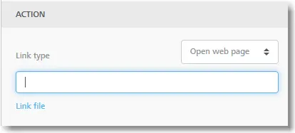
Under Content Padding, we'll make sure we have a padding of 5 px top and bottom.Let's also remember to insert a link to the button: in the same Content Properties menu we've been working from, we'll scroll to the Action section and paste in our link.
Now, we have a fully functional bulletproof CTA button, identical to the Skillcrush email! Wasn't that easy?
If you would like to further customize the CTA button, here are a few additional button design settings in the BEE editor:
Border radius
You can adjust the Border Radius to change your button's shape. From a design perspective, rectangular elements generally connote a senseof traditionalism, practicality, and balance, while circular elements can be perceived as softer and calming.
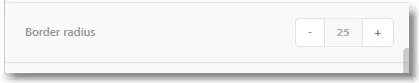
Here's a rounded version of our CTA button after adjusting theradius to25 px:
Button padding
We can also make the button taller (or shorter): make sure the "More options" button is turned on in the Content Padding section, and bump up thetop and bottom padding.

Here's our button with an upper and lower padding of 20 px.

Borders
Another adjustment we can make is the color and width of the button's border, found under Content Properties in the BEE editor. Notice how we have granular control on borders (to learn more watch a quick video tutorial on borders).
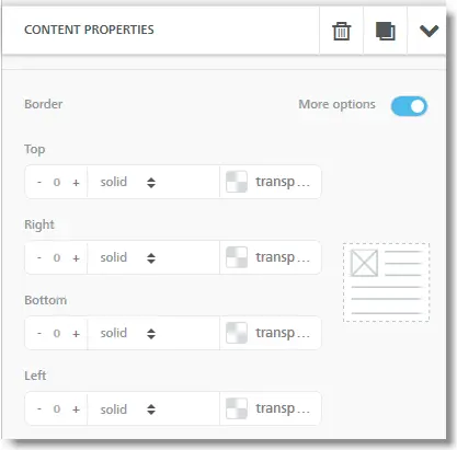
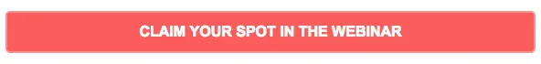
The traditional "Register Now" button we looked at earlier had a thin black line around it. In the Border settings in the BEE editor, we can play with different colors and thicknesses.A thin, light border adds a bit of depth:
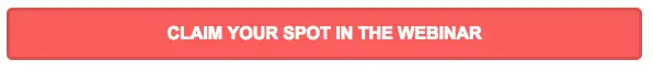
And slightly thicker, darker border is more prominent but has a similar effect:
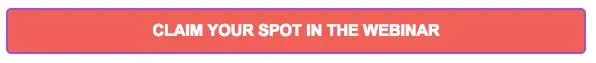
Switching to a totally different color generally detracts from the light, modern feel of the button:
But a border can also be useful in maintaininga light, airy, and modern look if weomit a background color, like this:
As you can see, we could spend probably all day customizing a CTA button in the BEE editor!
Our CTA button design takeaways
As you're designing your own emails and customizing your CTA button, hereare the key thingstokeep in mind:
- Buttons should be on-brand, too. Skillcrush does a great job of demonstrating how a well-designed button can go a long way in reflecting your brand so you can connect with your audience. Play with colors and styles to achieve a look that matches both your brand identity and your email's aesthetic. The button should attract attention (it should be obvious that it's a button) but not stick out like a sore thumb.
- Balance the size of your button. Bigger isn't always better. Don't make your readers feel like you're shoving a demand in their faces. Strike a balance by making your button wide if it's not too tall, or by making it a little taller if it's not too wide. Remember, readers on mobile devices or tablets should be able to easily click with a fingertip, so allow ample white space around your button.
- Don't forget content! "Register," "Learn more," "Sign up," and similar CTAs are overused. Think about how you can customize your message in a way that reflects the tone of your brand. Be sure to use a clear, direct action verb—and be concise. Try using personal pronouns like "my" and "your" that make your message friendly and engaging. You could try: "Reserve my spot now" or "Get my free ticket."
- Placement is key. Research has shown that placing a CTA button below the fold actually increases clicks by 304%! Let readers know what they're signing up for first—with great copy and visuals—then invite them to act. Skillcrush does exactly this by placing their CTA button last.
- Be bulletproof. Above all else, it's critical that your button looks great and works as it should, no matter the device or email inbox. Always use HTML instead of an image. We've seen that in the BEE editor, all buttons are bulletproof, so you'll never need to worry about how they'll render!
We have to ask: are your CTA buttons bulletproof? What did you think of our button design tips? Share your ideas and thoughts in the comments below!We'll see you in our next email design workshop, every Friday!