How many webinar invitation emails do you find in your inbox each week? You've probably seen dozens, if not hundreds, of webinar invitations over the course of your working life. And you’ve probably seen what has become the de facto webinar email campaign — a two-column email with the date and time of the event, a short description of why you might want to attend and a photo of the presenter, similar to this one from Compete, a software analytics company.

But you don’t have to conform to this standard template for a webinar email marketing campaign.The fact is, most webinar invitation emails don’t have a lot of personality. They give potential attendees the basic information they need (event time, duration, speakers, and a registration CTA button), but they don’t make you feel anything about the brand. They’re all business — they’re starkly minimalist, and they all seem to use that same light blue for the highlight color and call-to-action buttons.In this article, we want to share tips and examples to increase your conversions for your brand's webinar invitation emails. Subject line: Don’t miss Thursday’s webinar with Salesforce
Many businesses use webinars as a way to generate new leads for classes or businesses. Webinars can help you deepen your relationship with existing customers. And email invitations are crucial for getting potential customers to attend your online event. Marketers report that email drives 57% of webinar registrations.If you want people to show up at your webinar, sending the right email is essential.
Email drives 57% of webinar registrations. If you want people to show up at your webinar, sending the right email is essential.
So how can you turn the typical webinar invitation email template on its head and make it its own? Keep reading to find out!
Tip #1: Use good email headers to define your value proposition
A webinar isn’t something customers attend on a whim. It’s an investment of their valuable time. So your email needs to make it clear that your event is worth their while.When creating webinar invitation emails, it’s important to make clear the benefits of the webinar at the top of the email. In this example, a few simple lines of text were made that were compelling to the users and visually appealing.
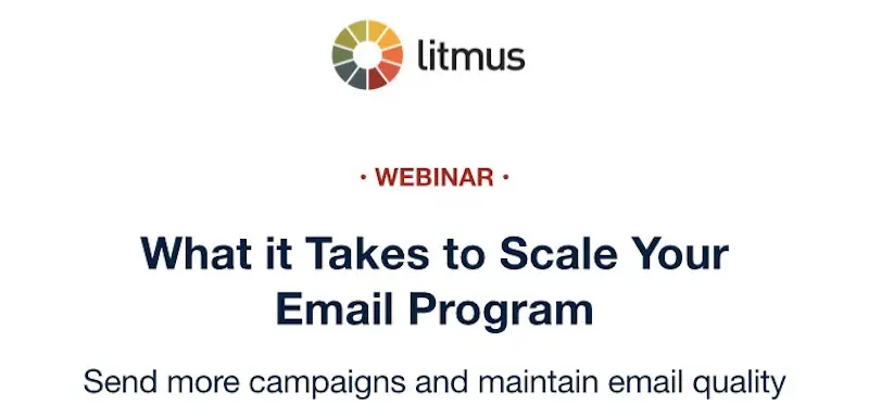
Additionally, in this example, the background of the email is white, helping the text pop. The word “Webinar” is written in the same dark red that we can see in the color wheel of the brand’s logo. The clear language means that people who receive this email will immediately understand that this webinar is about smart growth — scaling up your email program without sacrificing quality.
Tip #2: Optimize your webinar subject lines
No pressure, but your subject line is one of the most critical parts of your email because it’s a key factor in whether recipients open the email at all. In fact, 33% of people use only the subject line to decide whether to open an email.So how do you write killer webinar subject lines that make recipients want to open them? Here are a few tips to keep in mind:
- Use a relatable, engaging tone that isn’t overly stiff.
- Include numbers when possible, such as, “Can this 20-minute webinar change your life?”
- Write your subject line in the form of a question to spark interest.
- Use emojis to add visual interest and grab recipients’ attention (just don’t go overboard with half a dozen emojis, as this could look unprofessional - one or two will make a greater impact).
- Include the recipient’s name if you have this data in your mailing list, because this gets the recipient’s attention and engages them more directly.
- Be concise - most email interfaces can only display six or seven words in the subject, so make sure your subject line (or at least the most valuable part of it) will be visible.
Writing effective webinar subject lines does take skill and practice, but you’ll get the hang of it. To give you a helping hand, here are some examples of subject lines you can tweak:
- How much do you know about ? Brush up with our webinar.
- Join us for our webinar! 😀
- Learn about in 30 minutes!⏱️ Join our webinar.
- Only 20 spots left for our webinar! Claim your spot now.
- New webinar! Join us to learn about .
- Why is everyone talking about ? We’ll tell you in our webinar.
- You busy on ? Hop on our webinar!
- , you’re invited to our latest webinar!
- Free webinar for you! 🤑
- We have secrets waiting for you.
Tip #3: Choose the best time to hold a webinar and highlight it
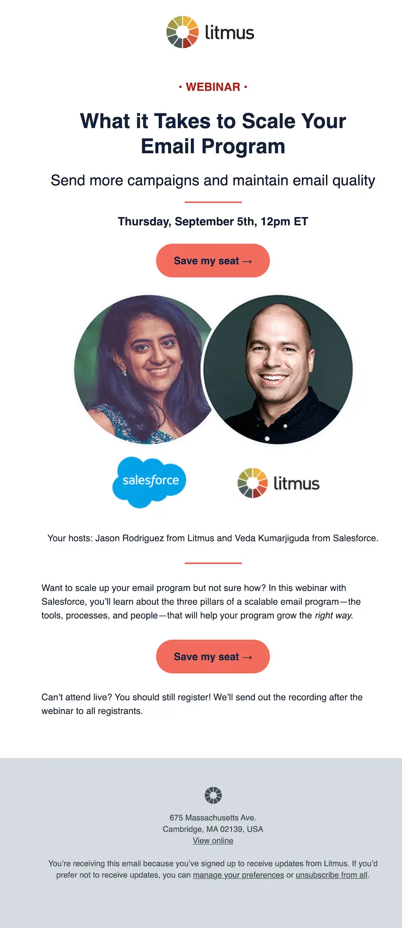
The most important thing a reader can take away from a webinar invitation email? Knowing when the webinar is!In this next webinar invitation email example, the event day is highlighted right under the value proposition so subscribers can’t miss it. The time of the event noted that the webinar is in Eastern Time and appears right next to the date, so readers will easily know exactly when this webinar is taking place.The first CTA button in this email appears right under the date and time — we’ll discuss the CTAs in a minute.

Tip #4: Offer a description of a webinar's features
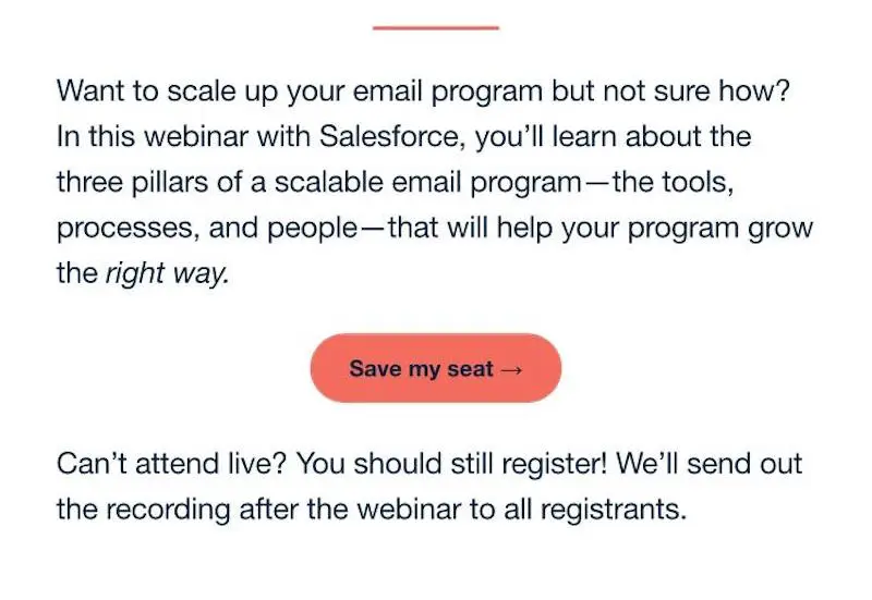
With email webinar invitations, it’s important to get across a comprehensive description of the webinar without being wordy. In this example, we first see photos of the webinar hosts.This is helpful because faces are often easier for people to remember than names or other details. Logos beneath the pictures are also helpful in boosting brand awareness in an easy-to-digest way.The last thing that is important to include is to reiterate with a few simple lines to describe how attendees will benefit from this webinar. The email copy in the example shown lists three main things that the webinar will teach: the tools, processes, and people you need for a scalable email program.
TIP #5: Create a CTA button to get the attention of your audience
Your webinar won’t be a success if people don’t sign up to attend. So your call to action button is one of the most important pieces of your webinar invitation email.Don’t be afraid to try a unique call-to-action button. CTA buttons and copy are a great way to A/B test and see what works for your audience. Trying to be safe in webinar invitation emails can provide the opposite result than intended. For example, the button down below.

This is what we like to call “webinar blue,” and frankly, it’s a bit overused.Brands should consider limiting the use of this shade and using a color relevant to their brand. For example, adding a hover color is one way to add some dynamism to your email and help buttons stand out. Adding elements like an arrow to CTA buttons is also a great way to add some movement.
Examine Your Webinar Email Sequence
Convincing people to sign up for your webinar is an orchestrated dance, not a single move. To optimize both your sign-ups and your attendance, you need a well-crafted and strategic sequence of emails rather than just one. After all, your audience is busy, and they need to see the value in your webinar to deem it worthy of their time.You should be sending out a series of emails, each designed specifically for a different stage in the audience’s journey. There are three essential steps in your campaign: the announcement, the invitations, and the follow-ups.
Webinar Announcement Email
Your webinar announcement email is the first opportunity for recipients to hear about (and get excited about) your webinar. This email should be full of energy and should announce and celebrate your webinar as the fantastic opportunity that it is. This is your chance to start building recognition and enthusiasm for the webinar. If you have a sign-up link ready, include it to capture the attendees who are ready to sign up right away, but you can also leave them on a cliff-hanger with a “stay tuned for more details” if you’re still putting together the essentials.
Webinar Invite Email
Your email recipients are already excited or intrigued about your webinar, so the invitation email is your opportunity to draw them in and convince them to sign up. This invitation should include all the essential details, like when the webinar is and who’s presenting, but it should also focus on presenting the value of the webinar.Explicitly tell readers how the webinar will benefit them. Maybe it will allow them to increase their sales, live a more organized life, deal with difficult clients, create an amazing dating app profile, or whatever the goal may be. Paint a picture of how their life or business will improve from this informational webinar.And, of course, the sign-up button should be front and center in this invitation.
Follow-Up Emails
After your webinar invitation, follow-up emails can take a few different forms. For recipients who haven’t yet signed up, you can send further invitation emails reminding them to sign up. These can further expand on your value proposition from your invitation email or they can add an escalating sense of urgency, like “only 10 spots left” or “sign up in the next 24 hours to get a bonus special offer.”For attendees who have already signed up, follow-up emails should focus on reminding them about the webinar as well as giving them more reasons to get excited about the webinar and encouraging them to share the webinar with others.
Webinar invitation email best practices
- Try a unique header that will grab your readers' attention and set your invitation apart. It's important to know your audience and design a header that's right for them.
- Offer plenty of details about the webinar's contents. If they're going to invest their time, your potential webinar attendees want to know exactly what they're going to get out of it. Give them the details of what you’re going to cover and how that information will impact them.
- Use short paragraphs and bullets to make the email readable. A detailed description will only entice your readers if they're able to read it easily. Break up long text into shorter paragraphs to make your description scannable. Then give readers bite-sized nuggets in bullet points to highlight key content.
- Make the date and time of your webinar prominent. The time and date of your event are the most important information in your email. Make sure it's easy to see when the webinar is taking place.
- Experiment with the colors and size of your CTA button. Litmus succeeds with a bulletproof call-to-action button that renders across all inboxes. Your CTA text should be similarly prominent and enticing.
3 Additional webinar invitation emails
Looking for inspiration to get some ideas flowing as you start building your webinar invitation email? These examples showcase some effective real-world webinar invitation emails to jumpstart your brainstorming.
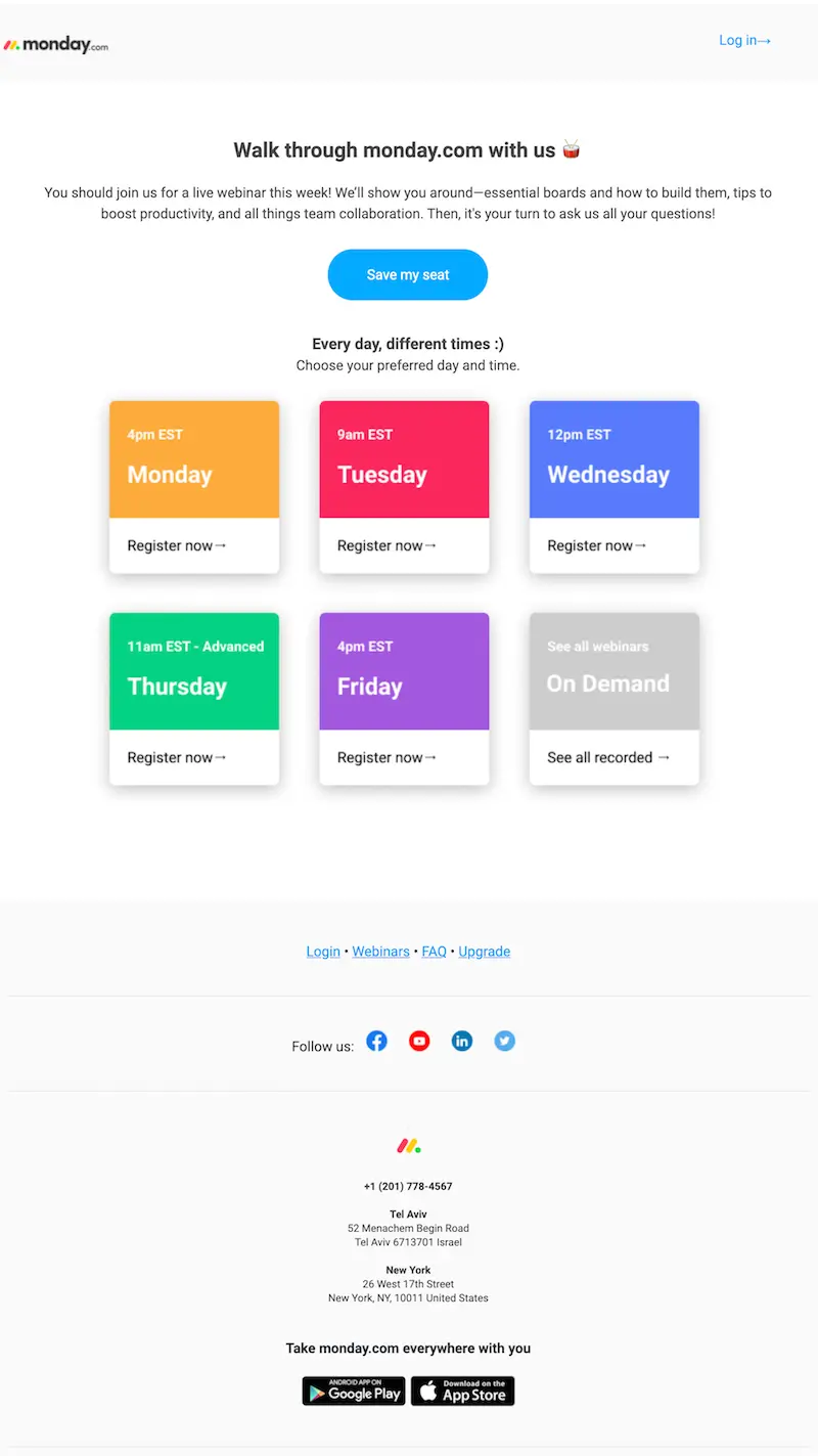
Monday.com
Subject line: Join one of our daily webinars on remote work
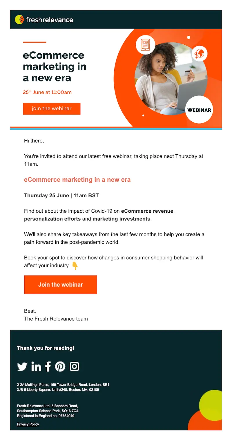
Fresh Relevance
Subject line: Webinar invitation: Ecommerce marketing in a new era
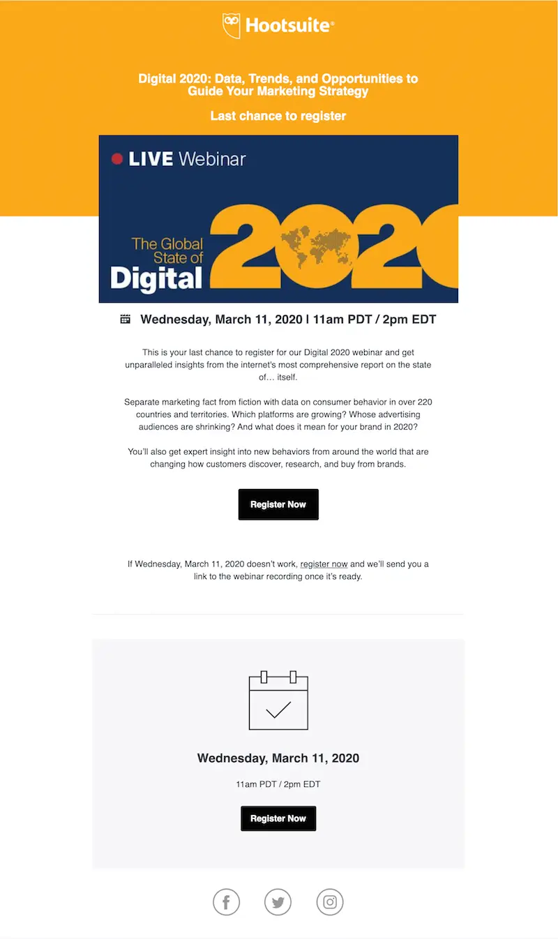
HootsuiteSubject line: Digital 2020 | Last chance to register!
Get Started with an email webinar template
One of the best ways to kick off your webinar email campaign is to start with a pre-designed template. With a well-constructed template, you’ll be able to begin with a strong foundation and customize it to suit your brand, your audience, and your needs.Check out the abundance of webinar email templates from Beefree to start. These templates are designed by email marketing pros with all the best practices baked in, so you can take advantage of that expertise wherever possible while bringing your own skills into the mix because these templates are user-friendly and easy to customize.
Wrap-up: Design your own webinar invitation email
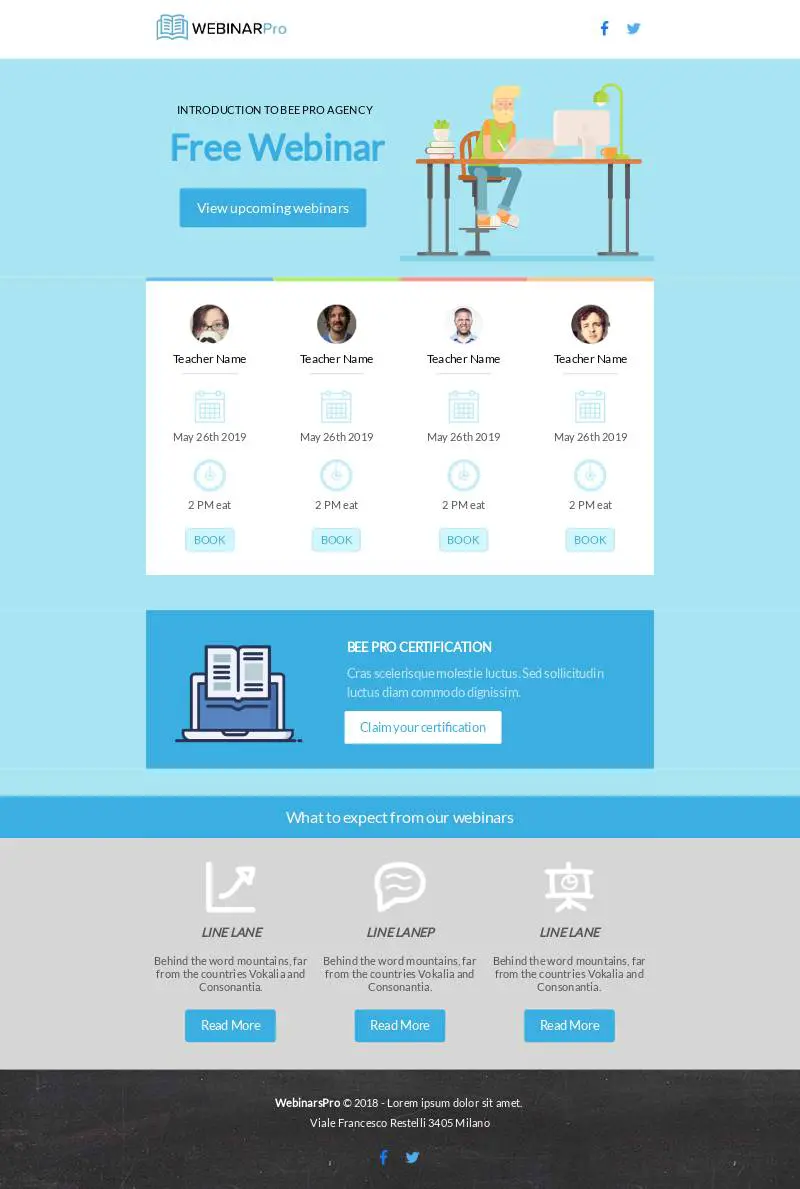
If you're looking for a way to build your own webinar invitation email, try starting with a free email template in BEE. Choose our webinar template designed by Andrea Dall’Ara or browse through template categories like health and wellness, food and beverage, fashion, and more to find the perfect template to promote your next webinar.
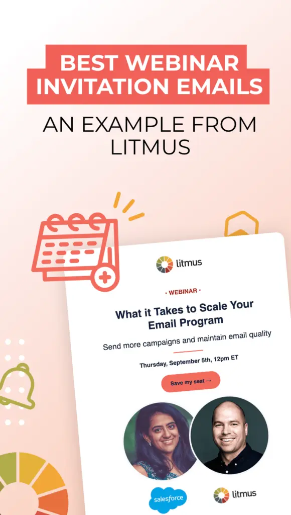
Share this post with your friends! Pin it on Pinterest ?
Editor’s Note: This post was updated on April 2023 to ensure accuracy and comprehensiveness.
