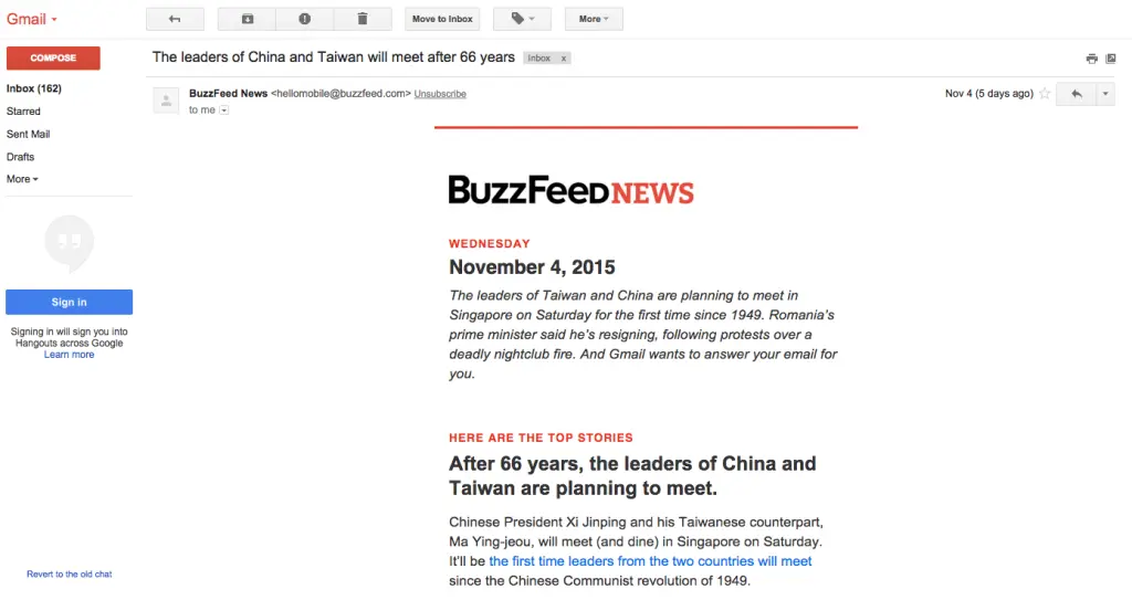
Originally published on November 13, 2015. Last updated August 27, 2021.Brands tend to sit at two ends of the email design spectrum, sending either image-heavy or text-heavy messages. Which design style gets greater results? It’s helpful for email marketers to take a closer look at these preferences and trends for their subscribers.When it comes to email formatting trends, a healthy content-to-image ratio is a recommended email design best practice. With that being said, text-heavy email is appealing because it keeps the email simple and straight-forward. Many brands take the text-heavy approach including this BuzzFeed News example:

Instead of asking readers to click to read like an image-heavy email, content is placed directly in the email itself. BuzzFeed, Vice, The Skimm, Mic, and others are doing this. This method curates and distills stories, leaving no onus on the reader to choose what to click from a collection of headlines. It’s a hassle-free email filled with solid information.
Email formatting: Should I go text-heavy or image-heavy?
Like anything else, there are pros and cons to both image-heavy and text-heavy email formatting approaches. Consider how your subscribers prefer to be communicated with and what email formatting aligns best with your brand identity.When taking a closer look at text-heavy email formatting, some pros include:
- Increased deliverability. Using minimal images helps emails avoid getting flagged by spam filters.
- Feels more genuine. Text-heavy emails include more personalized copy to create a more authentic connection with subscribers.
- Passes accessibility standards. Screen readers won’t have an issue with more live text, and messages will easily translate to whatever language is needed.
- Easy to create. You don’t need extensive graphic design skills to create a text-heavy email. Smaller marketing teams and freelancers drive successful marketing campaigns by crafting more meaningful content.
Also, keep an eye on your email message size. Note that if the size exceeds a certain limit – regardless if it’s text-heavy or image-heavy – it’s possible that your email message clips for some subscribers.
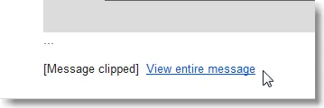
For example, Gmail clipping occurs when your email message is too large, and this becomes a problem if a majority of your mailing list subscribers are on Gmail. When using any email service provider, your best solution to avoid clipping is to reduce the total amount of content in your emails and optimize for mobile devices.If you are choosing between a text-heavy or image-heavy email design it’s best to stick with a text-heavy design for a more authentic, perfectly rendering email campaign.
Text-heavy email formatting best practices
Strategic email formatting weighs heavily on your subscribers’ preferences. Which means that some email marketers will have more success following an image-heavy email format. But if you’ve found that text-heavy emails work best for your campaigns, then it’s best to focus on enhancing those emails. Let’s pinpoint some text-heavy email best practices through brands who did it well.
Create a successful text hierarchy
Place content into your email in a way that makes it easy for subscribers to scan, skim and interpret the main idea of your email message. Your text hierarchy is how you section off blocks of image and copy throughout your email.Like a traditional print newspaper, for example. Print newspapers start off strong with a big story on their front page with a bold headline and eye-catching image. This is followed by multiple subsections that contain smaller news stories.Implement a similar text hierarchy for your emails. Like this BuzzFeed email example, they implement a hierarchy by explicitly stating, “Here are the top stories.”
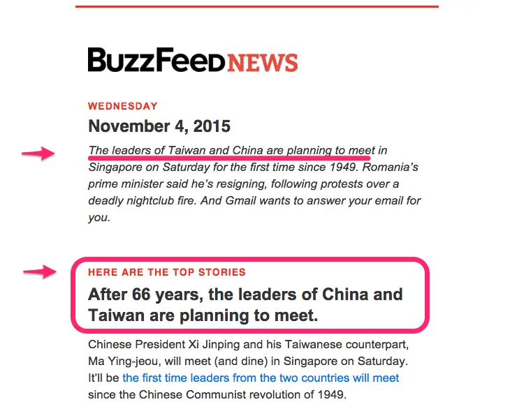
Establish a hierarchy by prioritizing content to reflect what’s most valuable to your subscribers. Once your hierarchy is set, begin to explore heavier format-related details.
Set a max-width
When lines of text endlessly stretch across a screen, it’s easy for subscribers to lose track of where they left off in a paragraph.This is especially true with emails being viewed on many different devices. It’s a good idea to set the max width of your email to around 500 pixels. This ensures that your email will render at a readable size on wider devices such as on desktop and tablets.To optimize for mobile, keep that same width, but double check that mobile view looks correct.Take this BuzzFeed email as an example: it’s a short of 500 pixels wide. On a large desktop screen, there’s plenty of white space on both sides. This white space won’t bother your desktop readers, and it will make your email easy-to-read on mobile devices.
Stick to one or two email fonts
Keep it simple and stick to one or two fonts in your email. Arial, Georgia and Helvetica are popular email-safe fonts. They are reliable classic, elegant and easy to read.BuzzFeed uses Arial along with Helvetica for section headers. Once you’ve established your font, you should implement more structure and styling techniques to improve readability.
Distinguish section headers and headlines
Headers are incredibly important to break up the flow of text and establish structure in email. Buzzfeed uses consistently styled section headers (Helvetica, caps, red) and headlines (Arial, about 2x body size, bold). As a reader, this makes it super easy to skim with clear transitioning into new sections and big, bold headlines.Mic, a news publication, takes a similar approach with their daily newsletter. The section header, “Today’s Talking Points,” is in a different font (Avenir) and is gray and all-caps, while the major takeaways in the content below are bolded with no line breaks or size differences.
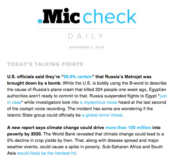
Note the use of all caps in the header. Most designers agree that lowercase letters are easier to read (they’re more distinguishable, with ascenders, descenders and modulated widths that capital letters lack). So, all-caps style should be used sparingly in emails.As for headers, their style should serve the purpose of setting text apart from the rest of the content. The font size of your headers should be at least twice as large as body copy, with generous line breaks between sections (at least the height of a full line of text).
Don’t over-format your email
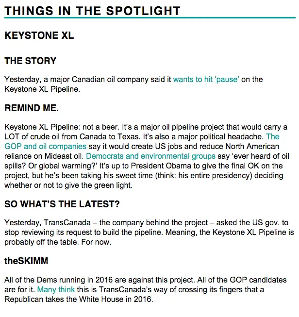
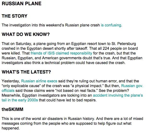
Notice that BuzzFeed and Mic don’t focus on stylizing their body text much. After the header, their text is all the same size, font, and color, minus their links.The media company, The Skimm, takes a similar approach. The body copy is all the same size, color, and font, while headers are in all-caps and bold (same font and color as body text). Here’s a story from one of their newsletters:
It’s tempting to bold, italicize, underline and play with color, but it’s better to resist. A minimalistic approach to body copy is the best for readability, while also emphasizing your email’s main idea and CTA.
Capitalize on color
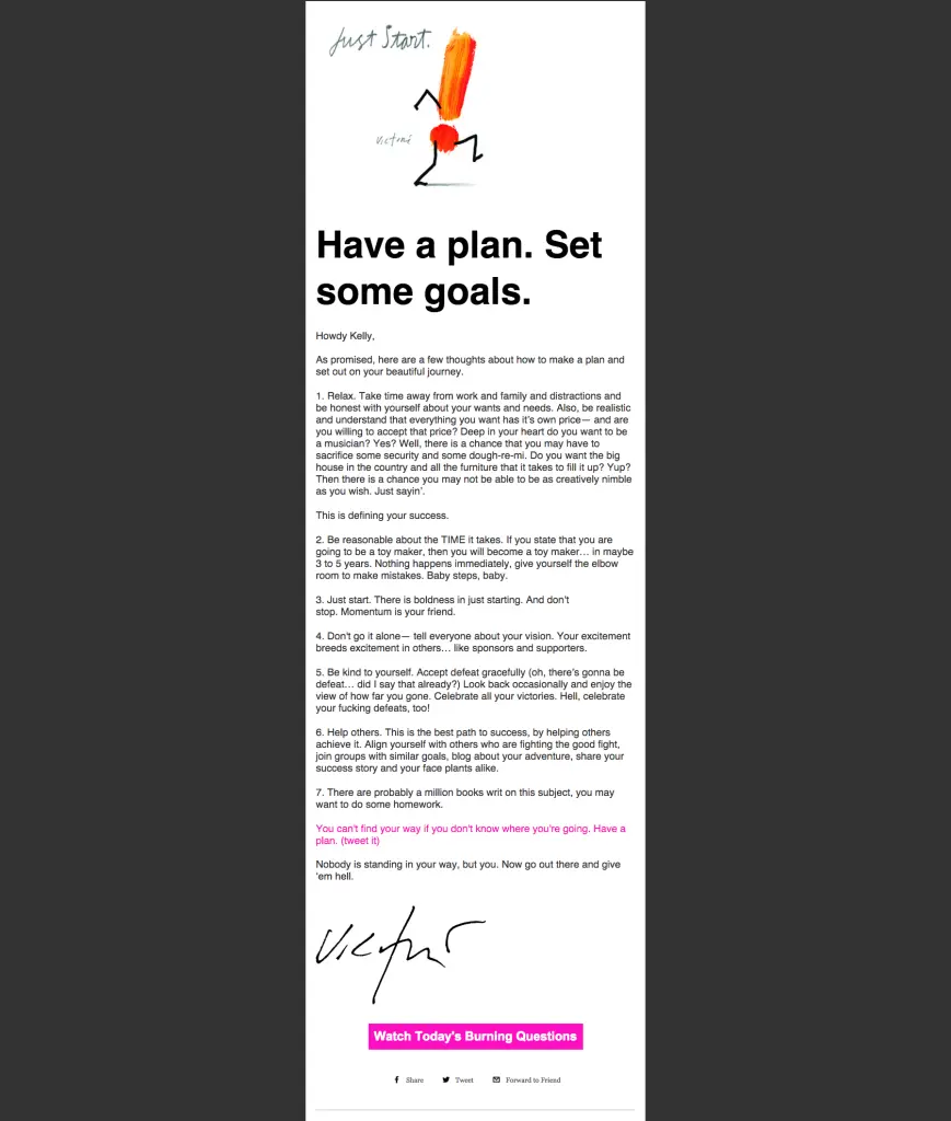
Color is most effective in your links and headers. Capitalize on branding your email by using one on-brand color. The Skimm and Mic both make links appear in their brand color, while BuzzFeed leaves links in their usual blue shade but uses red for their section headers.Here’s another example of great color use in a text-heavy email from artist and designer James Victore, who sends out a weekly inspirational email. The CTAs stand out with the vibrant shade of pink, which is a bright juxtaposition to the black-and-white email:
Remember line height and spacing
A good rule of thumb is to set your line height to be at least 1.3x the height of your letters. So if your body copy is 12pt, your line height should be 16pt. This keeps a comfortable distance between lines, optimizing readability. Copy should never appear too tight or too loose.Likewise, a break between sections is usually the height of a full line of text. Check out how The Skimm optimizes line breaks to structure their emails. Notice the main header section and the sub-headers look similar; instead of changing the typeface format, they’ve varied the line breaks to distinguish hierarchy—i.e., the space after “Russian Plane” is greater than the space left after “The Story.”
Left-align your text
Designers recommend that you should left-align your email copy. We read from left-to-right, and newsletters are best formatted that way. Don’t be tempted to center-align your headers or copy; keep it easy to read with left alignment. All the examples we’ve covered in this post have left-adjusted content.
Moderate white space with padding
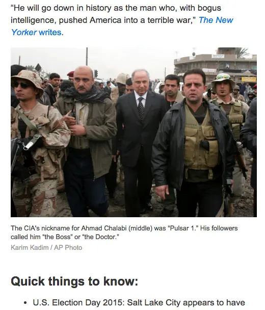
The space between your content and the container filled with that content is referred to as padding. When you’re sending out a text-heavy email, moderate white space primarily with line breaks and line height. Then when you add images and other design elements between text structures, adjust the padding to make sure the space above and below it is proportionate to line breaks in your text.In other words, the spacing should be relatively equal between elements. Do this by adjusting the padding above and below a structure. Below, we see how BuzzFeed moderates the space between the end of a paragraph and an image with padding, and then between the image caption and the start of a new section.
Give it a try in BEE Pro
When in doubt, keep it simple. The quality of your content is what subscribers signed up for, so avoid getting in-between the message and its readers with a distracting formatting. Try out these design tips in BEE Pro.
