Originally published on December 17, 2020. Last updated September 10, 2021.Your font choice plays a large role in how customers perceive your brand. It dictates the appearance and feel to your email or landing page. While there is a long list of fonts available to use, don't let choosing the right one intimidate you.Each font has its own personality. When choosing the best fonts for emails and landing pages, look further than appearances, think about your customers’ motivations, font compatibility and how your fonts work to create a cohesive, readable piece.The perfect font will evoke emotion and leave a lasting impression on your customers, but most importantly it will be web safe.Web safe fonts are fonts that display on any application and are seen on any device. They are perfect for emails and landing pages because they are default fonts found on all computers and devices. They are trusted to clearly get your message across no matter what.Implement these email safe fonts and best practices to leave a lasting impression on your customers.
The perfect font will evoke emotion and leave a lasting impression on your customers, but most importantly it will be web safe.
Web-safe fonts you should use
There are a handful of fonts that render correctly in about any environment. These fonts are called “web-safe” fonts and are guaranteed to be the best fonts for email marketing. Although it’s tempting to choose cursive fonts, Comic Sans MS or Kristen ITC, when designing for email and landing pages, stick to these fonts instead:
- Arial - flexible, simple
- Roboto - certain, distinct
- Georgia - authoritative, formal
- Verdana - clear, direct
- Helvetica - modern, bold
- Open Sans - friendly, minimal
- Tahoma - welcoming, humanist
- Times New Roman - traditional, reliable
- Raleway - elegant, smooth
These fonts have great readability, which means a majority of email service providers will showcase your chosen font in the way you intended it to be seen. Use these fonts freely in all your email and landing page designs. While this collection seems small compared to all the fonts that are out there, it’s important to stick to these fonts to ensure that all emails will be received on all email service providers. To add variety to your designs, get creative with placement, color and other design elements for these fonts throughout your emails and landing pages.
How to choose the best fonts for email
The best font for email marketing should be readable and reinforcing your brand to keep you out of the spam box. Consider how your email or landing page is formatted: Are they more text-heavy or image-heavy? Match a font that is compatible with the format you decide to use; a text-heavy format should use a more simplistic style font while image-heavy will allow for more variety.Remember to keep your fonts consistent between content. The fonts you use for your emails are the same ones you use for your landing pages. This way, customers will begin to recognize your brand style more, ultimately reinforcing your brand identity. Keep this in mind and use these best practices to guide your font choice.
Consider your brand
The fonts you use will depend in part on your industry and the nature of your business. An elegant jewelry brand like Laura Lombardi Jewelry selected Script style fonts that are graceful and stylish:Subject line: It’s here! ✨ Our annual holiday sale starts now.

…whereas the sturdy, Serif fonts used by REI are a great fit for this outdoorsy brand:Subject line: Let’s make the holidays as easy as possible

Create a list of words that describe your brand best. Consider how you are going to incorporate those words into your emails and landing pages. Then, when choosing a font, ask yourself:Does your brand carry a…
- Cheerful or serious tone
- Professional or playful
- Formal or casual
Decide how you want subscribers to perceive your brand. After pinpointing adjectives to describe that tone, refer back to the web-safe fonts to match-up your desired tone with a few of the font descriptions listed. The best font to use for email marketing is a font that aligns with your brand’s personality.
Decide on how many fonts to use
How many fonts are too many? As a general rule of thumb, stick to a maximum of three fonts. Too many fonts will clutter your email or landing page and distract your subscribers.Limiting your fonts doesn’t mean you have to limit your creativity. Add variety to your designs by changing up the size and typographical emphasis you use. Try bolding or italicizing certain phrases or use all caps for certain words. For example, Golde uses different font sizes and even bolds certain words in that same font. The result is an eye-catching, skimmable email that looks uniform.Subject line: IT’S HERE

Choose header and body fonts
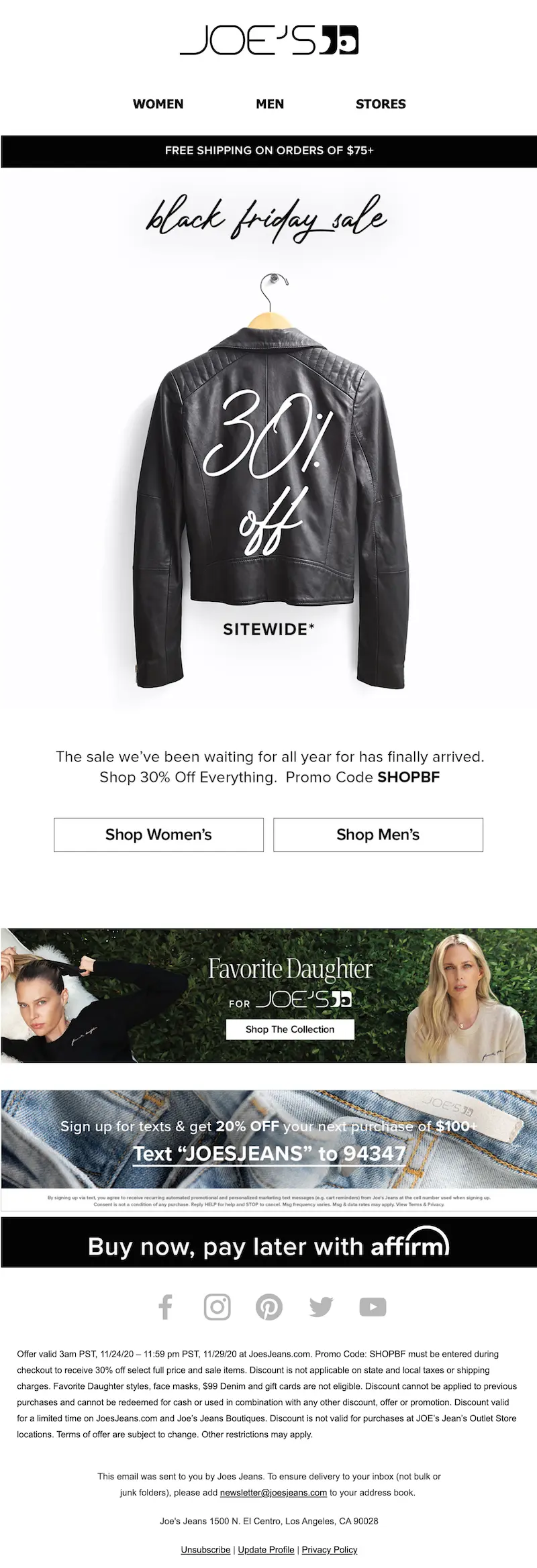
Consider selecting different fonts for the header and body of your email or landing page to make your designs more visually engaging. Header fonts should stand out and be eye-catching to subscribers. Body fonts, however, need to be more legible since they contain important supporting information. In this Joe’s Jeans example, the “Black Friday Sale” text is in a smooth, Script font which stands out and plays into the text hierarchy. The rest of the text is in a more straightforward font making it clear on what this sale has to offer. Subject line: Sweaters, cardigans, and knitwear

Select the best font size for your email
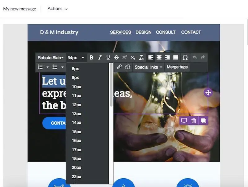
After you’ve settled on your web-safe font, you’ll want to consider the best font size to use for emails and landing pages. We recommend a range of 20-28 pixels for your headings and 12-14 pixels for your body copy for desktop and mobile devices.

Consider color for your professional email fonts
Your font color is another useful aspect to consider when thinking about the typography in your email or landing page. Color has a major impact on how customers perceive your brand. It shares insight on your brand personality and characteristics because color evokes emotion, meaning subscribers will get a feel of your brand values based on your color choices.When choosing a font color, consider what service or product you provide and what emotions you want customers to feel about your brand. Then, decide on a font color that compliments the background of your design. Don’t go overboard — two or three font colors is plenty. Black or grey body copy is always a safe, readable choice. This Dropps message uses blue headers and easily visible body copy.Subject line: Take 30% off our reusable wool dryer balls ?

Use web-safe fonts for your emails and landing pages
The typography choices you make are crucial to the overall success of your marketing campaigns. Design in BEE Pro to quickly create perfect emails and landing pages with web-safe fonts. BEE makes it easy to pick your font and even set up and save your brand kit to easily access your desired fonts each time you head into the design suite. Start designing from scratch or explore BEE’s template catalog for a fresh look. Get started here.
Share this post with your friends! Pin it on Pinterest ?


