We've crossed the Labor Day weekend threshold. Now, the biggest spending season of the year is in our sights. But before the holidays are upon us, let's take this chance to get imaginative with our email design strategies for the months ahead. In fact, there's a lot we can learn from the Labor Day weekend emails we just received. We picked out some of our favorite designs, so use these ideas for inspiration in your upcoming email campaigns.
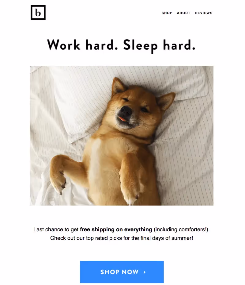
Brooklinen sent a made-us-smile, took-two-seconds-to-read email
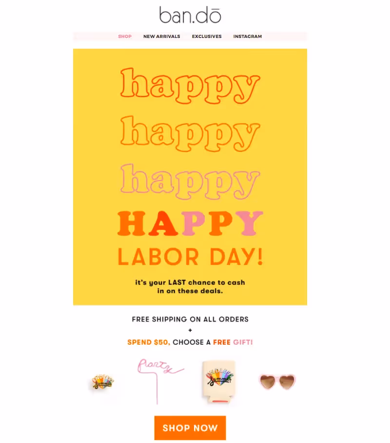
Ban.dō used color-blocking and pretty type to create cheer
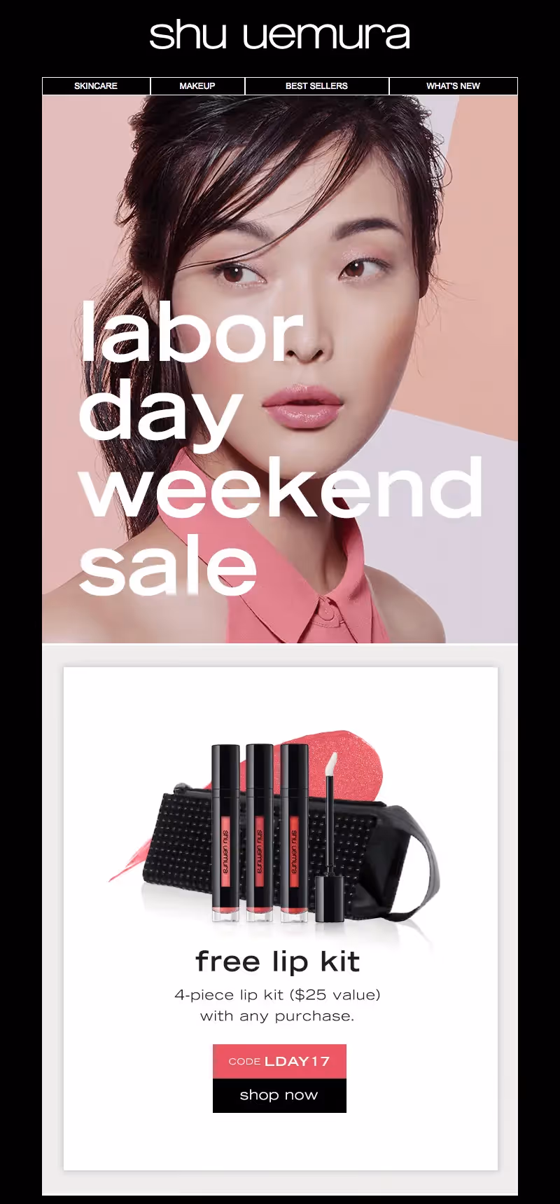
Shu Uemura showcased a stunning hero image with text overlay (using live text over the image would be even better!)
Estēe Lauder's equation: illustration + product display = a GIF that catches the eye
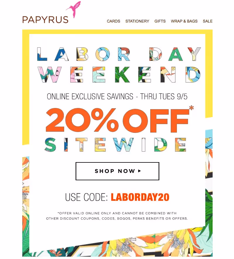
Papyrus got colorful and playful—within its font
Lord & Taylor caught the eyes with a hint of animation against a color-blocked design

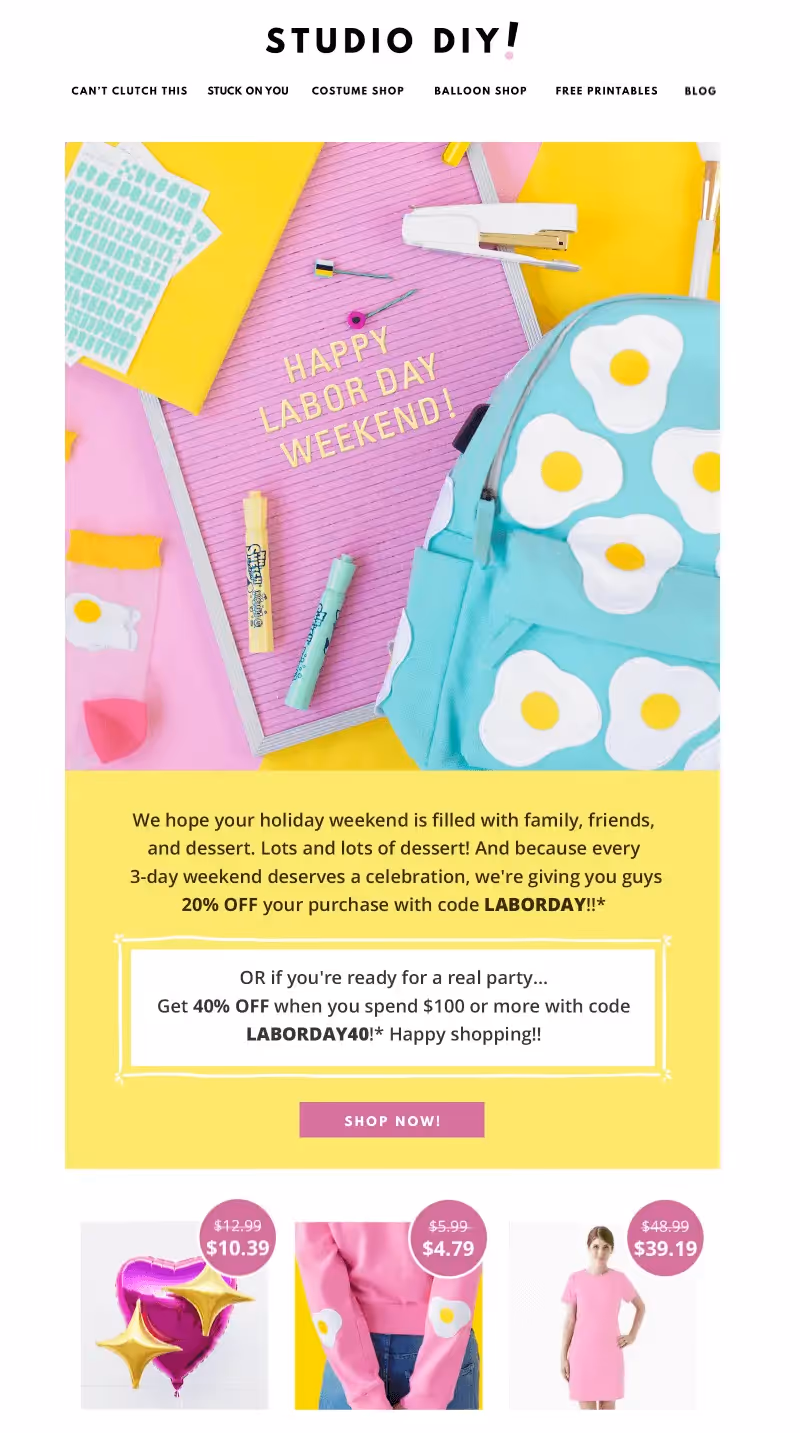
Studio DIY's custom photography was perfectly pretty and on-brand
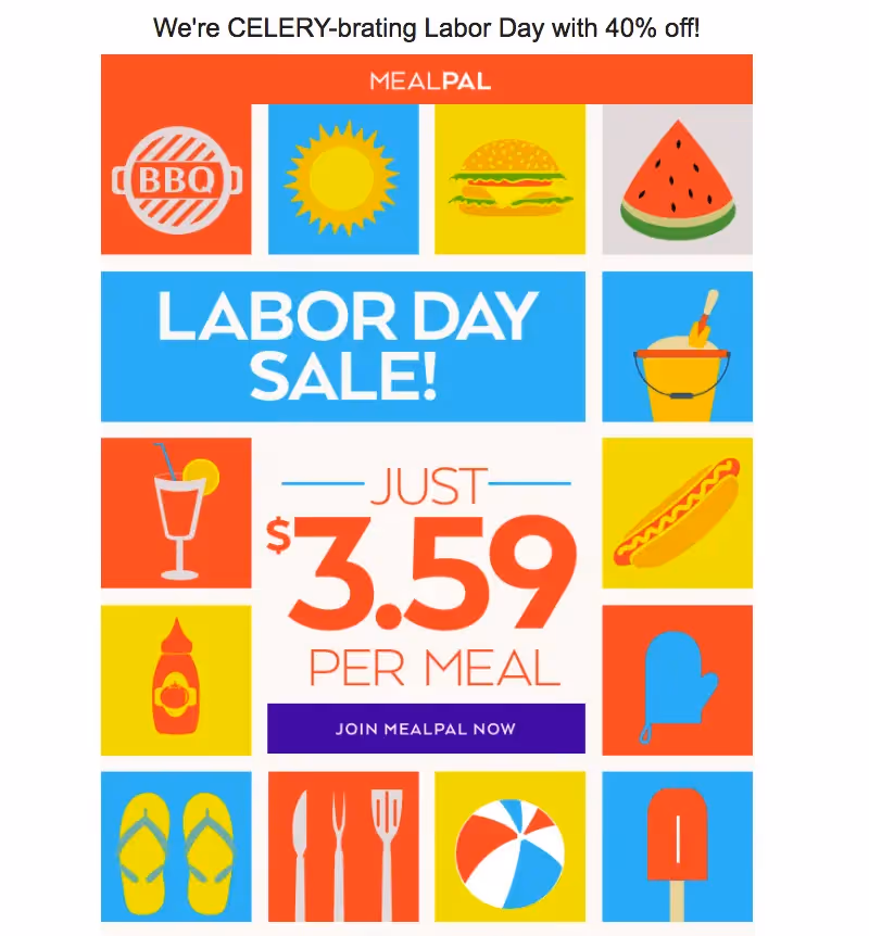
MealPal built a spot illustration collage that looked different from the rest
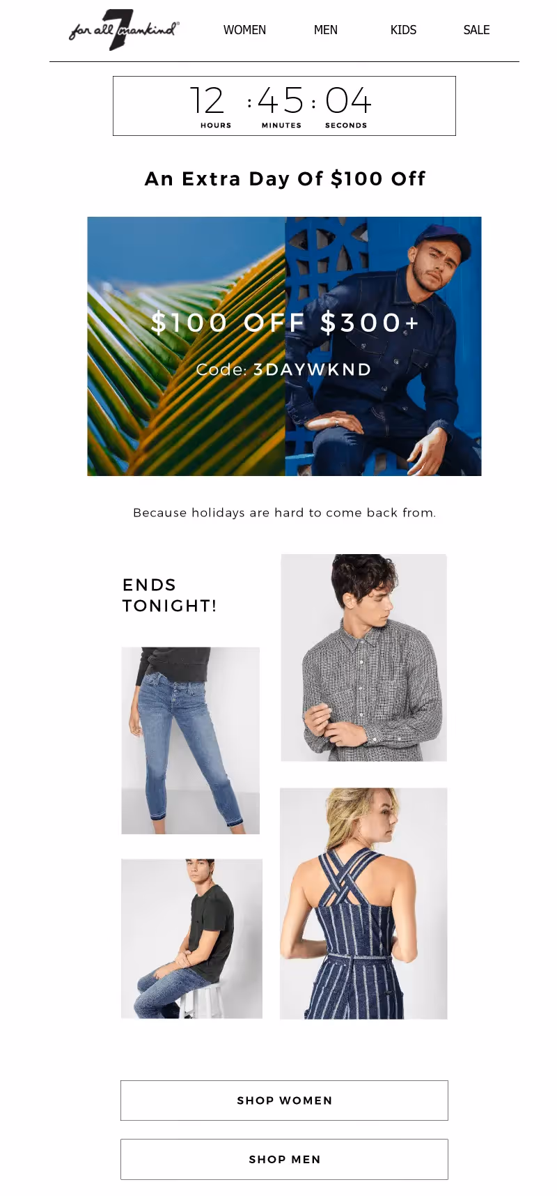
7 for All Mankind extended its deals with a countdown timer