Designers use email newsletter templates not to make cookie-cutter emails, but to have a consistent, branded foundation. Email newsletter templates improve workflow efficiency and provide a framework for delivering well-designed emailsthat are always on brand.When you use templates, your emails start offwith basic components that are assembledin your brand's visual style, so you don't have to reinvent the wheel with every email.That means, from email to email, components like these always have the same size, style, color, andplacement:
- Logo
- Header and footer
- Call-to-action and social media buttons
- Font style (headers, body text, and links)
Having email newsletter templates on hand is valuable for any email marketer, and today, we're going to walk through the top five you should always have ready to go.
1. A letter or text-based template
Letter or text-based templates are useful for sending subscribers a personal message or a serious update, like one necessary for legal reasons. You might use a letter to welcome a new subscriber, apologize for an error, or announce a company change. Often, we see text-based emails when companies let readers know about an update to the privacy policy or terms of service, like in thisemail from AirBNB:

And another from The Muse:

Similarly, some brands use letter-style templatesfor their standard newsletters, like in this example from Skillcrush:

Even for brands with a primarily visual style, a simple letter-style template isessential to have on hand, particularly if you need to send a note to subscribers in a timely manner, like an apology email.Here's an example from Drybar:

Letter or text-based emails are straightforward. Important components to considerincluding in your email newsletter template are:
- A standard, branded header/logo
- An easy-to-read email-safe font for the body text
- A call-to-action button
- An e-signature
- A footer
Format each of these items to match your visual brand standards, and your text-based template will be ready to go at a moment's notice.
2. An invitation-to-join template
Think about the promotional content on your website. Are you inviting subscribers to participate in an online webinar, offering them a free report or e-book to download? You'll want a well-designed invitation template for your online lead generation efforts.If you're a publisher, this is one of your most valuable templates, only second to your newsletter template. Why? Because it's the template used for uploading content and promotions from your advertisers.Here is an example of an invitation email fromtheSkimm.To invite existing readers to try out their new app, the Skimm Ahead app, the subscription service styled their promotion email similar totheir daily newsletters. Even though there aren't overt call-to-actions, theSkimm employs a short intro featuring the app prominently, plus a mock Q&A section written in their trademark tongue-in-cheek friendliness, to help readers get to know the app without being pressured to buy it.

Another email example fromHomeAwaymanages to tug at the heartstrings with an invitation email inviting subscribers to enter a romantic vacation sweepstakes. Not only does the email immediately grab the eye with a strong visual image, but specific keywords reinforce the sweetness ("romantic, fairytale, luxurious, enchanting"). Plus,the strong call-to-actions (one more visual than the other but both using romantic words like "epic" and "dream") make this email promotionfeel more personal.

In an email newsletter template like this, you'll generally want to include fivekey elements:
- A logo/header
- A strong visual image or two (especially of the product)
- A fairly short section providing promotion highlights
- Clear and strong call-to-action language
- A footer
3. A news alert or product announcement template
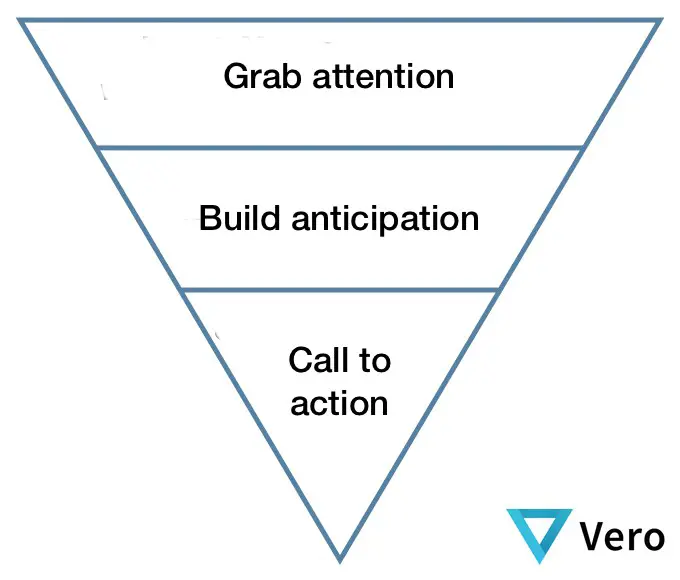
It's important to have a template that canquickly communicate a single, clear message to readers. It's anewsletter that's dedicated to delivering an important piece of singular information, like a big promotion alert or reminder, or a product announcement. These email types areoften most effective when designed with simplicity using the inverted pyramid model:

Clothing company Everlane often uses this basic format in announcement emails:

These templates are likely to be updated significantly from one use to another, especially when announcing new products (you'll probably have special art and color schemes dedicated to the new item), but it's valuable to have a template with a structure and standard width and flow in place. Everlane, for example, always needs the same header, content dividers, "Radical Transparency" content section, and footer for announcement emails like these.

So for announcement and product email newsletter templates, you'll usuallywant to include fivekey elements:
- A logo/header
- A placeholder for artwork
- A consistently-formatted section for body text
- A clear call-to-action button
- A footer
4. A content roundup template
For lists, roundups, or blog/article digests, a single column, modular email newsletter templateis a must. A template like this can reinforce consistency around the number of items included and the format of each item in the list. For example, this email from Skillsharethat liststhe most popular free classes is well-organized and formatted. Items are equidistant from each other (consistent padding), the image sizes and text styles are all the same, and the CTA buttons have the same format:

Depending on your objectives, your list format can vary widely. Inc. Wire, for instance, chooses social sharing CTA buttons and sticks to one header image per digest email:

With a template like this, it's easy to drop in new content with every send, maintaining a polished, branded roundup email no matter the frequency of your campaigns. And if your lists are generally on the longer side, be sure to check out our posts on formatting text-heavy emails and preventing Gmail from clipping your messages.So for these types ofemail newsletter templates, aim toinclude fivekey elements:
- A logo/header
- Relevant artwork placeholder(s)
- A well-organized body text section
- Clear and consistent call-to-action button(s)
- A footer
5. A multiple products template
Product feature emails have become a real art. Designers and email marketing teamscreatesophisticated infographics, visual stories, photo collages, and much more. And with the email volume that brands send, having a baseline product email template is important, especially for regularly-scheduled product offering messages featuring multiple items.Danner, for instance, uses a simple template to introduce and remind subscribers about featured boot collections:

Similarly, Aloha uses a photo collage template to feature recipes and content on its site:

MAC Cosmetics also uses a grid style to send out regular emails featuring its bestselling or newest products:

Most product feature emails break from the single-column structure and use agrid-based layout. Since keeping a grid formation often means items are difficult to see on mobile devices, make sure these messages are responsive so products reposition into one column.When it comes down to email newsletter templates for multiple products, always try to include fivekey elements:
- A logo/header
- A well-organized photo and body text section
- Clear and consistent call-to-action button(s)
- A design that responsive on mobile devices
- A footer
Wrap up: 5 email newsletter templates to have on hand
Templates don't just lay the foundation for good email design—they reinforce and build your brand, establishing trust with readers. Make sure you have these templates ready to go:
- Letter or text-based
- Promotional
- Simple announcement or reminder
- Content roundup
- Multiple products feature
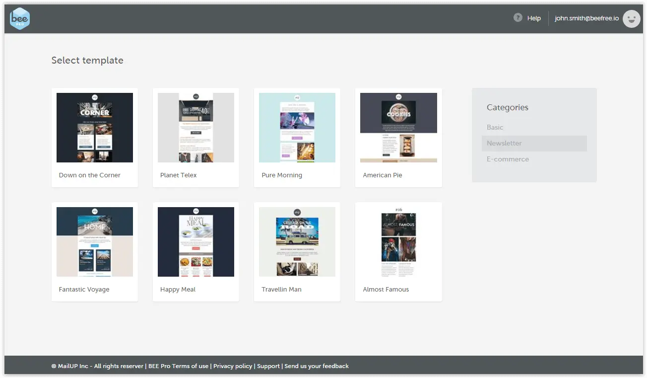
Looking for email templates to use? Go Pro!
If you're not already using our BEE editor, sign-up for a BEE Pro free trial and find dozens of beautiful, professional-quality email templates to edit again and again for all of your newsletter needs.Here are just a few examples of our email templates found in BEE Pro:


