Email Support Group #5
The countdown to WCAG 2.1 Level AA
WCAG 2.1 explicitly defines its scope around web pages and web applications. Email marketing sits in a grey zone, yet practically subject to the same accessibility challenges. That's why in this Email Support Group we did all the heavy lifting for you. Watch the replay to find out:
- What actually matters – The key requirements that will have the biggest impact on your emails and workflows.
- What you can still do – Practical steps you can take right now to get your content, templates, and teams ready—without overhauling everything.
- Where not to overthink – Focus on what moves the needle and skip what doesn’t.
- Live problem-solving – Bring your questions and challenges; we’ll tackle them together so you leave with clarity and actionable ideas.


Wait, what what are we counting down to?
In April 2024, the Department of Justice (DOJ) finalized a rule requiring public entities, such as community colleges and public universities, to ensure digital services and web content meet WCAG 2.1 Level AA standards.
- Entities serving 50,000+ folks must comply within 2 years
- Smaller entities get three years (April 2027)
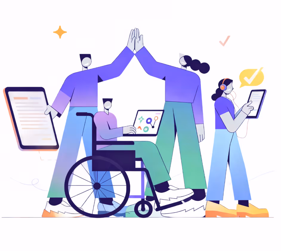
WCAG 2.1 Level AA breaks accessibility down into four clear principles:
- Perceivable: Can everyone receive your content, regardless of how they experience it?
- Operable: Can everyone interact with it, no matter their input method?
- Understandable : Is it clear, consistent, and readable for all?
- Robust: Does it hold up across assistive technologies, screen readers, and beyond?
If you're ready to dive into the world of email accessibility here are some great learning resources for you:
- Email Accessibility 101: Designing for Everyone: This course teaches you how to design emails that are accessible, readable, and inclusive for every subscriber.
- The HTML email about HTML email: A newsletter created by Email Designer and Developer, Paul Airy.
What guidelines in WCAG 2.1 Level AA actually apply to email?
Some WCAG criteria are genuinely difficult to achieve in email because of how email clients work (Gmail strips <head> styles, Outlook uses Word's rendering engine) and most clients give you no control over focus styles. So strict WCAG compliance is harder to guarantee than on a website, but applying the principles still meaningfully improves accessibility for a large portion of your audience.
Here's what actually matters in emails:
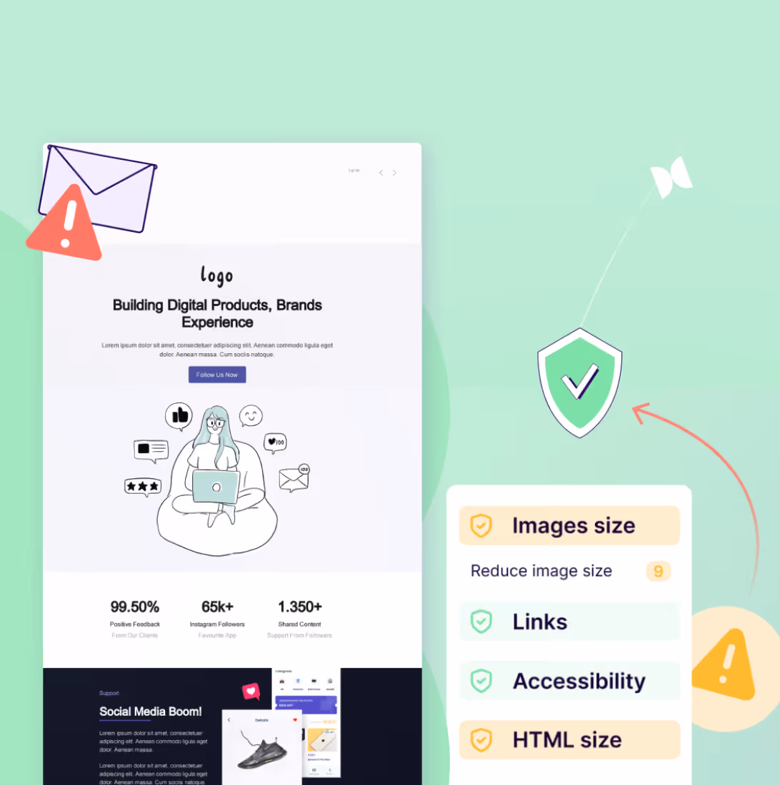
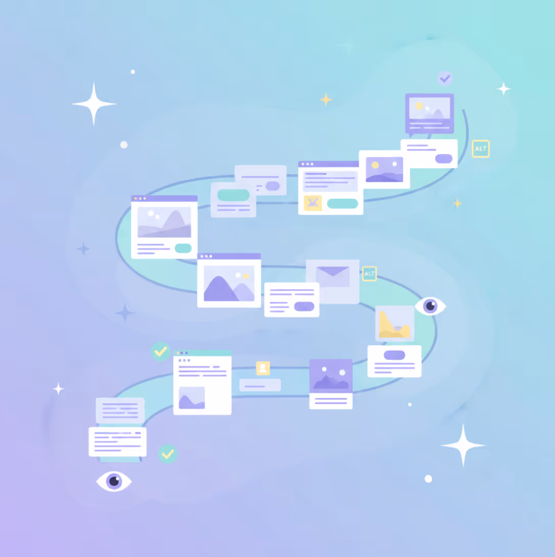
1. Alt Text:
Every meaningful image needs descriptive alt text. For images that are more for "decoration" and don't offer much context to what the email is about add " " so screen readers skip them.
2. Color contrast:
Body text needs a contrast ratio of at least 4.5:1, and large text (18pt+) needs 3:1. This affects your CTA buttons, body copy, and anything placed over a colorful background.
Recourses mentioned in the ESG:
- Contrast.tools: Checks contrast and relative text size, so you get a more complete legibility picture
- Webaim.org: Color contrast checker to verify you're meeting WCAG guidelines
- Blog: Dark mode design best practices
3. Text:
Text should be readable at 200% zoom without assistive technology without breaking the layout of the content or functionality. Text size should be 14px minimum. Email clients on mobile can auto-resize small text, and when they do, it often breaks your layout in ways you can't predict or control.
4. Responsiveness:
Your email should adapt to small screens, without any horizontal scrolling.
Recourses mentioned in the ESG:
- Inbox Monster: Email rendering tool with dark mode testing capabilities
- Email on Acid: Similar rendering tool, also supports dark mode previews
- Blog: Mobile friendly email design best practices
5. Link purpose:
Every link should make sense on its own, out of context CTAs, like "Click here" and "Learn more" don't cut it . Anchor text for something descriptive, like "Read our guide to email accessibility."
6. Language of page:
Add a lang attribute to your <html> tag so screen readers know which language profile to use. Most ESPs support this and it's a small addition that makes a real difference for multilingual audiences.
7. Consistent navigation:
If you're running a series of emails with a header or footer links, keep the placement consistent across sends.
Additional resources:
- Blog: 8 Highly effective email header design tips and ideas
- Blog: What to include in your email footer design
8. Error identification:
If your email includes a form (like an embedded preference center), any errors need to be identified clearly —not just highlighted in red. Describe what went wrong and how to fix it.
9. Semantic structure:
Screen reader users navigate by headings. Use heading tags (<h1>, <h2>).
10. Reading order:
In multi-column layouts, your HTML order should still read logically — left to right, top to bottom — even if the visual layout is doing something different.
11. Animation and motion:
Animated GIFs should either not autoplay, or give users a way to pause them. And if anything in your email flashes more than three times per second, cut it.
Additional resources: